Many data visualization tools like Tableau exist in the market, including Power BI, SAS and Qlikview.
Despite this, a significant number of people consistently choose Tableau. They favor it for its remarkable flexibility and user-friendly approach to data analysis.
Whether you’re a rookie analyst or a seasoned executive, Tableau has something for you.
With a vast array of dashboard types, you can track everything from real-time sales metrics to annual performance reviews.
This post will dive into the some of the best Tableau dashboard examples that deliver real, actionable insights.
Take a look for and get inspired to turn your data into decisions.
Best Tableau Dashboard Examples
1. Attrition Dashboard
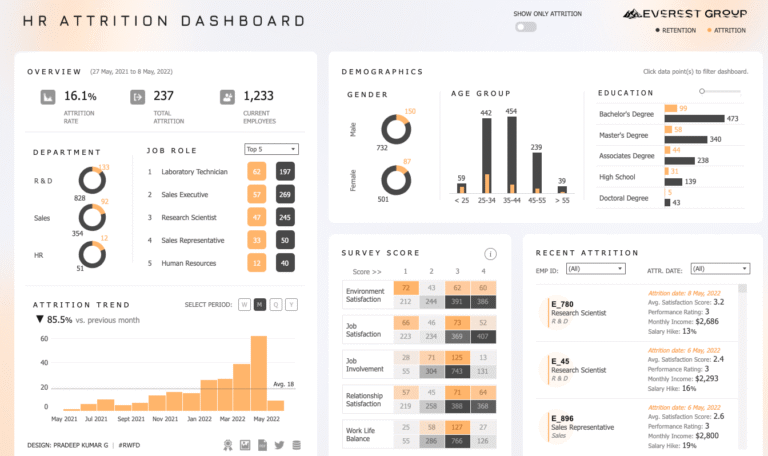
This Tableau HR Attrition Dashboard for Everest Group provides a comprehensive overview of employee turnover, displaying key metrics like attrition rate, total departures, and current headcount.
The dashboard analyzes attrition across multiple dimensions including departmental breakdowns (R&D, Sales, HR), job roles (with top positions like Laboratory Technician and Sales Executive), and demographics such as gender, age groups, and education levels.
It also features an attrition trend chart showing monthly patterns with a declining trend, employee satisfaction survey scores across various categories like environment satisfaction and work-life balance presented in heat map format.
There is a recent attrition section highlighting individual departing employees with their satisfaction scores, performance ratings, and compensation details.
The dashboard includes interactive filtering options and toggle functionality between retention and attrition views for comprehensive workforce analysis.
The dashboard is ideal for HR professionals.
2. Call Center Dashboard
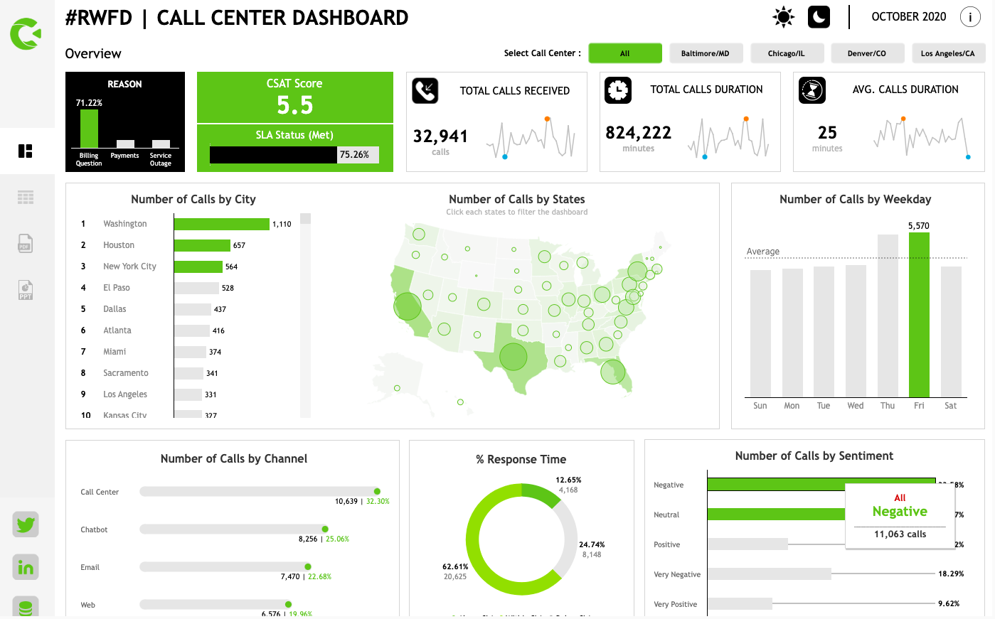
The Call Center Dashboard provides comprehensive call analytics with filtering options by call center location (Baltimore/MD, Chicago/IL, Denver/CO, Los Angeles/CA).
The overview displays key performance indicators including a customer satisfaction (CSAT) score and SLA status meeting percentage, alongside primary call reason categories for billing questions, payment issues, and service outages.
Core metrics show total calls received, total call duration in minutes, and average call duration with accompanying trend lines.
The dashboard analyzes call distribution geographically through city rankings (led by Washington, Houston, and New York City), a US map visualization showing call volume by state with bubble sizes indicating volume, and weekday patterns highlighting Friday as the peak call day.
Additional insights include call channel breakdown (Call Center, Chatbot, Email, Web), response time percentages displayed in a donut chart format.
The call sentiment analysis shows the distribution between negative, neutral, positive, very negative, and very positive customer interactions with corresponding percentages and call counts.
If you run a call center and have a large team of customer care representatives, this dashboard can help you with detailed insights on customer calls and contacts.
3. Help Desk Dashboard
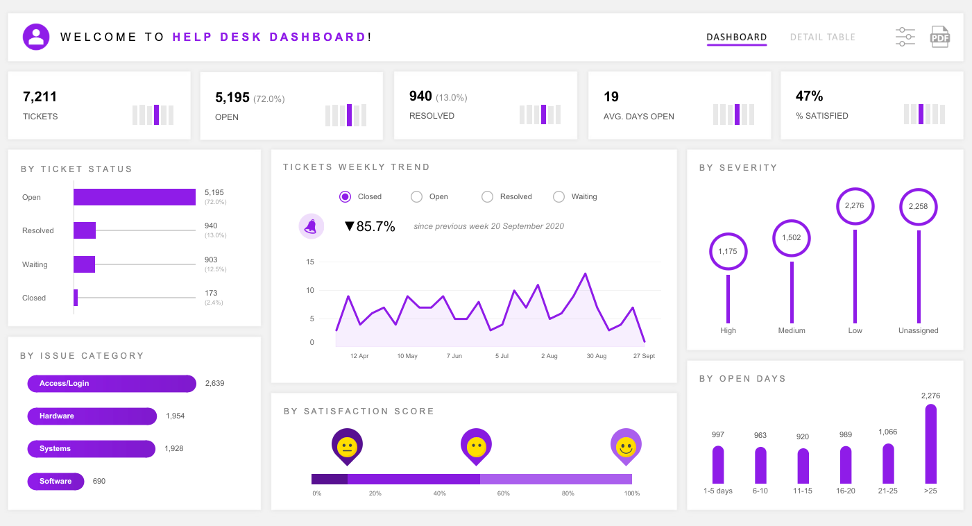
This Help Desk Dashboard presents a comprehensive IT support ticket management overview.
It shows key performance metrics including total tickets, open tickets with percentages, resolved tickets, average days tickets remain open, and customer satisfaction percentage.
The dashboard analyzes ticket status distribution showing the majority as open tickets, with smaller portions resolved, waiting, or closed.
Weekly trends are tracked through a line chart displaying an overall decline in ticket volume since the previous week, with toggle options for viewing closed, open, resolved, and waiting tickets.
Issue categorization breaks down tickets by type including Access/Login (highest volume), Hardware, Systems, and Software issues.
Severity analysis uses a hierarchical bubble chart showing high, medium, low, and unassigned priority levels with corresponding ticket counts.
The dashboard includes customer satisfaction scoring with emoji indicators and percentage breakdowns.
Additionally, there is the ticket aging analysis, showing distribution across different timeframes from 1-5 days to over 25 days, helping identify potential service level agreement concerns.
You can incorporate the dashboard to monitor and improve your help desk performance.
4. Hospital Emergency Room Dashboard
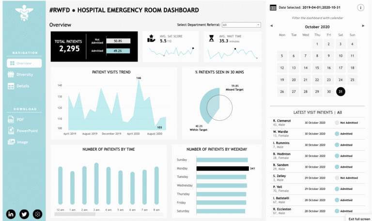
The Hospital Emergency Room Dashboard features navigation options for Overview, Diversity, and Details sections with export capabilities for PDF, PowerPoint, and Image formats.
The overview shows total patient count with admission status breakdown (admitted vs. not admitted percentages), average satisfaction scores, and average wait times with trend indicators.
Patient visit trends are displayed through an area chart showing fluctuations over the time period, while a donut chart illustrates the percentage of patients seen within 30 minutes target versus those missing the target.
Time-based analysis includes hourly patient distribution from 12 AM to 8 AM and weekday patterns.
The dashboard also features a calendar interface with date filtering and a latest visit patients section displaying individual patient records with names, ages, gender, visit dates, and admission status
This provides real-time operational insights for emergency department management.
Admin supervisors working with a hospital or nursing home in their emergency departments can effectively leverage this dashboard to their advantage.
5. Hospitality Dashboard
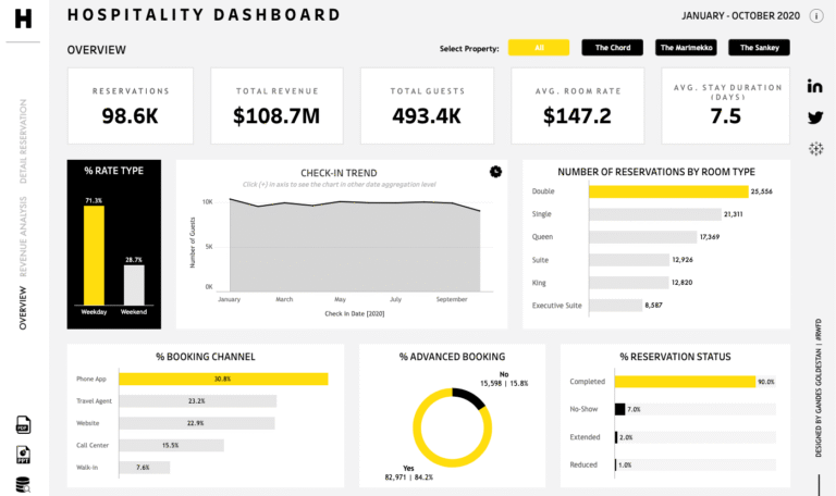
This Hospitality Dashboard shows operational insights of a hotel.
You can see property selection filers along with key performance indicators that include total reservations, revenue, guest count, average room rate, and average stay duration in days.
The dashboard analyzes booking patterns through rate type comparison (weekday vs. weekend percentages), check-in trends over the months via an area chart.
The room type reservation distribution shows Double rooms leading followed by Single, Queen, Suite, King, and Executive Suite categories.
The Channel analysis breaks down booking sources including Phone App (highest percentage), Travel Agent, Website, Call Center, and Walk-In reservations.
Advanced booking patterns are visualized through a donut chart showing the split between advance bookings and immediate reservations.
This is perfect for people working with hotel industry. It provides comprehensive trends into hotel operational performance and guest behavior patterns.
6. Human Resources Dashboard
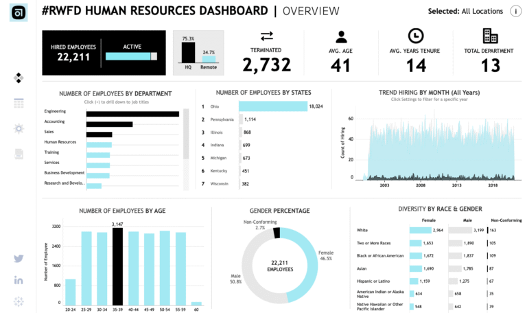
As you can see, the dashboard tracks workforce analytics for over 22,000 employees.
It shows active versus terminated staff, with a split between headquarters and remote workers. The data reveals Engineering as the largest department, followed by Accounting and Sales.
Geographic distribution spans multiple states with Ohio having the highest concentration.
Age demographics show most employees in the 35-39 bracket, with nearly balanced gender representation.
The diversity section breaks down workforce by race and gender combinations.
A hiring trend chart displays recruitment patterns over several years, showing fluctuations in hiring activity across different time periods.
Using this dashboard, HR professionals can stay informed about organizational workforce. The data is often required by the management team to make hiring decisions.
7. Inventory Management Dashboard
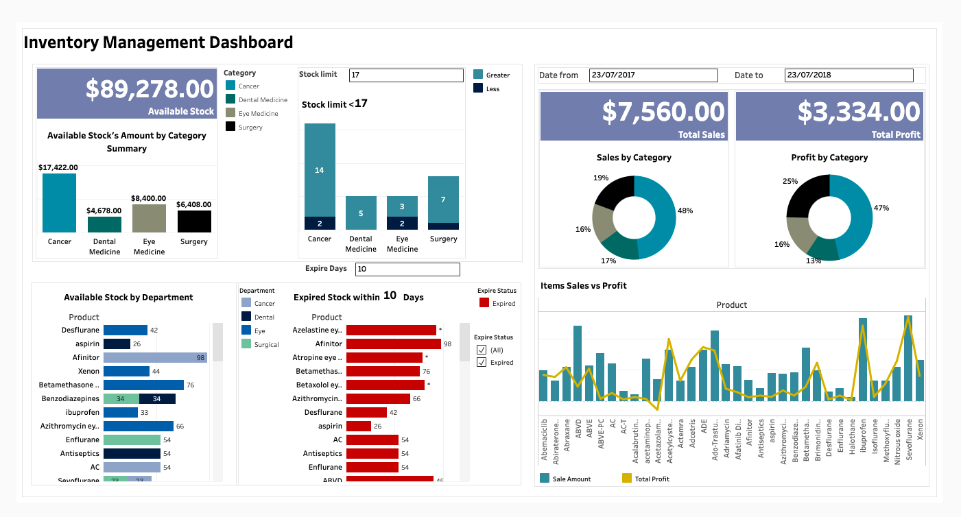
People taking care of product inventories can greatly benefit from this dashboard.
This inventory dashboard tracks stock worth nearly $90,000 across medical categories like Cancer, Dental, Eye Medicine, and Surgery.
It identifies items below stock limits and tracks expiring products with detailed expiration alerts.
Sales and profit breakdowns show Cancer products dominating both metrics.
A comprehensive chart compares sales versus profit performance across all pharmaceutical items.
The system monitors stock levels by department and provides filtering options for inventory oversight.
8. IT Project Management Dashboard
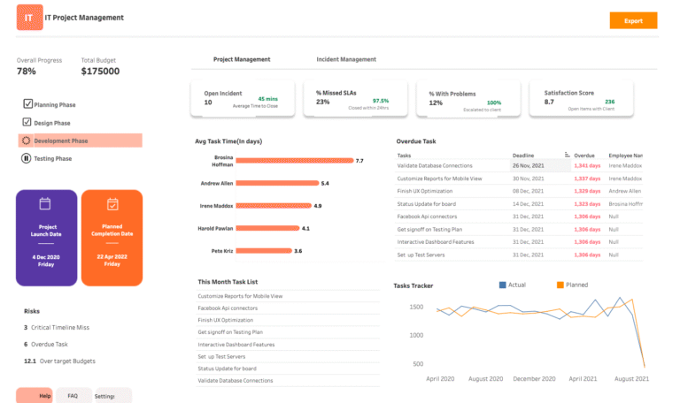
This IT project dashboard shows overall progress on a $175,000 budget project.
It tracks four phases: Planning, Design, Development, and Testing, with Development currently active.
The dashboard displays team member task completion times and identifies overdue items with specific deadlines.
Risk metrics highlight timeline misses and budget overruns. A task tracker chart compares actual versus planned progress over time, showing recent performance declines.
If you’re into technology, especially into a project management role, this dashboard can be really handy.
9. Project Management Dashboard
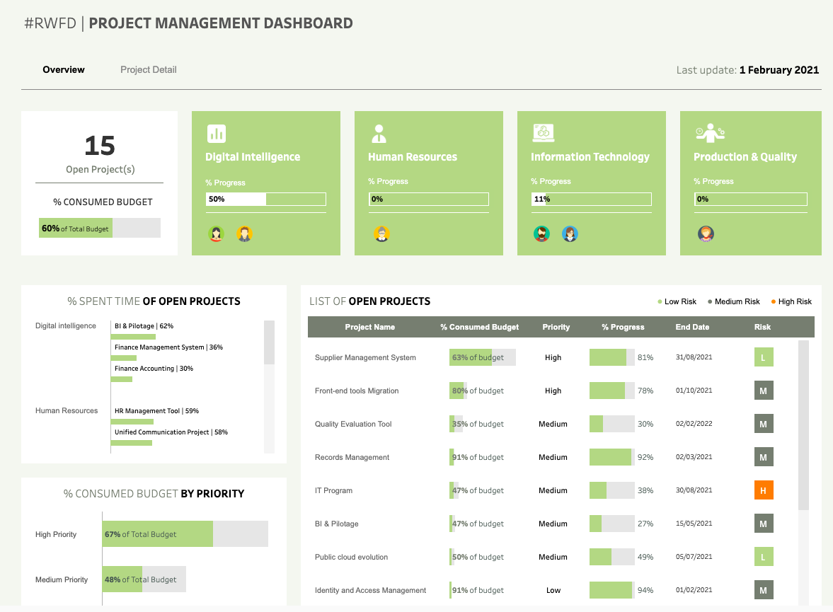
This is another good example of a project management dashboard.
It shows the open projects with total budget consumed. Four department categories are shown: Digital Intelligence, Human Resources, Information Technology, and Production & Quality.
Each department displays assigned team member avatars.
The project list shows individual initiatives with budget consumption rates, priority levels, progress percentages, and risk assessments.
You can also make out High-priority project consumption along with the ones in the medium-priority list.
The Time allocation charts break down effort distribution across different project areas within each department.
Depending on your project requirements, you can customize the dashboard.
10. Spend Analytics Executive Summary
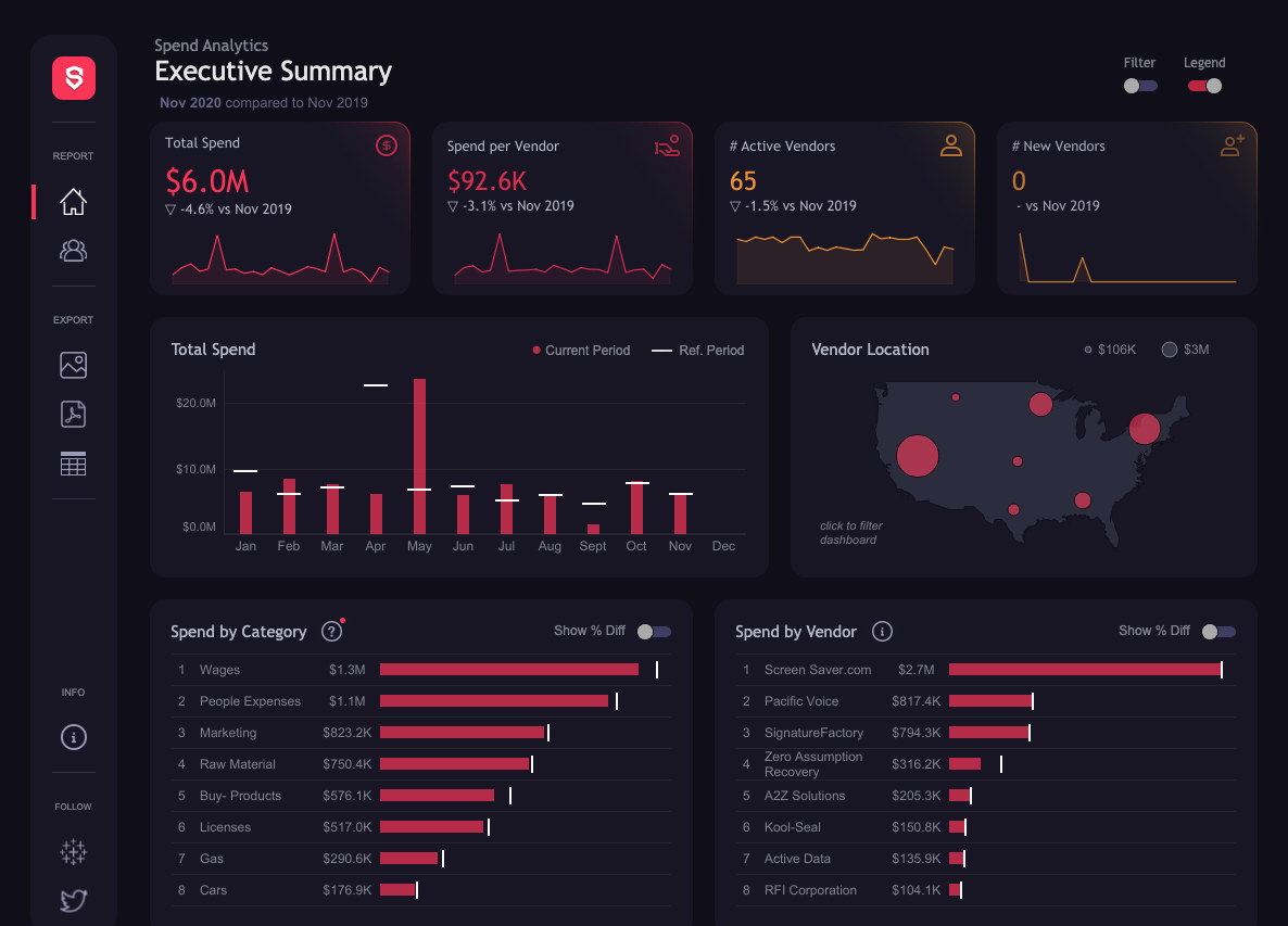
This financial dashboard compares spending.
You can see Total spend, Decrease year-over-year, Spend per vendor, Active vendors, and New vendors added.
The Monthly spending patterns show fluctuations throughout the year.
Category breakdown reveals Wages as the largest expense, followed by People Expenses and Marketing. Vendor analysis identifies the top vendor by spend amount.
The Geographic distribution displays vendor locations across a US map with varying spend concentrations. It includes year-over-year comparison capabilities and percentage difference toggles for detailed analysis.
People taking care of commercials and those involved with finance teams must consider this dashboard.
11. Web Analytics Dashboard
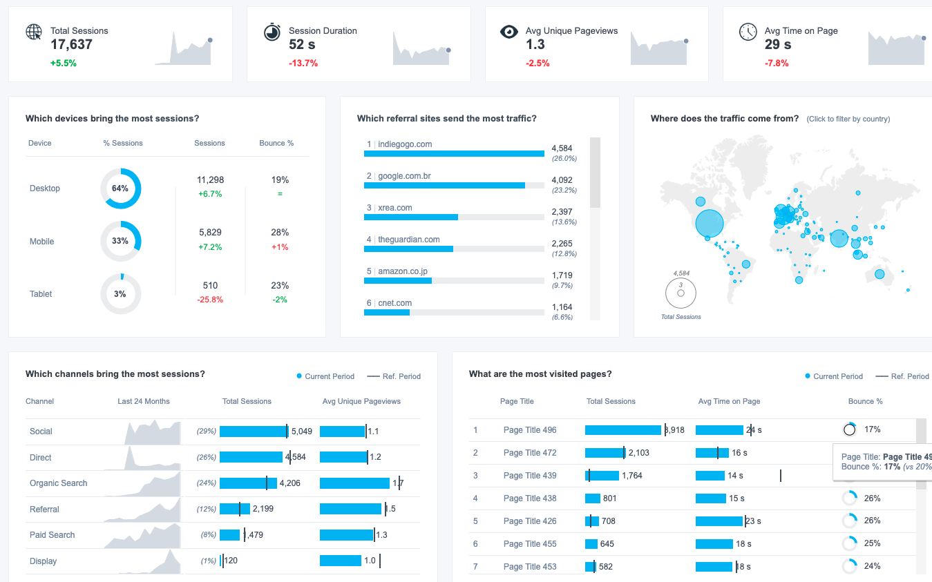
Irrespective of the industry you work with, this is a must-have dashboard for agency marketers and marketing teams of small and big businesses.
This analytics dashboard shows 17,637 total sessions with a 5.5% increase.
Session duration averaged 52 seconds (down 13.7%), while unique pageviews per session was 1.3 (down 2.5%). Average time on page was 29 seconds, decreasing by 7.8%.
Device analysis shows Desktop generating 64% of sessions, Mobile 33%, and Tablet 3%. Top referral sites include indiegogo.com and google.com.br driving the most traffic.
A world map visualizes traffic sources by country with session volume indicators.
Channel performance breaks down traffic sources including Social, Direct, Organic Search, Referral, Paid Search, and Display.
The most visited pages section lists top-performing content with session counts, time on page, and bounce rates for performance comparison.
Apparently, you get insights on most metrics you would want to review as a marketer.
12. Sales Pipeline Dashboard

A sales pipeline dashboard turns your sales metrics into a roadmap for action.
Whether you’re a sales manager, sales analysts or sales executive, this tableau dashboard gives you the full picture, leads, opportunities, deal stages, and more.
The sales pipeline dashboard lets you zero in on key performance indicators that matter to your business.
From spotting new opportunities to understanding where leads are coming from, the insights are immediate and actionable.
In a world where data drives decisions, a Sales Pipeline Dashboard is a must-have.
Related: 15 Best Tableau Sales Dashboard Examples
13. Account Management 360 View Dashboard

The Account Management 360 View Dashboard stands out as a vital tool for businesses looking to elevate their customer relationship game.
This comprehensive dashboard brings together critical data from various touch-points, providing a holistic view of customer interactions and account status.
Sales executives and account managers find this tool invaluable as it helps in identifying opportunities, understanding client needs, and tracking communication history.
The dashboard displays key metrics such as purchase history, account health, and recent interactions, all in an easy-to-read format.
This ensures that teams are well-equipped with the information they need to foster positive client relationships and drive sales growth.
By utilizing the Account Management 360 View Dashboard, businesses can ensure that they are maintaining a client-centric approach, leading to increased customer satisfaction and loyalty.
In turn, this strategic approach to account management paves the way for sustained business success.
14. Executive Overview Sales Summary Dashboard

The Executive Overview Sales Summary Dashboard shares a quick snapshot of your sales.
Tailored for top-level management, this dashboard simplifies complex sales data, presenting it in an accessible and clear format.
What does this mean for sales leaders?
They can make swift, informed decisions without getting bogged down in data analysis.
The dashboard highlights key sales metrics, trends, and performance indicators, all in one place.
It’s not just about seeing the numbers; it’s about understanding what they mean for the business.
Whether it’s identifying high-performing products or pinpointing areas that need attention, this Tableau dashboard is indispensable.
It cuts through the noise, providing clarity and insight. This isn’t just a visual tool; it’s a roadmap for strategic decision-making.
With the Executive Overview Sales Summary Dashboard, leaders have the information they need at their fingertips, ready to guide their team to success.
Also Read: 10 Best Tableau Courses
15. Quarterly Forecast Dashboard

The Quarterly Forecast Dashboard stands out as a strategic tool for businesses aiming to stay ahead of their sales goals.
This dashboard breaks down sales data quarterly, providing clear visibility into trends and performance.
Users can easily spot which products are performing well and which may need extra attention.
By doing so, sales teams can adjust their strategies proactively rather than reacting when it might be too late.
The Tableau dashboard also showcases projected versus actual sales, giving a comprehensive view of the business’s trajectory.
This transparency ensures that all team members are on the same page, fostering a collaborative environment focused on meeting and exceeding sales targets.
Managers find this dashboard particularly useful for resource allocation, ensuring that efforts are concentrated in the right areas for maximum impact.
In essence, the Quarterly Forecast Sales Dashboard is a vital asset for businesses aiming to turn data into a competitive advantage.
16. Sales Growth Dashboard

The Sales Growth Dashboard tracks sales trends and pinpoint areas for improvement.
Leveraging this Tableau dashboard, sales teams gain direct access to critical data, streamlining the decision-making process.
It highlights trends, showcases performance metrics, and reveals the effectiveness of sales strategies over time.
It’s a strategic instrument to analyze various aspects of sales, from lead generation to final purchases.
Teams can identify which products are performing best, where sales efforts are yielding results, and where there’s room for improvement.
With a user-friendly interface, the dashboard ensures that even those with minimal technical know-how can navigate through and make sense of their sales data.
The dashboard turns raw sales data into a clear, actionable format, paving the way for informed strategies.
Read: 15 Best Power BI Dashboard Examples
17. Sales Territory Assignment
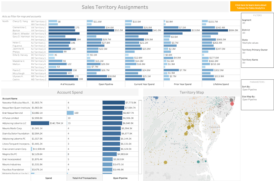
The Sales Territory Assignment Dashboard focuses on sales strategies and sales performance tracking.
It provides a clear, visual layout of sales territories, aligning them with the right sales representatives.
This ensures balanced workload distribution and optimal coverage across different regions. Users can quickly identify which territories are underperforming and which ones are hitting their targets.
This allows sales managers to make data-driven decisions to reassign territories or provide additional support where needed.
The dashboard is user-friendly, ensuring even those new to Tableau can navigate and understand the data presented.
It provides real-time updates, so sales teams are always working with the most current information.
By using this dashboard, organizations can boost their sales efficiency, enhance representative performance, and ultimately drive higher sales.
18. Sales Cockpit Dashboard

The Sales Cockpit is a combination of selected behaviors, data, and goals into one single tool.
Using this dashboard, your sales rep will have easy access to leads, customers’ insights, and sales quota attainment.
There’s no seasonal constraint for the Sales Cockpit dashboard. In fact, it yields better results when used consistently. This helps the sales team to stay focused and guides them through the process of making result-oriented decisions.
The Sales Cockpit dashboard is a sales executive solution to ensuring that their sellers stay informed without having to leave the hub of sales data.
19. Super Sample Superstore Dashboard

The Super Sample dashboard helps to evaluate the dataset.
It guides on how to develop better designs, tactics, and data arrangement strategies.
To get started with the Sample Superstore, you will have to select a date range and region to coordinate your actions.
After highlighting a region, select a sub-region. For example, if you have selected Europe as your region, you can highlight Scotland to filter the descriptive dashboard further.
You can also set date formats, so you can choose to view performances by date granularity or year over year.
The “Prescriptive” dashboard helps users to get a clearer understanding of the “Descriptive” dashboard outputs.
The Superstore Sample dashboard is mainly used to analyze trends pertaining to sales, profit margins, shipping periods, etc.
Related: 15 Best Qlikview Dashboard Examples
20. Social Media Dashboard

This dashboard represents your social performance.
There are preset templates that you can use to broadcast your messages across several platforms.
The Social Media dashboard makes collaboration and KPIs alignment easy within internal and agency teams.
You can share your dashboard content with members of your team or management to keep them informed of your marketing efforts.
The dashboard shares insights on how your paid social activities are faring. You can easily monitor your paid campaigns and see what they are yielding in terms of website traffic and conversions.
Related: 15 Best Grafana Dashboard Examples
Final Words
There you have it. 20 game-changing Tableau dashboard examples that put data to work.
From hospitality to sales, and healthcare, we’ve walked through diverse industries and functions; but the power and flexibility of Tableau didn’t fail to impress.
Keep in mind that incorporating these dashboards in your work is just a starting point. The real magic happens when you effectively tailor these dashboards to fit your unique business needs.
That’s when you see things happening for you.
Enjoyed the post?