There’s something inherently nostalgic and engaging about chalk writing that instantly transports us back to classroom days.
Whether you’re an educator looking to create more engaging lesson presentations, a designer crafting vintage-inspired slides, chalk-style fonts can transform ordinary PowerPoint presentations into visually compelling experiences.
These typefaces combine the authentic texture and character of real chalk with the clarity needed for digital presentations, offering the perfect balance between style and readability.
Let’s explore some of the best fonts that look like chalk adding fun and creativity to your presentations.
Also Read: Best Fonts For Emails And Presentations
1. Chalkduster
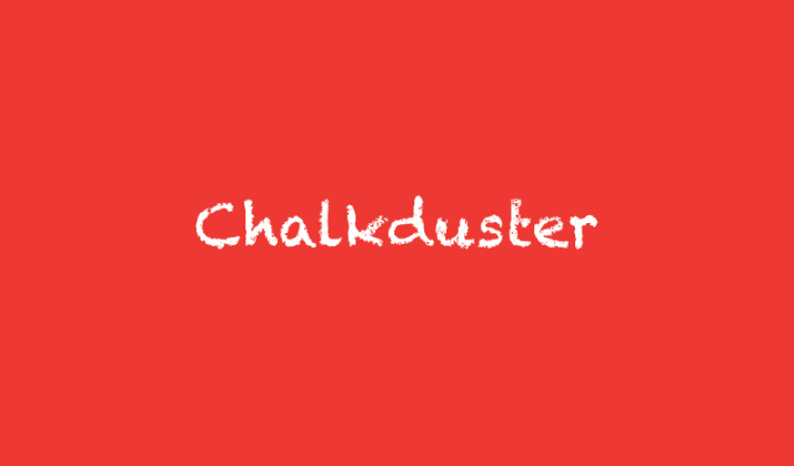
Chalkduster delivers an instantly recognizable chalk aesthetic with its bold, weathered appearance that perfectly mimics the look of well-used chalk on a traditional blackboard.
The font features deliberate roughness around the edges of each character, creating that authentic worn-chalk texture that makes presentations feel more approachable and less corporate.
The generous spacing between letters ensures excellent readability, while the substantial weight of the characters makes it particularly effective for titles and headings.
Chalkduster works exceptionally well for creative presentations, restaurant menus, vintage-themed designs, and any project where you want to evoke a sense of handcrafted authenticity.
The font’s bold presence commands attention without being overpowering, making it versatile enough for both casual and semi-professional contexts.
Also Read: Best Fonts For Teachers
2. Dusty Chalk
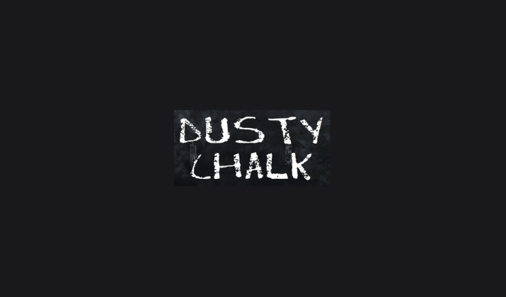
Dusty Chalk takes realism to the next level by incorporating actual dust-like particles and texture variations that mirror the way chalk naturally accumulates and disperses on writing surfaces.
This font excels at creating presentations that feel tactile and three-dimensional, with each letter appearing as though it was just written with a fresh piece of chalk.
The irregular edges and varying opacity throughout the letterforms add depth and visual interest that static fonts simply cannot match.
Dusty Chalk is particularly effective for artistic presentations, creative workshops, and design portfolios where the texture itself becomes part of the visual storytelling.
The font maintains clarity while delivering impressive visual impact, making it suitable for both large display text and medium-sized subheadings.
Also Read: Best Fonts For Reports & Professional Documents
3. Chalk Hand Lettering
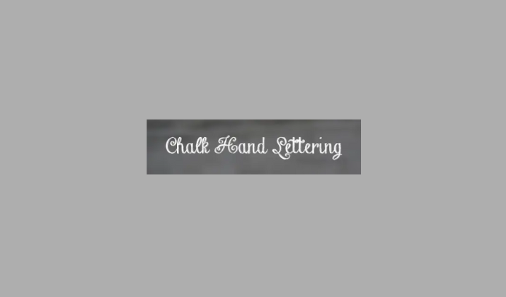
Chalk Hand Lettering brings the personal touch of custom calligraphy to your PowerPoint presentations, combining the organic feel of hand-drawn chalk letters with carefully crafted letterforms that ensure consistent readability.
This font captures the natural flow and rhythm of someone writing with chalk in real-time, complete with the slight tremors and character variations that make handwriting so distinctive.
The connecting strokes and flourishes add elegance while maintaining the casual, approachable feel that makes chalk fonts so appealing.
This typeface works beautifully for wedding presentations, creative portfolios, inspirational quote slides, and any project where you want to convey personality and human touch.
The balanced contrast between thick and thin strokes creates visual hierarchy naturally, making it easy to emphasize important points without changing font sizes.
Also Read: Best All-time Professional Fonts On Canva
4. Rudiment
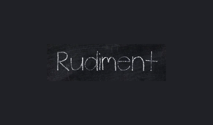
Rudiment is a fantastic chalk-style font that deserves consideration for PowerPoint presentations.
It has several qualities that make it particularly appealing. Rudiment captures the authentic look of chalk writing with its rough, textured edges and slightly irregular letterforms that mimic the natural variations you get when writing with actual chalk on a blackboard.
The font has a hand-drawn quality that feels organic and approachable, while still maintaining good readability across different sizes.
What makes Rudiment especially useful is its balance between character and professionalism.
It’s casual enough to feel warm and inviting, but structured enough to work in more formal presentation contexts.
Check Out: Best Fonts For Legal Documents
5. Chalkboard
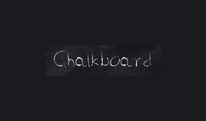
Chalkboard perfectly captures the nostalgic essence of traditional classroom instruction with its authentic representation of teacher handwriting on slate boards.
This font incorporates the subtle inconsistencies and natural flow that occur when writing quickly with chalk, including varying pressure marks and the organic spacing that develops in real classroom settings.
The letterforms strike an excellent balance between formality and casualness, making presentations feel both authoritative and approachable.
Chalkboard is particularly effective for educational content, training materials, and presentations that benefit from a more personal, human connection with the audience.
The font’s moderate contrast and clear character definition ensure that important information remains accessible while adding visual warmth that helps maintain audience engagement throughout longer presentations.
Also Read: Best Fonts For Memorization
6. DJB Chalk It Up
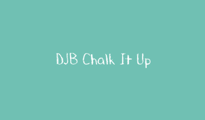
DJB Chalk It Up rounds out our selection with its playful yet sophisticated approach to chalk typography, featuring carefully crafted irregularities that give each letter personality without compromising readability.
This font excels at creating presentations that feel both professional and creative, with texture variations that add visual interest without becoming distracting.
The slightly condensed letterforms make efficient use of slide space while maintaining the authentic chalk aesthetic that audiences find so appealing.
DJB Chalk It Up works particularly well for marketing presentations, creative briefs, and any context where you want to convey innovation and fresh thinking.
The font’s moderate weight and balanced proportions make it suitable for both display text and longer passages, offering flexibility that many specialty fonts lack.
Also Read: Best Fonts For Kindle
7. Chalk Dust
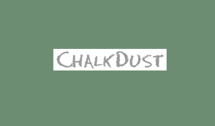
Chalk Dust creates an incredibly realistic chalk writing experience by incorporating actual particle effects and granular textures that simulate the way chalk powder naturally settles and accumulates during extended writing sessions.
This font goes beyond simple texture overlay by featuring varying opacity levels throughout each character, creating the illusion that some areas of the letters are thicker with chalk residue while others appear lighter and more translucent.
The irregular baseline and subtle size variations between characters add to the authenticity, making it appear as though each letter was written individually by hand rather than generated digitally.
Chalk Dust works exceptionally well for artistic presentations, gallery showcases, and creative workshops where the medium itself becomes part of the message.
The font’s organic imperfections and realistic chalk particles make it ideal for projects that need to convey authenticity and craftsmanship, while still maintaining enough structure to ensure professional readability across different slide layouts.
Also Read: Most Common Fonts
8. Sketch Chalk
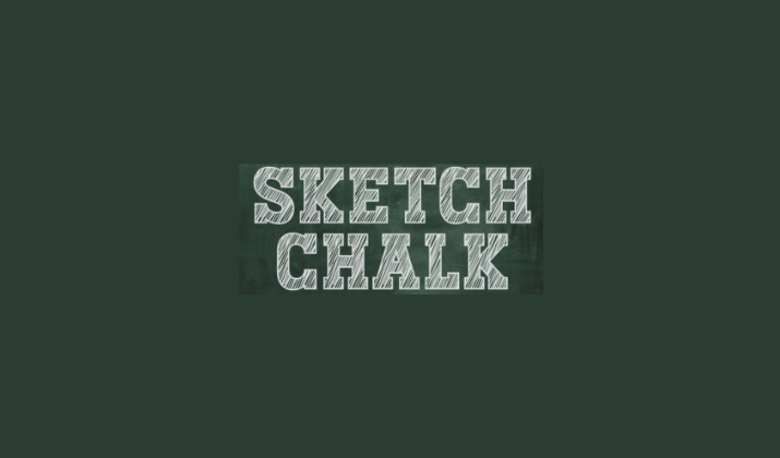
Sketch Chalk brings an artistic, hand-drawn quality to chalk typography that perfectly captures the spontaneous nature of sketching with chalk on blackboards.
The font features intentionally uneven strokes and varying line weights that mimic the natural pressure variations that occur when someone draws letters freehand with chalk.
The letterforms have a loose, expressive quality that suggests movement and creativity, with subtle tremors and organic curves that make each character feel alive and dynamic.
What sets Sketch Chalk apart is its ability to convey both informality and artistic sophistication simultaneously, making it ideal for creative presentations, brainstorming sessions, and design workshops where you want to encourage innovative thinking.
The font’s sketch nature works particularly well for presentations about creative processes, artistic concepts, or any content that benefits from a more experimental, exploratory visual approach.
Also Read: Trendy Fonts For Teachers On Canva
9. Vintage Chalkboard
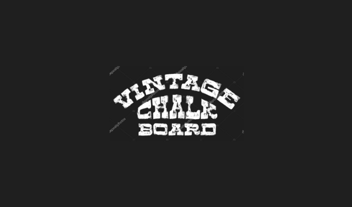
Vintage Chalkboard delivers the timeless appeal of old-school classroom instruction with carefully crafted letterforms that evoke the golden age of traditional education.
The font captures the precise, methodical handwriting style that characterized skilled teachers from earlier eras, complete with the subtle imperfections and natural wear patterns that develop on well-used chalkboards over time.
The characters feature consistent baseline alignment and traditional proportions that speak to educational heritage while incorporating the essential chalk texture that makes the font feel authentic and tactile.
Vintage Chalkboard excels in presentations that need to convey authority, tradition, and established knowledge, making it perfect for historical content, academic presentations, and formal educational materials.
10. KG Primary Penmanship
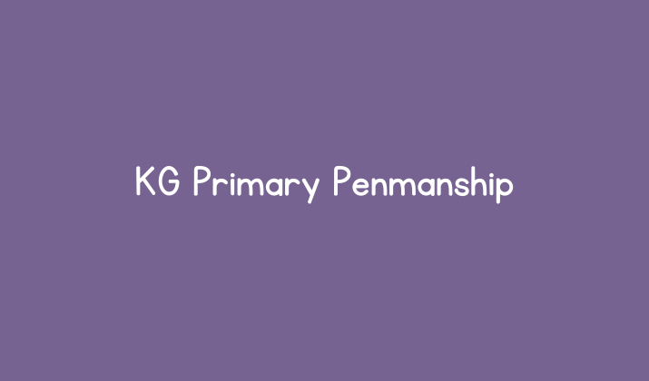
KG Primary Penmanship stands out as one of the most authentic chalk-inspired fonts available for PowerPoint presentations.
This font masterfully captures the uneven, slightly rough texture that occurs when chalk meets blackboard, complete with natural variations in line thickness that mimic the way real chalk wears down during use.
The letterforms maintain excellent readability even at smaller sizes, making it ideal for both headlines and body text in educational presentations.
What sets this font apart is its careful attention to the subtle imperfections that make chalk writing so distinctive, the slight irregularities in curves and the organic feel of hand-drawn characters.
Teachers and educators find its warmth and personality when used in slides while maintaining the professional appearance needed for classroom settings.
Also Read: Best Fonts For Teachers On Canva
Conclusion
Choosing the right chalk-style font for your PowerPoint presentations can dramatically enhance their visual appeal and emotional impact.
Each of these ten fonts offers unique characteristics that can help you achieve different presentation goals.
The key is matching the font’s personality to your content and audience while ensuring that readability remains paramount.
Do note that chalk fonts work best when used thoughtfully, typically for headers, key points, or creative elements rather than large blocks of body text.
Check Out: Best Canva Font Pairings
Enjoyed the post?