When it comes to healthcare analytics, conditions like cancer present notoriously complex.
We’re talking about thousands of records, countless variables, and statistics that need to be both accurate and accessible.
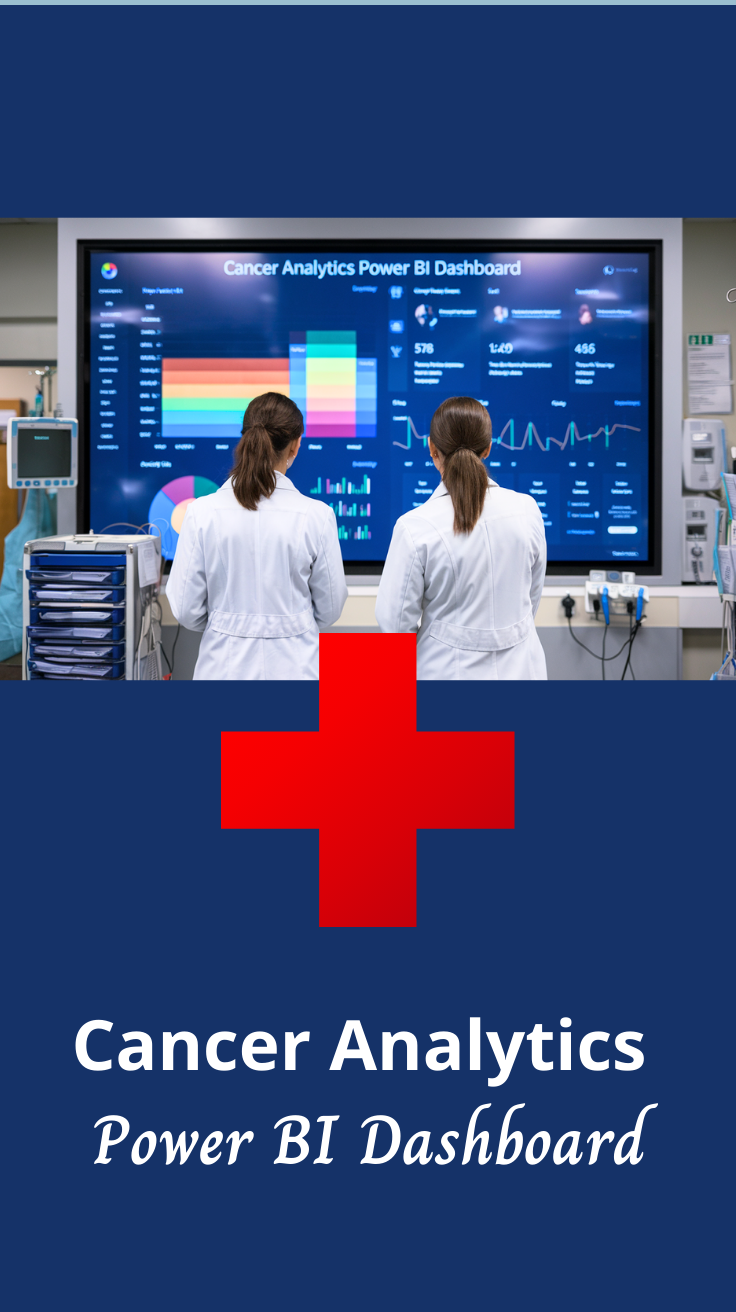
This Cancer Analytics Power BI Dashboard is a prime example of how good data visualization can transform overwhelming numbers into actionable insights.
Let’s be honest. Most healthcare dashboards look like they were designed by statisticians for statisticians. But this one? It actually makes sense to real humans.
Take a look.
What This Dashboard Reveals
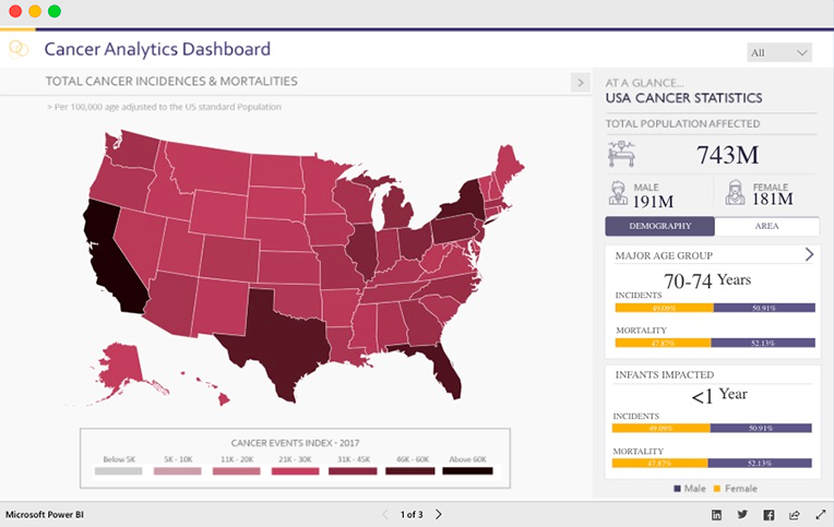
This comprehensive cancer analytics dashboard paints a sobering yet informative picture of cancer’s impact across the United States.
The numbers tell a story that’s hard to ignore, with 743M total population affected and key statistics broken down by demographics that matter.
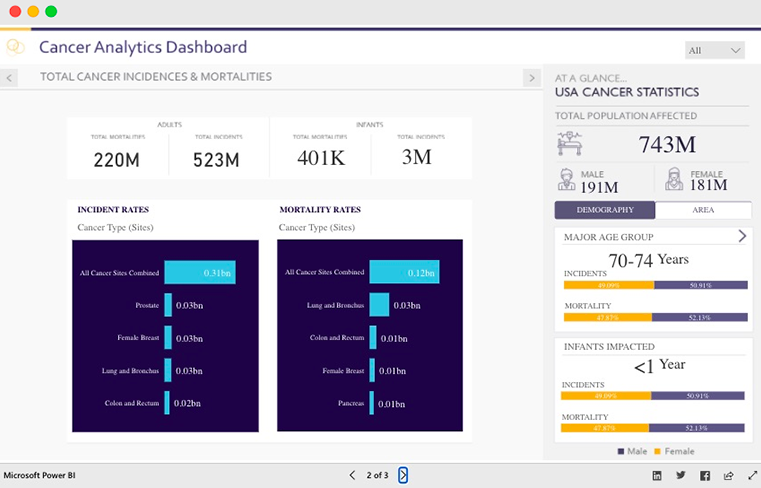
The dashboard cleverly organizes data into digestible sections. You’ve got your big-picture view with a color-coded US map showing cancer event indices by state. Then it dives deeper with incident and mortality rates broken down by cancer type.
What’s particularly smart is how it segments data by demographics. The 70-74 age group being the major affected demographic isn’t surprising, but seeing it visualized this clearly drives the point home.
The gender breakdown and infant impact statistics add crucial context that raw numbers alone just can’t provide.
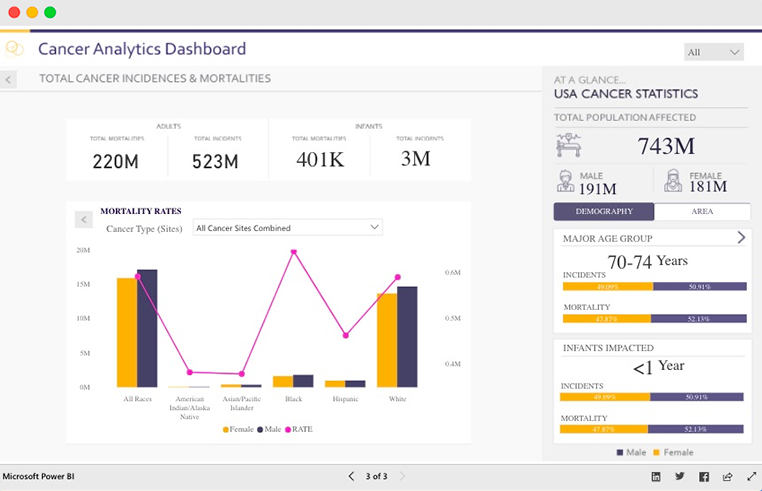
The mortality rates section is where things get really interesting. The dashboard doesn’t just throw percentages at you.
It shows comparative data across different racial and ethnic groups, revealing disparities that are crucial for healthcare planning and resource allocation.
Power BI Dashboards Worth Exploring:
- Retail Dashboard
- Airport Performance Dashboard
- Customer Analysis Dashboard
- HR Analytics Dashboard
- Inventory Insight Dashboard
- Energy Usage Dashboard
- Sales Scorecard Dashboard
- Social Media Monitoring Dashboard
Where This Dashboard Shines in the Real World?
This type of cancer analytics dashboard isn’t just eye candy for data nerds. It’s a game-changer across multiple industries and use cases:
Healthcare Systems and Hospitals can use this to identify high-risk populations and allocate resources more effectively. When you can see at a glance that certain demographics are disproportionately affected, you can plan your screening programs accordingly.
Public Health Agencies love this stuff. State and federal health departments can use these insights to develop targeted prevention campaigns and justify funding requests. Nothing speaks louder to budget committees than clear, visual data.
Research Institutions can leverage this dashboard to identify research gaps and opportunities. When you can easily spot which cancer types have the highest mortality rates across different demographics, you know where to focus your next grant application.
Insurance Companies use similar dashboards for actuarial analysis and risk assessment. Understanding cancer patterns helps them develop more accurate pricing models and coverage options.
Pharmaceutical Companies can identify market opportunities and target populations for drug development and clinical trials. When you see which cancers are most prevalent in which demographics, you know where the unmet medical needs lie.
What Makes This Dashboard Good
Here’s where this dashboard really nails it. The design choices that make complex data feel manageable.
Color Psychology That Works: The dashboard uses a smart color scheme that isn’t just pretty to look at. The deep blues and purples for serious statistics create the right tone, while the orange accents draw your eye to mortality data without being alarmist. It’s clinical but not cold.
Geographic Visualization Done Right: That US map isn’t just decoration. The color gradients immediately show you geographic patterns without requiring a PhD in epidemiology to interpret. One glance tells you which states are dealing with higher cancer burdens.
Smart Data Hierarchy: Notice how the dashboard flows from general (total population statistics) to specific (breakdown by cancer type and demographics). Your brain doesn’t have to jump around trying to make connections – the layout does the work for you.
Comparative Analysis Made Simple: The side-by-side incident vs. mortality rate charts are brilliant. You can immediately see which cancers are more deadly relative to their occurrence rates. Lung and bronchus cancer standing out in mortality despite lower incident rates? That tells a story.
Demographic Insights at a Glance: The right-side panel with age groups and gender breakdowns means you don’t have to dig through multiple screens to understand who’s most affected. Everything you need is right there.
The Bottom Line
The dashboard proves that healthcare data doesn’t have to be intimidating or incomprehensible.
When you combine thoughtful design with powerful analytics, you get something that’s both beautiful and functional, a rare combination in the world of healthcare dashboards.
The real victory here isn’t just in making data look good (though it does). It’s in making complex cancer statistics accessible to the people who need to act on them.
Check Out Other Power BI Dashboards:
- Team Performance Dashboard
- Attendance Tracker Dashboard
- Carbon Emission Footprint Dashboard
- Player Performance Dashboard
- Procurement Dashboard
- Healthcare Analysis Dashboard
- Weather Analysis Dashboard
- Transportation & Logistics Dashboard
Enjoyed the post?