
Calibri has dominated the document world since becoming Microsoft’s default font in 2007. It is known for its clean lines and excellent readability.
Not only in MS Word, the font is now available to use in most software including Canva.
Its modern sans-serif design strikes the perfect balance between professional and approachable.
If you create your designs in Canva and use Calibri for most of your projects, here are some other fonts that bear the flavor of Calibri.
Each of these fonts provides the same experience as you get with Calibri, yet adds an element of novelty and freshness to your projects.
Take a look.
Also Read: Best Canva Fonts That Look Like Georgia
1. Poppins

Poppins emerges as a premier Calibri alternative on Canva with its geometric precision and exceptional versatility.
Designed by Indian Type Foundry, this geometric sans-serif font captures Calibri’s professional clarity while introducing a slightly more contemporary feel through its perfect circular geometry and consistent stroke weight.
Poppins excels across both headlines and body text, maintaining excellent readability regardless of size.
The font family offers an impressive range of weights from Thin to Black, providing even more flexibility than Calibri’s standard options.
What makes Poppins particularly effective as a Calibri substitute is its similar x-height combined with slightly more open letterforms, creating a familiar reading rhythm with enhanced clarity.
Its subtle geometric touches add a modern sophistication while preserving the approachable professionalism that defines Calibri.
For projects requiring a fresh interpretation of Calibri’s balanced aesthetic, Poppins delivers outstanding performance across diverse design applications.
Check Out: Best Canva Font Pairings
2. Nunito Sans
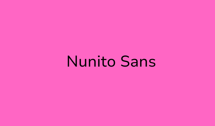
Nunito Sans captures Calibri’s approachability while introducing a slightly softer touch.
Designed by Vernon Adams, this sans-serif font features balanced proportions and terminal roundings that create a friendly yet professional appearance.
What makes Nunito Sans particularly comparable to Calibri is its excellent readability in longer text passages, the letterforms remain distinct without calling attention to themselves.
The font’s x-height (the height of lowercase letters) closely matches Calibri’s, maintaining that familiar text flow.
With its comprehensive weight range from ExtraLight to Black, Nunito Sans offers flexibility for various design needs while preserving Calibri’s clean aesthetic.
Its slightly more humanist touch makes it perfect for organizations wanting to appear approachable while maintaining professionalism in their visual communications.
3. Inter

Inter has rapidly gained popularity as a versatile Calibri alternative that excels in digital environments while maintaining exceptional readability.
Designed by Rasmus Andersson, this sans-serif typeface was specifically crafted for screen interfaces but performs beautifully across all design contexts.
Inter captures Calibri’s clarity through its carefully optimized letterforms and generous x-height, ensuring excellent legibility even at smaller sizes.
What distinguishes Inter from Calibri is its slightly more contemporary approach to spacing and character design.
The font features marginally more open counters and precisely calculated letter spacing that enhances readability while maintaining text economy.
Its neutral appearance avoids drawing attention to itself, a key Calibri characteristic while providing subtle refinements that feel distinctly modern.
The comprehensive font family includes nine weights from Thin to Black, offering extensive design flexibility.
For organizations seeking a contemporary Calibri alternative optimized for both digital and print applications, Inter delivers exceptional performance with its balance of neutrality, readability, and refined execution.
Check Out: How To Identify A Font From An Image In Canva?
4. Lato
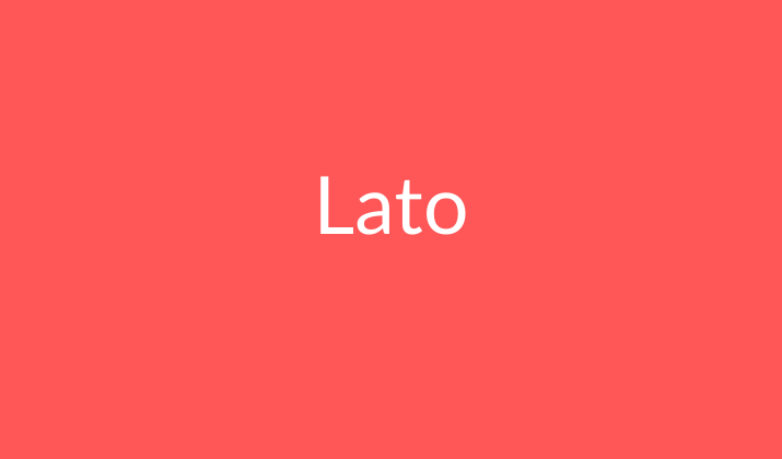
Lato strikes an impressive balance between structure and friendliness, making it an excellent Calibri alternative for professional designs that require a touch of warmth.
Created by Łukasz Dziedzic, Lato’s semi-rounded details give text a feeling of warmth while maintaining clean lines and professional appearance.
The font’s proportions closely mirror Calibri’s, particularly in its lowercase letters, creating a familiar reading rhythm.
Where Lato distinguishes itself is in its slightly more pronounced curves and marginally reduced contrast between thick and thin strokes.
These subtle differences create a slightly more organic feel without sacrificing the clean professionalism that makes Calibri so versatile.
With its comprehensive family of weights from Hairline to Black, Lato handles both body text and headings with equal efficiency, making it an excellent choice for creating cohesive design systems that need that familiar Calibri-like approachability.
Explore: Best Canva Fonts For Insta
5. Roboto

Roboto has established itself as a digital typography staple and serves as an excellent Calibri substitute in Canva projects.
Designed by Christian Robertson, Roboto maintains the mechanical skeleton of traditional grotesque sans-serifs while incorporating friendly, open curves similar to Calibri.
Its slightly condensed letterforms allow for efficient use of space without sacrificing readability, a characteristic that makes it particularly suitable for information-dense designs.
Roboto’s vertical terminals cut off at perfect right angles, giving it a slightly more engineered feel than Calibri while maintaining similar proportions and x-height.
The font family offers extensive weights from Thin to Black, providing flexibility across various design contexts.
For projects requiring a contemporary, slightly more technical alternative to Calibri that maintains excellent readability and professional appearance, Roboto delivers consistent performance in both digital and print applications.
Check Out: Best Canva Fonts For Teachers
6. Source Sans Pro

Source Sans Pro offers a neutral, versatile alternative to Calibri that excels in both user interface design and traditional document layouts.
Created by Paul D. Hunt for Adobe, this sans-serif font maintains Calibri’s excellent readability while introducing slightly more open counters and a marginally increased x-height.
These subtle differences enhance legibility at smaller sizes without drastically changing the familiar flow of text.
Source Sans Pro’s clean, unobtrusive character makes it particularly effective for information-heavy designs where content clarity takes precedence.
Its balanced letters and consistent stroke weight create a professional appearance with a touch more contemporary feel than Calibri.
The comprehensive font family includes six weights from ExtraLight to Black, providing ample versatility for complex design systems.
For organizations seeking a Calibri alternative that prioritizes clarity and maintains professional neutrality across various applications, Source Sans Pro represents an excellent choice.
7. Work Sans

Work Sans brings a subtle contemporary twist to the Calibri aesthetic while maintaining excellent readability for everyday design needs.
Created by Wei Huang, this sans-serif typeface features optimized letterforms that perform exceptionally well at medium sizes making it particularly suitable for body text.
Work Sans distinguishes itself from Calibri through slightly more geometric construction and marginally increased spacing between characters, creating an airy, modern feel.
Its friendly roundness in characters like ‘a’ and ‘g’ balances this geometry with approachability, much like Calibri achieves.
The font family includes nine weights from Thin to Black, offering extensive versatility for creating visual hierarchy.
Where Work Sans particularly shines is in designs bridging digital and print applications, it maintains consistent readability across mediums while providing a fresh alternative to Calibri’s familiar proportions.
For contemporary brands seeking a clean, professional typeface with slightly more personality, Work Sans delivers excellent results.
Also Read: Best Barbie-Inspired Canva Fonts
8. Catamaran
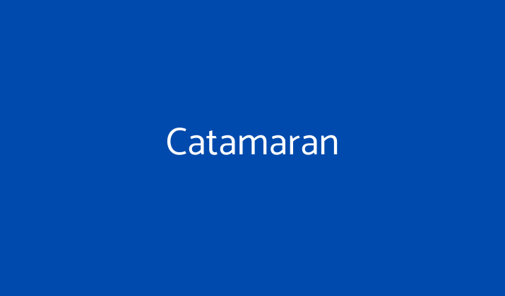
Catamaran offers a geometric take on the Calibri aesthetic while maintaining excellent readability across various contexts.
Designed by Pria Ravichandran, this versatile sans-serif features clean lines and open counters that create a fresh, contemporary appearance.
What makes Catamaran particularly effective as a Calibri alternative is its similar x-height and character width, allowing for comparable text flow and density.
The font distinguishes itself through slightly more geometric construction and marginally increased spacing, creating an open, airy feel that works beautifully in both digital interfaces and print applications.
Catamaran’s comprehensive family includes nine weights from Thin to Black, providing extensive design flexibility.
Its neutral yet friendly character makes it suitable for organizations wanting to maintain Calibri’s professional approachability while introducing subtle contemporary elements to their typography.
For consistent performance across headings and body text with a touch more modernity than Calibri, Catamaran represents an excellent choice.
Check Out: Best Canva Fonts For Females
9. Manrope
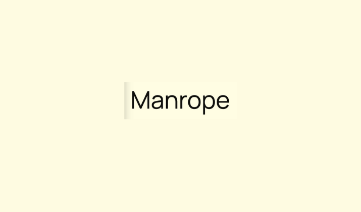
Manrope delivers a slightly more refined take on the Calibri aesthetic while maintaining excellent versatility across various design contexts.
Created by Mikhail Sharanda, this geometric sans-serif features clean, minimalist letterforms with carefully optimized spacing that enhances readability at various sizes.
What distinguishes Manrope from Calibri is its slightly more precise geometric construction and marginally taller x-height, creating a contemporary, sophisticated appearance while maintaining familiar text flow.
The font’s balanced proportions and consistent stroke weight create a professional impression with subtle personality, perfect for organizations seeking a fresh yet reliable alternative to Calibri.
Manrope’s seven weights from ExtraLight to Bold provide comprehensive design flexibility.
Where this font particularly excels is in mixed-use applications requiring both display typography and body text, as its geometric precision scales beautifully across sizes while maintaining the clean professionalism that makes Calibri so successful.
Check Out: Best Arabic Fonts On Canva
10. Barlow
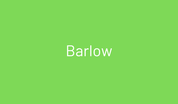
Barlow rounds out our list with its slightly condensed profile that offers an efficient yet readable alternative to Calibri.
Designed by Jeremy Tribby, this low-contrast sans-serif takes inspiration from California’s visual history while maintaining universal usability.
What makes Barlow particularly effective as a Calibri substitute is its similar approach to neutrality, the letterforms communicate clearly without calling attention to themselves.
Where Barlow distinguishes itself is in its slightly narrower proportions and marginally reduced letter spacing, allowing for more economical use of space without sacrificing readability.
The comprehensive family includes nine weights from Thin to Black in both regular and condensed styles, offering exceptional flexibility for complex design systems.
Barlow’s clear, straightforward character makes it particularly suitable for information-dense applications where space efficiency matters while maintaining Calibri’s professional readability.
For organizations seeking a space, efficient alternative that maintains Calibri’s clean professionalism, Barlow represents an excellent choice.
Conclusion
While Calibri remains a typography staple, these Calibri-like fonts offer fresh perspectives on its clean, professional aesthetic.
Each font maintains Calibri’s excellent readability while introducing subtle distinctions.
When selecting your alternative, consider your specific needs—whether prioritizing readability, space efficiency, or contemporary feel.
Experiment with these options and you might discover a new typographic signature that elevates your design while maintaining that familiar, professional quality that made Calibri so successful in the first place.
Explore: Best Canva Fonts For Menus
Enjoyed the post?


