
Ever wondered what happens when you give a business analyst access to customer data and a powerful visualization tool? Magic, that’s what.
The Customer Analysis Power BI Dashboard is proof that understanding your customers doesn’t have to involve drowning in spreadsheets or playing guessing games with quarterly reports.
Knowing your customers in a data-driven world is the key to your survival. This dashboard takes the complexity out of customer analytics and serves up insights that actually make sense to humans.
What This Dashboard Reveals About Your Customers
This comprehensive customer analysis dashboard is like having a crystal ball for your business, minus the mystical mumbo-jumbo.
It breaks down customer behavior into digestible, actionable insights that would make any CEO do a happy dance.
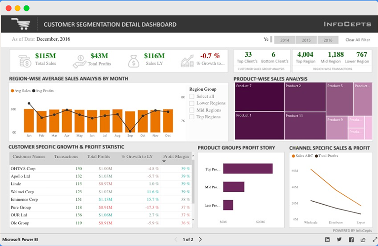
The dashboard starts strong with the financial big picture, total sales hitting $115M, total profits at $43M, and sales year-over-year metrics that tell you whether you’re winning or just treading water.
That -0.7% growth rate? It’s the kind of number that sparks important boardroom conversations.
What really sets this apart is the regional analysis component. The dashboard doesn’t just tell you where your customers are; it shows you where the money is coming from.
The region-wise average sales analysis by month reveals seasonal patterns and geographic hotspots that can make or break your quarterly targets.
The customer segmentation detail is where things get really interesting. You’ve got specific customer growth and profit statistics broken down by individual accounts, complete with transaction volumes, total profits, and growth percentages.
It’s like having a personal report card for each of your key accounts.
The product-wise sales analysis with that beautiful treemap visualization makes it instantly clear which products are your heavy hitters and which ones might need some TLC.
And let’s not forget the channel-specific sales and profit tracking, because knowing whether your wholesale or direct sales channels are performing better can reshape your entire go-to-market strategy.
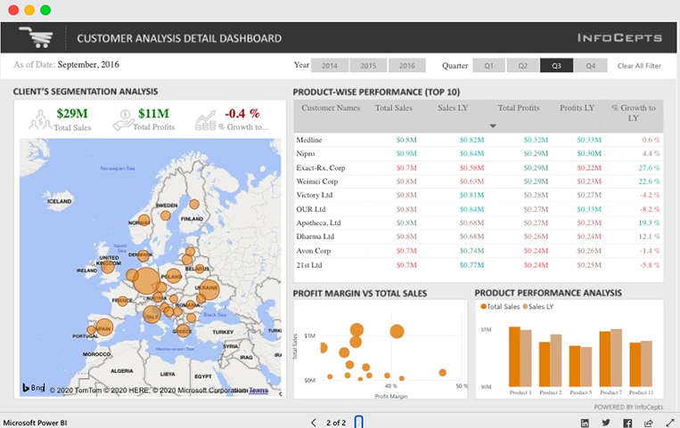
The geographic component with the European map showing client distribution is particularly clever. Those bubble sizes immediately tell you where your customer concentration lies, making expansion decisions a lot less guesswork-heavy.
Check Out Other Power BI Dashboards:
- Team Performance Dashboard
- Attendance Tracker Dashboard
- Carbon Emission Footprint Dashboard
- Player Performance Dashboard
- Procurement Dashboard
- Healthcare Analysis Dashboard
- Weather Analysis Dashboard
- Transportation & Logistics Dashboard
Industries That Live and Breathe This Kind of Analysis
This type of customer analysis dashboard is practically essential across numerous industries where customer relationships drive the bottom line.
Retail and E-commerce businesses absolutely love this setup. When you’re dealing with thousands of customers across multiple channels, having this level of insight into buying patterns, regional preferences, and customer lifetime value becomes your competitive edge. Black Friday planning, anyone?
Manufacturing and B2B Companies find this dashboard invaluable for managing key account relationships. When you can see exactly which clients are growing, which are stagnating, and which products they’re buying, you can tailor your sales approach accordingly.
Financial Services use similar dashboards to understand client portfolios, regional performance, and product penetration. Banks, investment firms, and insurance companies need to know which customers are most profitable and where their growth opportunities lie.
SaaS and Technology Companies rely on this type of analysis to track customer health scores, identify expansion opportunities, and prevent churn. When your revenue is subscription-based, understanding customer behavior patterns is literally the difference between growth and decline.
Pharmaceutical and Healthcare organizations use customer analysis dashboards to understand prescriber patterns, regional market penetration, and product performance across different customer segments.
Consulting and Professional Services firms leverage these insights to understand which clients are most profitable, which service lines are performing best, and where they should focus their business development efforts.
Design Elements That Work
Here’s where this dashboard really shines.
Color Strategy That Makes Sense: The dashboard uses a sophisticated palette that isn’t trying too hard to be flashy. Those warm oranges and deep purples create visual hierarchy without overwhelming your eyeballs. The color coding helps you instantly distinguish between different data types, sales in orange, profits in purple – making pattern recognition almost effortless.
Geographic Visualization Done Right: That European map isn’t just pretty decoration. The bubble sizes immediately communicate customer concentration without requiring a legend lookup every five seconds. One glance tells you that Germany and the UK are your heavy hitters while smaller markets are clearly identified.
Smart Data Hierarchy: Notice how the dashboard flows logically from high-level KPIs down to granular customer details. Your brain doesn’t have to jump around trying to make connections – the layout guides you through the story naturally.
Treemap Brilliance: The product-wise sales analysis using treemap visualization is a masterclass in data presentation. You can immediately see which products dominate your sales mix and which ones might be underperforming. No squinting at tiny pie chart slices required.
Table Design That Actually Works: Those customer-specific tables aren’t just data dumps. The clear columns, proper spacing, and logical sorting make it easy to spot trends and outliers.
Multi-Dimensional Analysis: The profit margin vs. total sales scatter plot is particularly clever. It immediately identifies your most profitable customers and potential risk accounts. High sales but low margins? That’s a conversation starter.
Power BI Dashboards Worth Exploring:
- Retail Dashboard
- Airport Performance Dashboard
- HR Analytics Dashboard
- Inventory Insight Dashboard
- Energy Usage Dashboard
- Sales Scorecard Dashboard
- Social Media Monitoring Dashboard
Final Words
In a business environment where customer-centricity isn’t just a buzzword but a survival requirement, dashboards like this one are changing how organizations understand and serve their customers.
It transforms raw data into customer intelligence, and customer intelligence into competitive advantage.
Enjoyed the post?