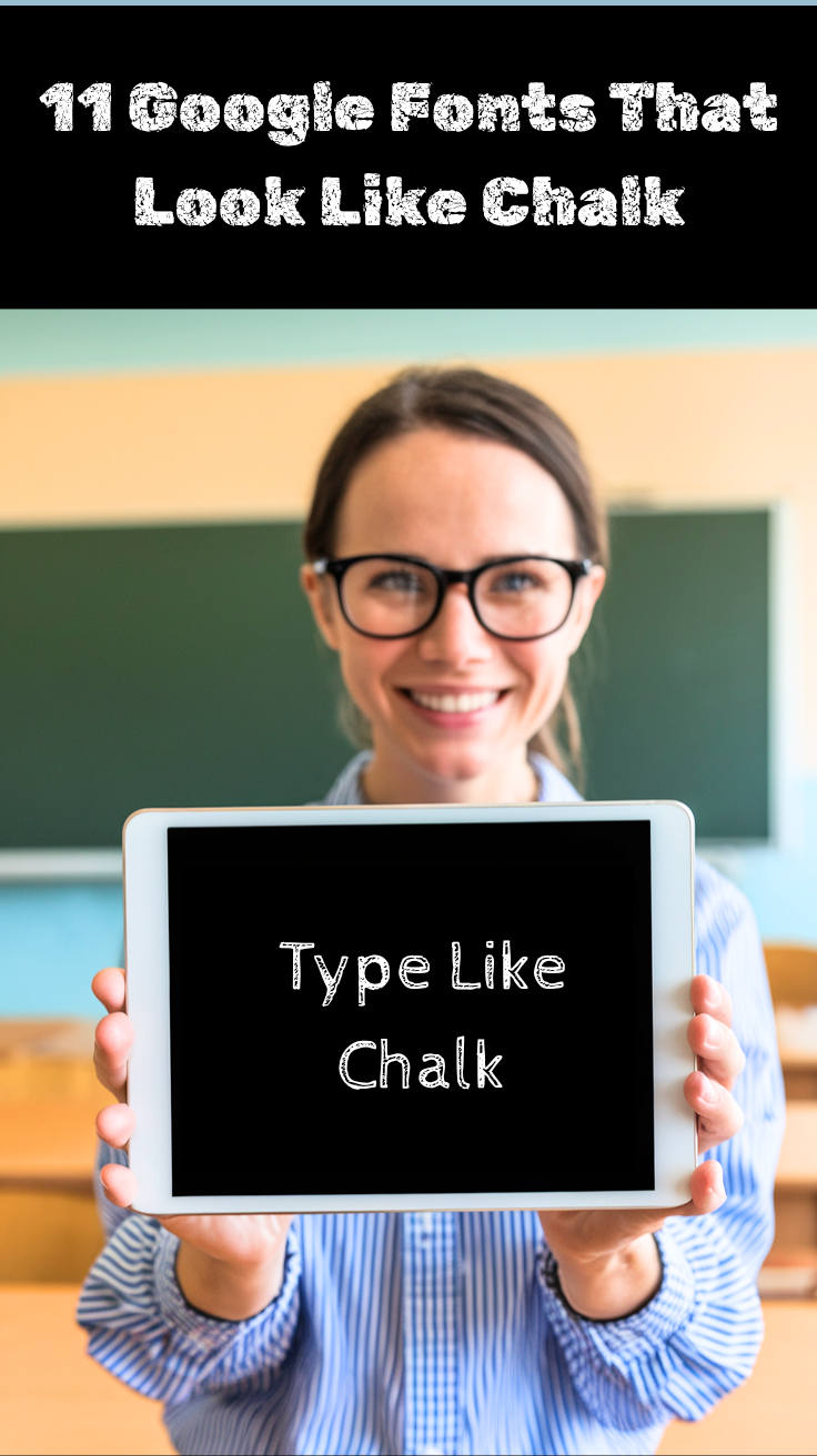
There’s something timeless and nostalgic about chalk typography that instantly transports us back to school days and cozy coffee shops with handwritten menu boards.
Whether you’re designing educational materials, creating vintage-inspired graphics, or building a website with a rustic charm, chalk-style fonts can add that perfect touch of authenticity and warmth to your projects.
Google Fonts offers an impressive collection of typefaces that capture the essence of chalk writing, each with its own unique character and style.
Here are eleven outstanding fonts available on Google Fonts that perfectly mimic the look and feel of chalk on a blackboard.
Explore: Fonts On Canva That Look Like Chalk
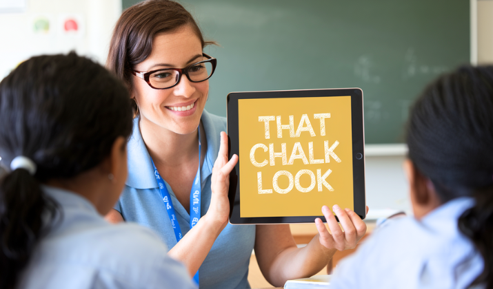
Google Fonts That Look Like Chalk
1. Fredericka the Great
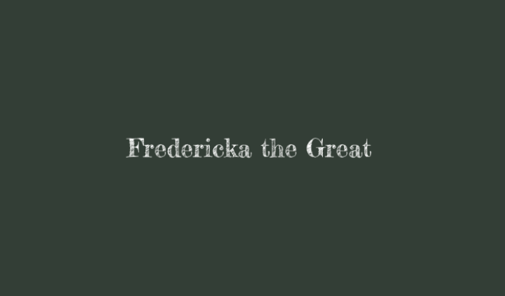
Fredericka the Great is a bold, decorative font that embodies the spirit of traditional chalkboard lettering with its thick, uneven strokes and slightly weathered appearance.
This font captures the essence of hand-drawn chalk letters with its irregular baseline and organic curves, making it perfect for headlines, signage, and decorative text that needs to make a strong visual impact.
The font’s robust character makes it particularly effective for restaurant menus, event posters, and educational materials where you want to convey a sense of warmth and handcrafted authenticity.
Its generous letter spacing and bold weight ensure excellent readability even at smaller sizes, while maintaining that distinctive chalk-like texture that makes text appear as if it was freshly written on a blackboard.
Explore: PPT Fonts That Look Like Chalk
2. Cabin Sketch
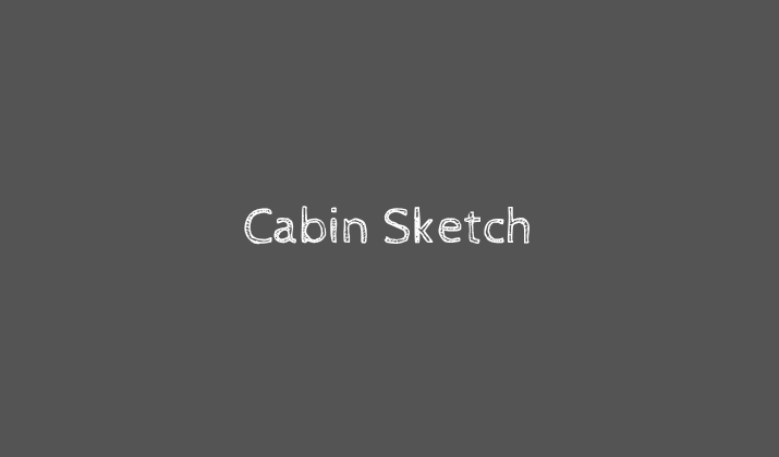
Cabin Sketch transforms the clean, modern lines of the original Cabin font into a delightfully rough, hand-drawn interpretation that perfectly mimics chalk writing on a textured surface.
This font features intentionally imperfect edges and subtle inconsistencies that give each letter a natural, organic feel, as if someone carefully traced over chalk outlines with varying pressure and speed.
The sketchy quality of Cabin Sketch makes it ideal for creative projects that require a personal, handmade touch, such as greeting cards, craft blogs, or artisanal product packaging.
Its balanced proportions and clear letterforms ensure that despite its rough appearance, the text remains highly legible and professional-looking.
This makes it suitable for both display and body text applications where you want to maintain readability while adding character.
Check Out: Google Fonts That Look Like Blood
3. Rubik Gemstones
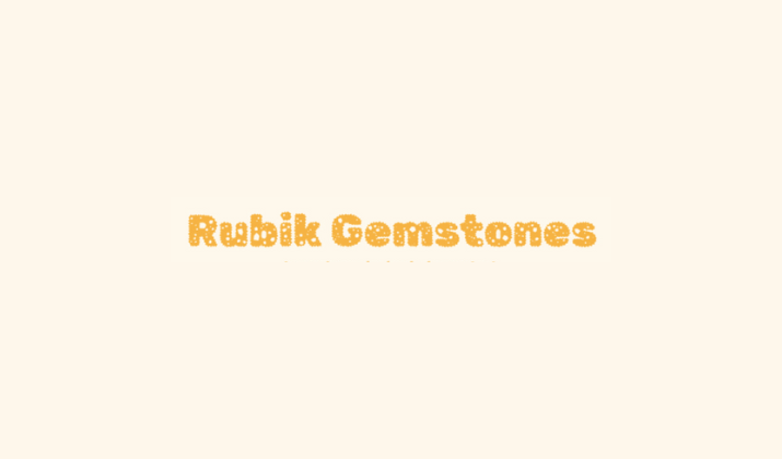
Rubik Gemstones takes the geometric foundation of the Rubik font family and transforms it into a sparkling, crystalline interpretation that resembles chalk letters decorated with geometric patterns and faceted details.
This decorative font features intricate internal patterns that create a gemstone-like effect within each letter, giving the impression of chalk text that has been enhanced with detailed ornamentation.
The font’s bold weight and distinctive styling make it perfect for luxury branding, jewelry websites, or any project that needs to convey elegance and sophistication while maintaining that handcrafted chalk aesthetic.
Each letter appears to be carefully carved and decorated, making Rubik Gemstones an excellent choice for logos, headers, and special occasions where you want text to feel both artistic and premium.
Also Read: Taylor Swift Fonts On Google Docs
4. Rubik 80s Fade
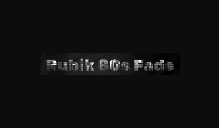
Rubik 80s Fade captures the nostalgic essence of retro chalk art with its gradient fade effect that mimics the natural wearing and smudging of chalk over time.
This font combines the clean, geometric structure of the Rubik family with a distinctive fading pattern that creates depth and visual interest, as if the chalk letters are gradually dissolving or have been partially erased.
The gradient effect gives each letter a three-dimensional quality that’s reminiscent of neon signs and vintage arcade aesthetics, making it perfect for projects that need to evoke the 1980s era or create a sense of nostalgic charm.
Its bold presence and eye-catching fade effect make it ideal for headers, posters, and branding materials where you want to create a strong retro vibe while maintaining excellent readability.
Explore: Google Fonts That Look Like Water
5. Barrio
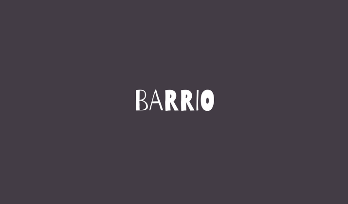
Barrio is a vibrant, playful font that captures the spirit of street art and community chalkboard messages with its bold, rounded letterforms and slightly irregular baseline.
This font feels like it was created by someone writing enthusiastically with thick chalk, producing letters that are full of personality and energy.
The organic curves and friendly appearance of Barrio make it perfect for community centers, local businesses, children’s educational materials, and any project that needs to feel approachable and welcoming.
Its generous character spacing and rounded edges create a soft, inviting appearance.
It works beautifully for both large display text and smaller informational content, while the slight irregularities in the letterforms add that authentic hand-drawn chalk quality that makes text feel personal and engaging.
Check Out: Best Cursive Fonts On Google Docs
6. Rubik Broken Fax
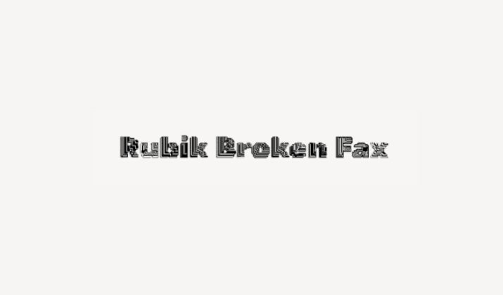
Rubik Broken Fax takes the reliable structure of the Rubik font and distorts it with digital glitches and breaks that create an intriguing contrast between clean geometry and chaotic interference, resembling chalk text that has been partially erased or smudged.
This font features intentional gaps, breaks, and distortions that give it a deconstructed appearance, as if the chalk letters are fragmenting or fading away over time.
The broken elements add a contemporary, digital age twist to traditional chalk aesthetics, making it perfect for tech-related projects, avant-garde designs, or any application where you want to suggest impermanence or digital decay.
Despite its fragmented appearance, the underlying structure remains clear and readable, allowing designers to use it effectively for both artistic expression and functional communication.
Explore: Best Harry Potter Fonts On Google Docs
7. Akronim
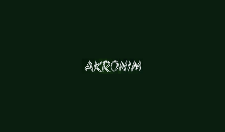
Akronim is a condensed, tall font that mimics the appearance of chalk letters written in a narrow, vertical style often seen on blackboards where space is at a premium.
This font features clean, straight lines with subtle chalk-like textures that give it an authentic handwritten quality while maintaining excellent legibility even at smaller sizes.
The condensed proportions of Akronim make it particularly useful for headlines, navigation menus, and any application where you need to fit more text into limited horizontal space without sacrificing the chalk aesthetic.
Its tall, elegant letterforms create a sense of sophistication and formality, making it suitable for professional applications like law firms, architectural studios, or upscale restaurants.
Explore: Google Fonts Similar To Helvetica, Avenir, Futura
8. Rubik Dirt
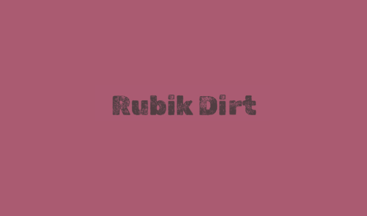
Rubik Dirt transforms the clean, geometric foundation of the Rubik font family into a weathered, textured masterpiece.
It perfectly captures the appearance of chalk that has been smudged, erased, and rewritten multiple times on a well-used blackboard.
This font features organic distressed edges, subtle cracks, and irregular textures that give each letter the authentic look of chalk that has accumulated layers of dust and wear over time.
The dirt-like texture creates depth and character within each letterform, making it appear as though the chalk has been ground into the board’s surface through repeated use.
Rubik Dirt is ideal for vintage-inspired designs, industrial branding, construction companies, or any project that needs to convey durability, authenticity, and a connection to hands-on craftsmanship.
Its weathered appearance tells a story of use and history, making it perfect for brands that want to emphasize their established heritage and reliable, time-tested quality.
Discover: Best Fonts That Look Like Rope
9. Rye
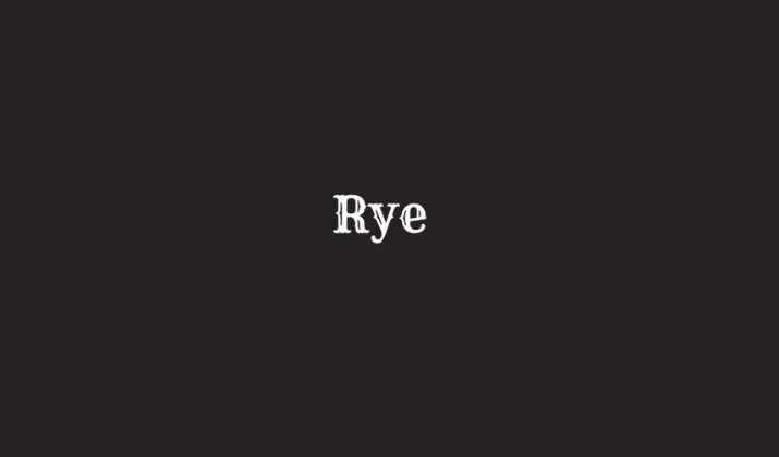
Rye captures the rugged, weathered appearance of old-fashioned chalk signage with its bold, slab-serif letterforms that look like they’ve been carved into wood and then outlined with chalk for emphasis.
This font combines the structural strength of Western-style typography with the organic imperfections of hand-drawn chalk, creating letters that feel both authoritative and approachable.
The thick serifs and robust character of Rye make it perfect for vintage-themed projects, rustic branding, brewery signage, and any application where you want to evoke the American frontier or artisanal craftsmanship.
Its bold presence ensures excellent visibility and impact, while the chalk-like texture adds authenticity and character that helps brands connect with audiences who appreciate traditional, handcrafted aesthetics.
Discover: Best Google Fonts That Look Like Graffiti
10. Kranky
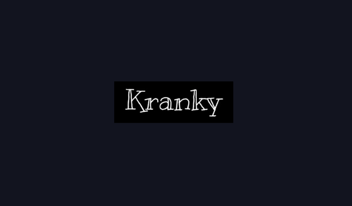
Kranky embodies the playful, slightly chaotic energy of chalk writing with its delightfully irregular letterforms that dance across the baseline with infectious enthusiasm.
This font captures the essence of someone having fun with chalk, creating letters that lean, wobble, and vary in size, giving text a lively, animated quality that feels spontaneous and joyful.
Each character in Kranky has its own personality, with quirky angles, unexpected curves, and an overall sense of movement that makes words appear to bounce and wiggle on the page.
The font’s informal, hand-drawn appearance makes it perfect for children’s projects, party invitations, comic books, casual blogs, or any design that needs to convey creativity, humor, and approachability.
Despite its seemingly random appearance, Kranky maintains excellent readability and a consistent chalk-like texture that gives it authenticity while ensuring that the playful irregularities enhance rather than hinder communication.
Explore: Best Google Fonts That Look Like Typewriter
11. Rubik Distressed
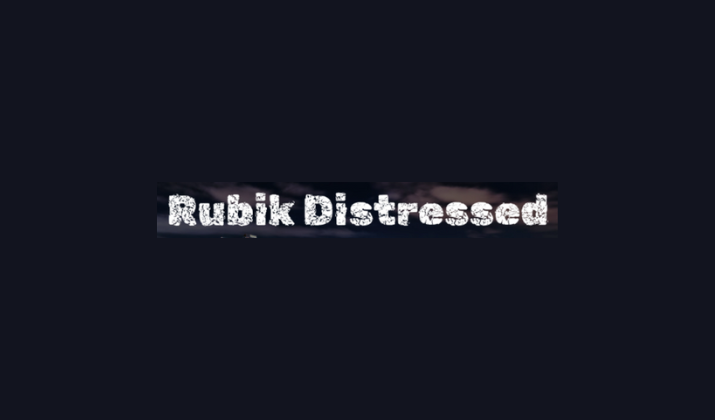
Rubik Distressed takes the solid, geometric foundation of the Rubik font family and subjects it to deliberate wear and tear, creating letters that look like they’ve endured years of classroom use, weather exposure, and countless erasings and rewritings.
This font features strategic chips, cracks, and worn edges that give each letter a battle-tested appearance, as if the chalk has been repeatedly applied and partially removed over time.
The distressed effect is carefully balanced to maintain the font’s structural integrity while adding authentic aging that tells a story of endurance and continuous use.
Rubik Distressed is ideal for vintage signage, urban design projects, distressed branding, or any application where you want to suggest history, resilience, and authentic wear.
The weathered aesthetic works particularly well for brands that want to emphasize their longevity, reliability, and connection to traditional craftsmanship.
While the underlying geometric structure ensures the text remains professional and highly legible even with its deliberately damaged appearance.
Also Read: Best Fonts For Medical Forms
Conclusion
These eleven Google Fonts demonstrate the incredible versatility and charm of chalk-inspired typography, each offering its own unique interpretation of this timeless aesthetic.
Incorporating these fonts can add warmth, personality, and that essential human touch that makes digital communications feel more personal and approachable.
The best part about using Google Fonts is their reliability, web optimization, and universal accessibility, ensuring that your chalk-inspired designs will display beautifully across all devices and platforms,
Enjoyed the post?