The significance of data in ecommerce can’t be undermined.
With countless metrics to track and analyze, having the right tools at your disposal can make all the difference between thriving and merely surviving.
The KPI dashboard is a powerful visual tool that aggregates critical performance indicators into one cohesive view. A well-designed dashboard not only simplifies data analysis but also empowers business owners and teams to make informed decisions quickly.
In this blog post, we’ll explore ten stunning ecommerce KPI dashboard ideas that can inspire you to create your own customized analytics solution.
Whether you’re looking to optimize sales, enhance customer engagement, or streamline inventory management, these dashboard ideas will provide you with the insights needed to drive your business forward.
Let’s dive in.
1. Revenue Performance Dashboard

The dashboard focuses on key financial metrics such as total revenue, average order value (AOV), and profit margins.
It provides a clear view of sales trends over time, allowing business owners to identify peak sales periods and adjust strategies accordingly.
Components
- Total Revenue: Displays overall sales figures over a specific period.
- Average Order Value (AOV): Calculated by dividing total revenue by the number of orders.
- Profit Margins: Shows gross profit as a percentage of total revenue.
- Sales Trends: Visual graphs that highlight sales performance over time (daily, weekly, monthly).
Benefits
- Helps identify peak sales periods and seasonal trends.
- Enables tracking of revenue goals against actual performance.
- Assists in making informed pricing and promotional decisions.
Also Read: Best Tableau Dashboard Examples
2. Customer Insights Dashboard

A customer insights dashboard aggregates data on customer demographics, behavior, and satisfaction metrics.
Key KPIs include customer acquisition cost (CAC), customer lifetime value (CLV), and repeat purchase rates. This dashboard helps in understanding customer preferences and improving retention strategies.
Components
- Customer Demographics: Age, gender, location, and other relevant data.
- Customer Acquisition Cost (CAC): Total marketing costs divided by the number of new customers acquired.
- Customer Lifetime Value (CLV): Predicted revenue from a customer over their entire relationship with the business.
- Repeat Purchase Rate: Percentage of customers who make more than one purchase.
Benefits
- Provides insights into who your customers are and what they want.
- Helps tailor marketing messages and product offerings to specific demographics.
- Informs customer retention strategies based on CLV.
3. Marketing Performance Dashboard

Marketing performance dashboard is essential for tracking the effectiveness of marketing campaigns.
It includes metrics like click-through rates (CTR), return on ad spend (ROAS), and conversion rates from different channels. By visualizing these KPIs, marketing teams can optimize their strategies in real-time.
Components
- Click-Through Rate (CTR): Percentage of users who click on a specific ad or email link.
- Return on Ad Spend (ROAS): Revenue generated for every dollar spent on advertising.
- Conversion Rates: Percentage of visitors who complete a desired action (e.g., making a purchase).
- Channel Performance: Breakdown of metrics by marketing channel (e.g., social media, email, PPC).
Benefits
- Allows for real-time assessment of marketing campaign effectiveness.
- Identifies which channels yield the highest ROI.
- Facilitates A/B testing by comparing different campaigns or strategies.
Check Out: Best Tableau Retail Dashboard Examples
4. Inventory Management Dashboard

An inventory management dashboard provides a real-time view of stock levels, turnover rates, and order fulfillment metrics.
This is crucial for managing supply chain efficiency and ensuring that popular products are always available while minimizing overstock situations.
Components
- Stock Levels: Current inventory status for each product.
- Inventory Turnover Rate: Ratio showing how many times inventory is sold and replaced over a period.
- Order Fulfillment Metrics: Time taken to process orders and ship products.
- Backorder Levels: Number of items that are out of stock but have been ordered.
Benefits
- Helps prevent stockouts and overstock situations.
- Enhances supply chain efficiency by tracking turnover rates.
- Improves customer satisfaction through timely order fulfillment.
5. Website Performance Dashboard

The dashboard focuses on web analytics, showcasing metrics like site traffic, bounce rates, and average session duration.
Understanding how users interact with your site can lead to better user experience design and improved conversion rates.
Components
- Site Traffic: Total number of visitors over a specific period.
- Bounce Rate: Percentage of visitors who leave after viewing only one page.
- Average Session Duration: Average time users spend on the site per visit.
- Page Load Time: Speed at which pages load, impacting user experience.
Benefits
- Provides insights into user engagement and site usability.
- Helps identify pages that may need optimization to reduce bounce rates.
- Aids in understanding traffic sources and user behavior patterns.
Check Out: Best Power BI Dashboard Examples
6. Sales Funnel Dashboard

A sales funnel dashboard visualizes the customer journey from initial contact to final purchase.
The key metrics include lead conversion rates, shopping cart abandonment rates, and time spent in each stage of the funnel. This helps identify bottlenecks in the sales process.
Components
- Lead Conversion Rates: Percentage of leads that convert into paying customers at each stage of the funnel.
- Shopping Cart Abandonment Rate: Percentage of users who add items to their cart but do not complete the purchase.
- Time in Funnel Stages: Average time customers spend in each stage before converting or dropping off.
Benefits
- Highlights bottlenecks in the sales process that need addressing.
- Provides insights into customer behavior at different stages of the buying journey.
- Enables targeted interventions to improve conversion rates.
7. Social Media Engagement Dashboard

Using this dashboard, you can track social media performance across platforms by measuring engagement metrics such as likes, shares, comments, and follower growth.
It helps you understand which content resonates most with your audience and informs future marketing efforts.
Components
- Engagement Metrics: Likes, shares, comments, and mentions across different platforms.
- Follower Growth Rate: Change in follower count over time.
- Post Performance: Metrics for individual posts (reach, engagement rate).
- Traffic from Social Media: Number of visitors coming from social media channels.
Benefits
- Provides a clear picture of brand presence and engagement on social platforms.
- Helps identify which content resonates best with the audience.
- Informs future content strategies based on performance data.
Check Out: Best Business Intelligence Dashboard Examples
8. Product Performance Dashboard

Focusing on individual product metrics, this dashboard highlights best-selling items, inventory turnover rates, and product return rates.
It aids in identifying trends in consumer preferences and optimizing product offerings.
Components
- Best-Selling Products: List of top-selling items over a specified period.
- Inventory Turnover Rates per Product: How quickly each product sells out relative to stock levels.
- Product Return Rates: Percentage of sold products returned by customers due to dissatisfaction or defects.
Benefits
- Identifies trends in consumer preferences for better inventory management.
- Helps optimize product offerings based on sales performance metrics.
- Informs promotional strategies for underperforming products.
9. Customer Support Dashboard

The support dashboard monitors customer service metrics such as response time, resolution rate, and customer satisfaction scores (CSAT).
By analyzing these KPIs, businesses can enhance their support processes and improve overall customer experience.
Components
- Response Time Metrics: Average time taken to respond to customer inquiries or issues.
- Resolution Rate: Percentage of issues resolved on first contact versus those requiring follow-up.
- Customer Satisfaction Scores (CSAT): Ratings provided by customers after support interactions.
Benefits
- Enhances understanding of customer support efficiency and effectiveness.
- Identifies areas for training staff or improving processes based on feedback scores.
Check Out: Best Kibana Dashboard Examples
10. Competitive Analysis Dashboard
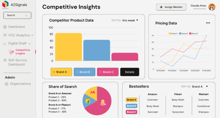
A competitive analysis dashboard compares your ecommerce performance against industry benchmarks or competitors.
The metrics include market share, pricing strategies, and promotional effectiveness, providing insights into areas for improvement or differentiation.
Components
- Market Share Comparison: Your business’s share compared to key competitors in the market.
- Pricing Strategies Analysis: Overview of competitor pricing models versus your own pricing structure.
Benefits
- Provides insights into competitive positioning within the market landscape.
- Identifies strengths and weaknesses relative to competitors, informing strategic decisions regarding pricing, promotions, and product offerings.
Conclusion
As the ecommerce landscape continues to evolve, staying ahead requires a keen understanding of your business’s performance metrics.
The ten KPI dashboard ideas we’ve explored offer a wealth of insights that can help you navigate this dynamic environment with confidence.
By implementing these dashboards, you can track essential metrics, identify trends, and make data-driven decisions that propel your business toward growth.
The key to a successful ecommerce strategy lies in harnessing the power of data. With the right dashboards in place, you’ll not only gain clarity on your current performance but also uncover opportunities for improvement and innovation.
Enjoyed the post?