
The Team Performance vs Target Power BI Dashboard offers an in-depth look at team sales performance against set targets, giving managers a clear visual summary of both individual and collective contributions.
It transforms raw data into a series of connected visual reports, enabling quick assessments of sales reps, customer performance, and product-level outcomes.
What Does This Dashboard Show?
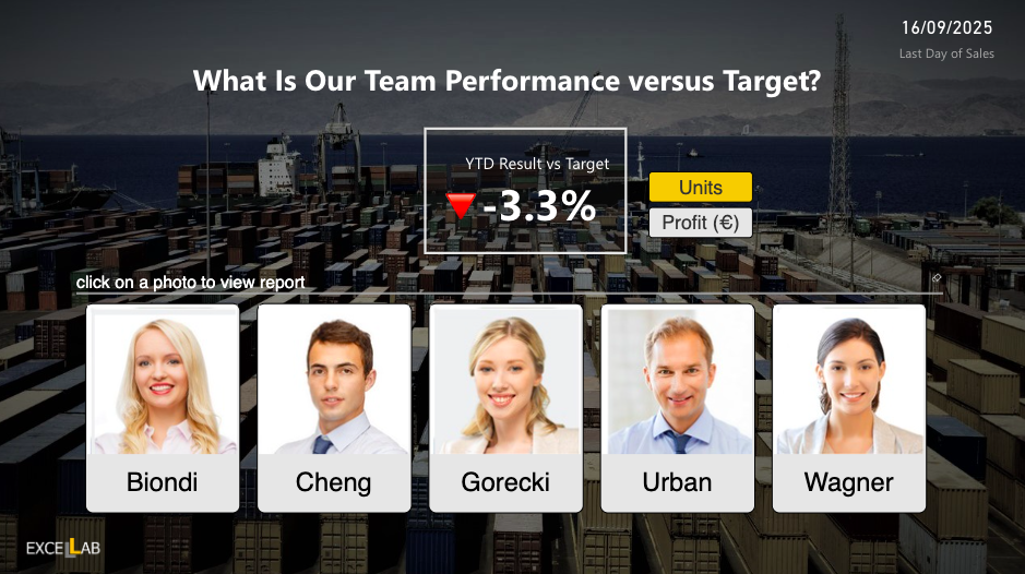
The dashboard begins with a high-level team overview, showing year-to-date (YTD) performance versus target and highlighting an overall variance figure.
Users can click on individual sales reps to view their detailed performance pages.
These drillthrough pages break down each rep’s performance metrics by customers, products, and time periods (such as last 30 days, last 90 days, and year-to-date).
Check Out Other Power BI Dashboards:
- Attendance Tracker Dashboard
- Carbon Emission Footprint Dashboard
- Player Performance Dashboard
- Procurement Dashboard
- Healthcare Analysis Dashboard
- Weather Analysis Dashboard
- Transportation & Logistics Dashboard
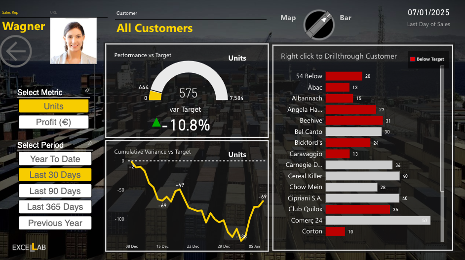
Each rep’s report features performance vs target indicators, cumulative variance trends, and customer-level performance bars (highlighting which clients are below target).
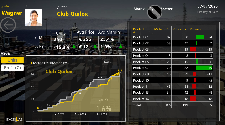
Further, product-specific views show year-to-date versus previous year units, average prices, margins, and variance by product line, making it easy to pinpoint which items drive growth or need attention.
Uses (Verticals/Functions)
-
Sales Team Management: Monitor individual rep performance and identify top and underperforming sales staff.
-
Customer Performance Review: Analyze which customers are meeting targets and which need strategic engagement.
-
Product Portfolio Tracking: Understand product-level performance trends to inform stock, pricing, and promotion decisions.
-
Incentive and Bonus Planning: Use detailed data to design fair and motivating sales incentive programs.
-
Forecasting and Strategy Alignment: Align targets with real-time performance data to recalibrate goals when needed.
Dashboard Highlights
-
Drillthrough design lets users navigate from team-level summaries to detailed individual metrics effortlessly.
-
Clear KPIs like variance to target and average margin make performance gaps instantly visible.
-
Interactive filters allow switching between units and profit, and between different time periods.
-
Visually cohesive design with consistent branding, charts, and contextual backdrops adds polish to the analysis experience.
Recap
The Team Performance vs Target Power BI Dashboard gives managers a powerful and intuitive way to measure how well their sales team is doing compared to targets.
Its layered, drillable structure means users can move seamlessly from big-picture team performance down to specific product or customer details, helping make smarter and faster decisions.
Power BI Dashboards Worth Exploring:
- Retail Dashboard
- Airport Performance Dashboard
- Customer Analysis Dashboard
- HR Analytics Dashboard
- Inventory Insight Dashboard
- Energy Usage Dashboard
- Sales Scorecard Dashboard
- Social Media Monitoring Dashboard
Enjoyed the post?