
If you’ve ever been stuck in an airport wondering why your flight is delayed (again), you’ll appreciate what goes into managing the organized chaos that is modern aviation.
The Airport Authority Performance Power BI Dashboard is like getting a backstage pass to see how airports really tick and trust us. There’s a lot more data flying around than just planes.
Managing an airport isn’t just about keeping runways clear and coffee shops stocked, but it also has to do with orchestrating thousands of moving parts, from ground handling times to passenger satisfaction scores.
This dashboard turns that complexity into something that actually makes sense to human beings, revolutionary, we know.
What This Dashboard Depicts
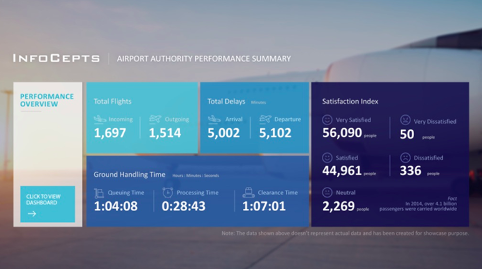
The performance overview hits you with the big picture, incoming and outgoing flights, total delays, and satisfaction metrics.
What’s interesting is how the satisfaction index reveals more satisfied passengers than dissatisfied ones. Not bad for an industry that’s basically synonymous with passenger complaints.
The ground handling time breakdown is where the real operational intelligence lives. Queuing time, processing time, and clearance time metrics tell the story of where bottlenecks actually happen versus where people think they happen.
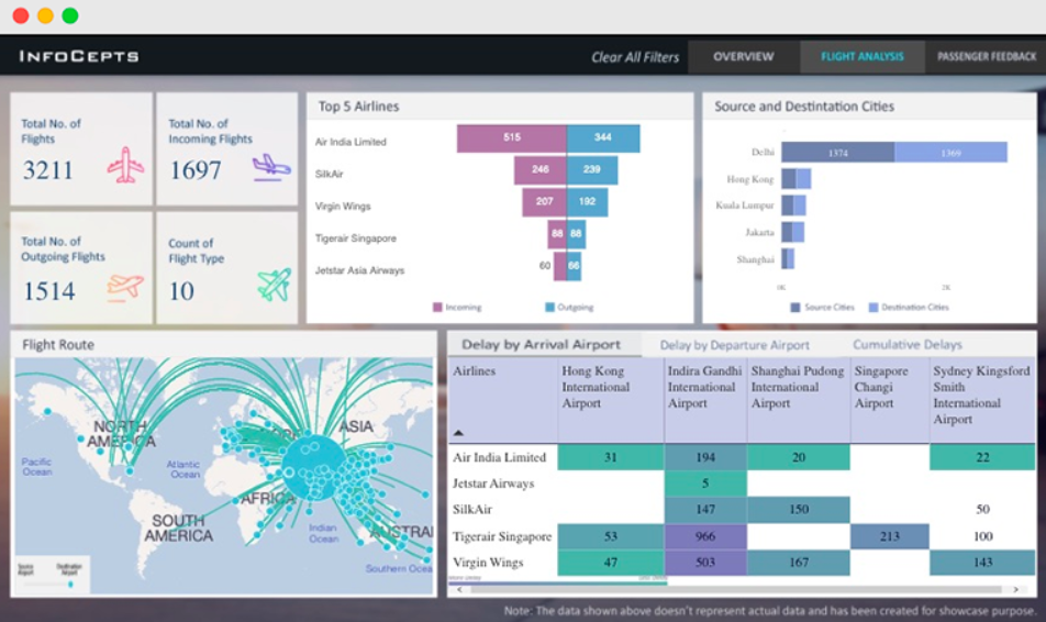
The flight analysis section goes deep into the data goldmine.
You’ve got the top airlines with their incoming/outgoing flight ratios, source and destination city breakdowns, and that beautiful flight route visualization that looks like a spider web of global connectivity.
The data tells you who’s driving traffic through this particular hub.
The delay analysis is particularly revealing, showing delays by arrival and departure airports across different airlines.
When you can see which airlines have more delays at specific airports, you know exactly where to focus your operational improvements.
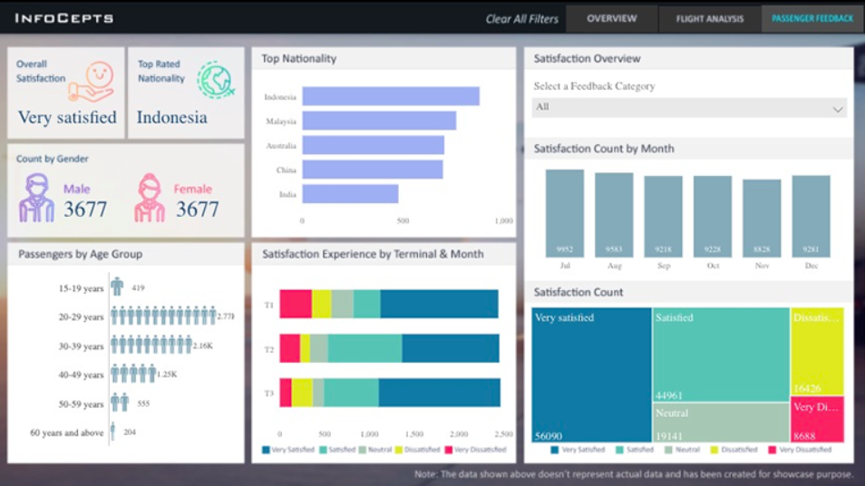
The passenger feedback section rounds out the picture with demographic breakdowns, nationality insights, and satisfaction trends by terminal and month.
That heat map showing satisfaction experience across different terminals is pure operational gold. You can literally see which parts of your airport are making passengers happy and which ones need some serious TLC.
Power BI Dashboards Worth Exploring:
- Retail Dashboard
- Customer Analysis Dashboard
- HR Analytics Dashboard
- Inventory Insight Dashboard
- Energy Usage Dashboard
- Sales Scorecard Dashboard
- Social Media Monitoring Dashboard
Industries/Verticals Using Similar Dashboards
Transportation & Logistics
- Seaports and shipping terminals
- Railway stations and metro systems
- Bus terminals and public transit authorities
- Freight and cargo hubs
Hospitality & Entertainment
- Hotel chains and resort management
- Convention centers and exhibition halls
- Theme parks and entertainment venues
- Stadium and arena operations
Healthcare Systems
- Hospital patient flow management
- Emergency department operations
- Multi-location healthcare networks
- Medical facility performance tracking
Retail & Commercial
- Shopping mall management
- Multi-store retail chains
- Food service and restaurant groups
- Event and venue management
Government & Public Services
- Municipal service departments
- Public facility management
- Emergency services coordination
- Immigration and border control
What Makes This Dashboard Actually Work
Smart Design Choices
- Calming blues and teals for operational data
- Strategic use of warning colors for delays
- Clean geographic visualization with flight route connections
- Professional palette that works in any setting
User-Friendly Layout
- High-level KPIs front and center
- Logical flow from performance metrics to passenger experience
- Clean card layouts for quick scanning
- Effective use of icons and visual cues
The Bottom Line
The Airport Authority Performance Power BI Dashboard transforms the controlled chaos of airport operations into clear, actionable insights.
It gives the airport authorities necessary tools to optimize everything from ground handling efficiency to passenger satisfaction.
In an industry where delays cost millions and passenger satisfaction drives revenue, dashboards like this one are changing how airports understand and improve their operations.
Check Out Other Power BI Dashboards:
- Team Performance Dashboard
- Attendance Tracker Dashboard
- Carbon Emission Footprint Dashboard
- Player Performance Dashboard
- Procurement Dashboard
- Healthcare Analysis Dashboard
- Weather Analysis Dashboard
- Transportation & Logistics Dashboard
Enjoyed the post?