Construction documents demand fonts that prioritize clarity, legibility, and professional appearance above all else.
The ideal typefaces for blueprints, specifications, contracts, and technical drawings must remain readable at various scales, from large-format prints to reduced copies.
Sans-serif fonts typically excel in this environment due to their clean lines and lack of decorative elements that can become unclear when scaled down or reproduced through multiple generations of copying.
The best construction fonts also maintain consistent spacing, offer clear distinction between similar characters, and perform well in both digital and printed formats.
If you’re into real estate, a construction role, or deal with property documents, take a look at these fonts. These are ideal to use for construction documents.
Also Read: Best Fonts For Medical Documents
1. Arial
Arial takes the top spot as the gold standard for construction documents.
This ubiquitous sans-serif font offers exceptional clarity at any size and maintains perfect legibility whether printed on large-format plotters or viewed on computer screens.
Its widespread availability across all operating systems ensures consistent appearance regardless of the software or hardware used to view documents.
Arial’s clean, geometric letterforms provide excellent character distinction, making it virtually impossible to confuse similar letters and numbers, a critical factor when precise measurements and specifications are at stake.
The font’s moderate character width strikes an ideal balance between space efficiency and readability, allowing for comprehensive information without excessive document length.
Also Read: Best Handwriting Fonts For Goodnotes
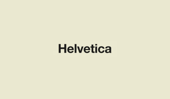
2. Helvetica
Helvetica earns its position as a close second through its refined design and professional appearance.
Originally created for architectural and technical applications, this Swiss typeface offers superior optical clarity and maintains its integrity across various reproduction methods.
Helvetica’s carefully crafted spacing and proportions make it particularly effective for technical specifications and dimensional callouts.
While slightly more condensed than Arial, it provides excellent readability and has been a staple in professional design and architecture firms for decades.
Its neutral character makes it suitable for both body text and headers in construction documentation.
Check Out: Best Harry Potter Fonts On MS Word
3. Calibri
Microsoft’s default font since Office 2007, Calibri brings modern typography principles to construction documents.
This humanist sans-serif combines the clarity of geometric fonts with subtle curves that enhance readability during extended viewing sessions.
Its slightly rounded edges reduce eye strain while maintaining the professional appearance required for official documents.
Calibri performs exceptionally well in digital formats and offers excellent screen readability, making it ideal for electronic submissions and collaborative review processes.
The font’s contemporary feel helps modernize document presentation without sacrificing functionality.
Check Out: Taylor Swift Fonts – The Art Behind Her Album Covers
4. Open Sans
Designed specifically for optimal legibility across print and digital media, Open Sans excels in construction document applications.
This Google font offers exceptional character distinction and maintains clarity even at small sizes commonly used for detailed annotations and notes.
Its open letterforms and generous spacing prevent character confusion, while the complete character set supports various technical symbols and international requirements.
Open Sans provides excellent readability for lengthy specification documents and contracts, reducing reader fatigue during detailed review processes.
Also Read: Best MS Fonts Without Serif
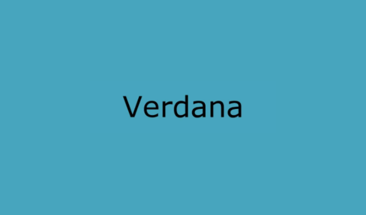
5. Verdana
Verdana’s design philosophy centers on screen readability, making it particularly valuable for digital construction documents and computer-aided design applications.
Its wide character spacing and large x-height ensure excellent legibility at small sizes, crucial for detailed technical drawings and compressed layouts.
The font’s robust construction maintains clarity even when reproduced through multiple generations of copying or faxing, still common in construction communication.
Verdana’s clear distinction between similar characters like ‘I’, ‘l’, and ‘1’ prevents costly misinterpretation of specifications and measurements.
6. Tahoma
Tahoma offers a more condensed alternative to Verdana while maintaining similar clarity benefits.
The Microsoft font provides excellent space efficiency without compromising readability, making it ideal for documents with extensive tabular data or detailed specifications.
Its tight character spacing allows for more information per line while preserving clear character distinction.
Tahoma performs particularly well in forms, schedules, and specification sheets where space optimization is crucial.
The font’s clean appearance and consistent spacing make it suitable for both headers and body text in professional construction documents.
Also Read: Best Fonts For Legal Documents
7. Franklin Gothic
As one of the most established sans-serif typefaces in American typography, Franklin Gothic brings traditional reliability to modern construction documents.
Its strong, authoritative appearance commands attention for important notices, warnings, and critical specifications.
The font’s sturdy construction and clear letterforms maintain excellent readability across all reproduction methods, from high-quality prints to basic photocopies.
Franklin Gothic’s various weights provide hierarchical flexibility, allowing for effective document organization through typographic contrast while maintaining consistency throughout the document family.
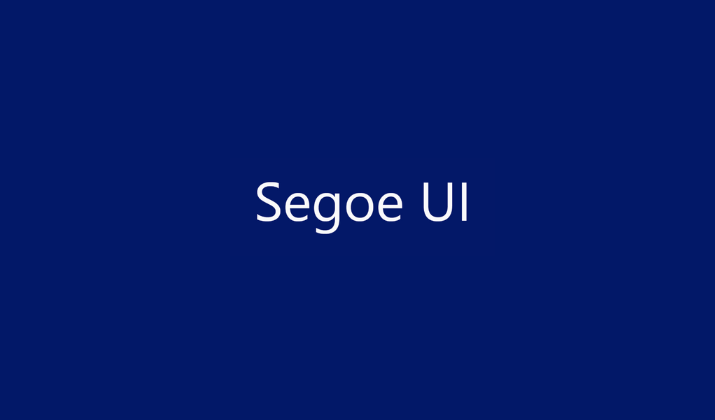
8. Segoe UI
Microsoft’s system font for Windows offers contemporary styling with exceptional functionality for construction documents.
Segoe UI provides excellent screen performance for digital document review and collaboration platforms increasingly used in modern construction projects.
Its humanist characteristics enhance readability during extended viewing sessions while maintaining the professional appearance required for official documentation.
The font’s comprehensive character set supports international projects and technical symbols commonly used in construction specifications.
Check Out: Best Fonts For Military Documents
9. Roboto
Google’s signature font brings modern digital design principles to construction documentation.
Roboto’s mechanical skeleton combined with largely geometric forms creates a typeface that feels both technical and approachable.
Its excellent performance across various devices and screen resolutions makes it particularly valuable for mobile construction applications and field documentation.
The font’s clear character distinction and consistent spacing ensure accuracy in quantity takeoffs and material specifications, while its contemporary appearance helps modernize traditional document formats.
10. Source Sans Pro
Adobe’s first open-source font family rounds out the top ten with its exceptional versatility and professional appearance.
Source Sans Pro offers multiple weights and styles while maintaining consistent readability across all variations.
Its clean, functional design works equally well for detailed technical specifications and executive summaries.
The font’s generous character spacing and clear letterforms ensure excellent legibility in both print and digital formats, while its comprehensive language support makes it suitable for international construction projects and multicultural work environments.
Check Out: Best Fonts That Look Like Cut-Out Magazine Letters
Conclusion
Selecting the appropriate font for construction documents significantly impacts communication efficacy and professional expression.
The fonts ranked above are all time-tested. They prioritize the essential characteristics needed in construction documents.
Though Arial and Helvetica lead the way through their proven track record and universal availability, newer options like Calibri and Open Sans offer modern touch to construction documents.
Enjoyed the post?


