
Medical forms demand clarity, precision, and professionalism.
Mostly used in hospitals, clinics, and pharmacies, these documents must be legible for patients, staff, and medical professionals alike.
Fonts used in medical forms and patient reports should be easy to read at various sizes, free of decorative elements, and optimized for both print and digital formats.
Sans-serif fonts are often preferred for their clean lines, though serif fonts may also be acceptable when readability is prioritized.
Most importantly, the font should reduce the chances of misinterpretation, especially when dealing with critical patient data, prescriptions, or instructions.
Here’s a curated list of some of the best fonts for medical forms, prescriptions and other documentation.
Also Read: Best Handwriting Fonts For Goodnotes
Best Fonts For Medical Forms
1. Gill Sans
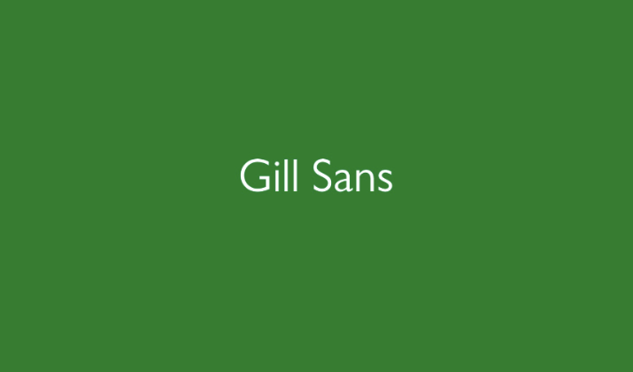
Gill Sans adds a touch of personality while maintaining legibility.
It has a slightly more distinctive appearance, which can help differentiate brand-heavy medical institutions without sacrificing readability.
While not as neutral as Arial, it remains highly functional in forms where a bit of branding style is welcome.
Gill Sans works well in headings or branding portions of the form, while the body can use simpler fonts. It adds visual interest while staying grounded in usability.
Check Out: Best Harry Potter Fonts On MS Word
2. Century Gothic

Century Gothic is a geometric sans-serif font with a clean, modern design.
Its circular letterforms can stand out, making it useful for attention-grabbing headings.
However, it’s less suited to body text due to its compact spacing and wider glyphs. Still, for titles, section dividers, or digital dashboards, Century Gothic offers a sleek and stylish touch.
It can be used sparingly in combination with more traditional fonts to maintain a professional form layout.
3. Cambria

Cambria is a serif font optimized for screen and print readability.
It’s a good option when a serif font is preferred for formal documents like consent forms or legal disclaimers.
Its proportional design allows for even spacing, reducing eye fatigue in long text blocks.
While not ideal for every field in a medical form, Cambria serves well in detailed narrative sections. Its professional tone complements the serious nature of medical documentation.
Check Out: Best Fonts For Construction Documents
4. Trebuchet MS

Trebuchet MS offers a slightly modern look with clear, distinctive characters.
It was created for on-screen reading, and its wide letter spacing aids in form readability. The font is especially useful for section headers or field labels where clarity is paramount.
Trebuchet MS provides a contemporary feel while maintaining the trust and formality necessary in medical environments.
Its style is well-suited for pediatric or outpatient clinics looking to balance approachability with professionalism.
It performs well in both digital interfaces and printed materials.
5. Segoe UI
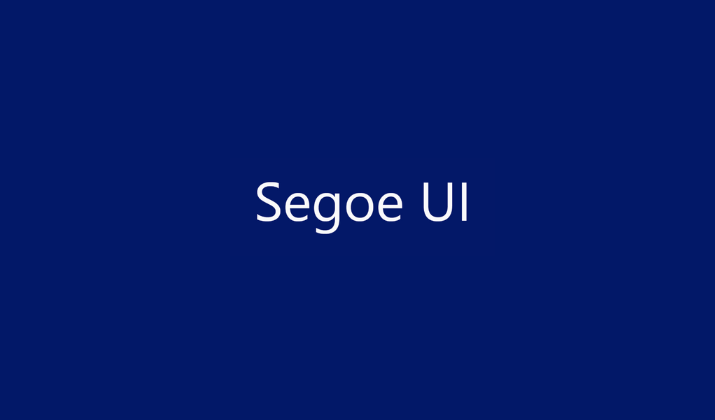
Segoe UI is Microsoft’s system font and is widely used in user interfaces.
It’s designed for clarity and modern aesthetics, making it ideal for digital medical forms and patient portals.
The font maintains excellent legibility at various screen resolutions and is optimized for Windows environments. It conveys a clean, professional tone and supports clear spacing between form fields.
The visual consistency between letters enhances its effectiveness in dynamic layouts. It’s a great choice for health tech platforms and EMR systems.
Check Out: Taylor Swift Fonts – The Art Behind Her Album Covers
6. Noto Sans
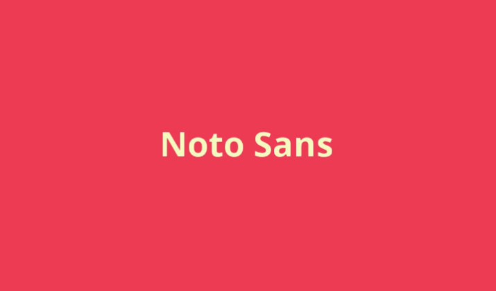
Noto Sans was developed by Google to support every language in the world without text rendering issues.
It’s ideal for multilingual medical forms that need to accommodate diverse patient populations.
Its clean, sans-serif design ensures consistent legibility across scripts. For hospitals or clinics in multicultural regions, Noto Sans ensures inclusivity without compromising design.
Its even stroke width and rounded shapes reduce visual clutter. It’s free, open-source, and well-supported across platforms.
7. Tahoma

Tahoma is a humanist sans-serif font designed for clarity on screens.
Its characters are tightly spaced yet distinct, allowing for more content to fit on a single page without sacrificing readability. This is especially useful for multi-field forms like patient intake forms.
It’s clean and straightforward, suitable for both headings and small-text fields. Tahoma also maintains its sharpness when printed, making it highly versatile.
Healthcare institutions that handle a mix of digital and paper records benefit from its cross-medium compatibility. Its no-nonsense design supports quick data entry and scanning.
Also Read: Best MS Fonts Without Serif
8. Open Sans

Open Sans is a friendly, neutral sans-serif font that’s popular in both digital and print.
It was designed for legibility across web and mobile platforms, making it perfect for digital health portals or online appointment forms.
Its slightly rounded edges make it appear more human, which can help soften the tone of clinical forms.
Open Sans supports a wide character set and multiple weights, providing flexibility in design. The clear distinctions between characters like “O” and “0” or “1” and “l” make it highly accurate.
It’s open-source and free to use, which is ideal for startups or small clinics.
9. Lucida Sans
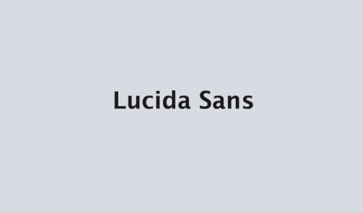
Lucida Sans is known for its large x-height and open letterforms, making it exceptionally legible in both small print and digital formats.
It’s often used in textbooks and educational materials, but its readability lends itself well to medical forms too.
The font helps minimize misinterpretation of numbers and letters, which is vital in fields like dosage or patient ID.
Lucida Sans is also clean and unobtrusive, supporting focused attention on form content.
It doesn’t overpower the layout, which is ideal in dense documentation. For healthcare documents requiring precision, it’s a smart choice.
Also Read: Best Fonts For Reports & Professional Documents
10. Helvetica
Helvetica is a highly neutral, timeless sans-serif font often used in branding, signage, and professional documents.
Its clean and minimal style makes it great for forms requiring precision. It’s especially effective in printed medical documents, labels, and ID cards.
Helvetica’s uniform character width reduces the chances of visual distortion during scanning or photocopying.
It is not bundled with all systems by default, but it’s worth installing for consistency in high-end clinical setups.
The font’s design reduces confusion between similar characters like “I” and “l,” enhancing clarity. Helvetica remains a go-to for design-conscious medical institutions.
11. Times New Roman

Times New Roman is a serif font with a classic, authoritative look.
Though not as modern as sans-serif fonts, it offers high legibility in printed documents. It’s often used in longer texts such as medical disclaimers, consent forms, and privacy policies.
The serifs help guide the eye in reading, which may be useful for elderly patients or those with visual impairments.
While it’s not ideal for short form fields, it pairs well with sans-serif fonts for structured form design.
Being a default font on most devices, it’s highly accessible. It brings a formal and trustworthy appearance to medical documentation.
Also Read: Best Fonts For Legal Documents
12. Verdana

Verdana was specifically designed for screen readability, making it perfect for electronic medical forms.
It has wide spacing and large x-height, which helps reduce eye strain and makes letters distinguishable even at smaller sizes.
This reduces the risk of misreading critical information. The font’s clarity makes it useful in labeling fields such as “Allergies” or “Medication Name” where accuracy is vital.
It’s less formal than Arial or Times New Roman but still maintains professionalism. Verdana also supports many international characters.
It’s an excellent choice for digital-first healthcare environments.
13. Calibri

Calibri is the default font in many Microsoft Office applications and is known for its smooth, rounded edges.
It is slightly more modern than Arial but maintains great legibility. Medical forms using Calibri often appear more contemporary and approachable without sacrificing clarity.
The font’s spacing and weight make it excellent for headings, labels, and input fields. It’s especially useful for digital forms, where screen readability is key.
Calibri also prints cleanly, which is important for physical documentation. For institutions aiming for a modern yet professional tone, Calibri is an excellent option.
Check Out: Best Fonts For Military Documents
14. Roboto

Roboto, developed by Google, combines mechanical structure with open curves, making it extremely readable and friendly.
Its neutral appearance works well for both labels and body text in medical forms. Roboto is optimized for digital interfaces and prints well at high resolution.
It supports a wide range of weights, useful for distinguishing between form instructions and user inputs.
The font’s consistent letter shapes prevent ambiguity. It’s especially beneficial for mobile forms used in telehealth apps.
Roboto blends professionalism with a modern touch, making it ideal for tech-forward healthcare providers.
15. Arial

Arial is one of the most widely used sans-serif fonts in the world—and for good reason.
Its simplicity and uniform strokes make it incredibly easy to read, even at small sizes. For medical forms, Arial ensures that text remains clean and unambiguous.
It’s available on nearly all systems, making it ideal for cross-platform documents. The lack of decorative features makes it less prone to printing or scanning errors.
Whether you’re printing patient history forms or digital prescriptions, Arial offers excellent clarity.
It also works well when translated into other languages. Its neutral tone makes it a safe and professional choice in healthcare settings.
Check Out: Best Fonts That Look Like Cut-Out Magazine Letters
Conclusion
Choosing the right font for medical forms isn’t just a design choice, it’s a matter of safety, accessibility, and professionalism.
All these fonts are ideal for medical documentation for their clarity, neutrality, and widespread support.
While some offer a modern and friendly appearance, others have the vintage time-tested element to them.
Whatever font you pick, always ensure to eliminate ambiguity and improve readability.
Enjoyed the post?