
Military documentation demands precision, clarity, and professionalism.
The choice of typography can significantly impact readability, command presence, and overall document effectiveness.
Preparing operational reports, training manuals, or official correspondence, all military text call for due diligence.
Here are some of the best fonts that bear legibility, professional appearance, and suitability required for military documents.
Take a look.
Explore: Best Fonts For College Essays, Reports
1. Courier New
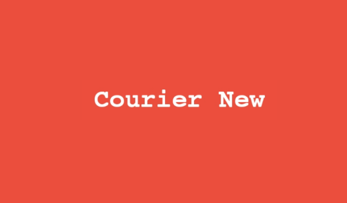
Courier New is a monospaced serif font where each character occupies the same amount of horizontal space.
Originally designed to mimic typewriter output, this font has a distinctive, utilitarian appearance that immediately conveys precision and technical accuracy.
The equal spacing of characters creates a structured, orderly appearance that is particularly effective for documents requiring exact formatting.
Its clear distinction between similar characters makes it excellent for displaying codes, coordinates, and technical specifications.
Also Read: Best Coding Fonts In Word
What Makes it Ideal for Military Documents?
Courier New’s monospaced design makes it indispensable for technical documents, code listings, and any materials requiring precise character alignment.
The font’s ability to maintain perfect column alignment makes it ideal for forms, data sheets, and tabular information commonly used in military logistics and planning.
Its high contrast and clear character differentiation ensure accuracy when transcribing critical information such as coordinates, serial numbers, and technical specifications.
Also Read: Best Fonts That Look Like Rope
2. Georgia

Georgia is a serif font specifically designed for screen reading while maintaining the classical appearance of traditional book typography.
Created with larger letterforms and more generous spacing than typical serif fonts, Georgia offers exceptional readability at small sizes and on low-resolution displays.
Its robust character design and slightly condensed width make it both space-efficient and highly legible.
The font combines the authority of serif typography with the practical demands of modern digital communication.
What Makes it Ideal for Military Documents?
Georgia’s authoritative serif appearance lends gravitas to formal documents and official communications while remaining highly readable across various devices.
The font’s robust design ensures clarity even when documents are photocopied, faxed, or printed on standard military equipment.
Its slightly condensed width allows for efficient use of space in reports and briefings, while its excellent legibility makes it suitable for documents that may be read in challenging lighting conditions.
Also Read: Best Google Fonts That Look Like Water
3. Garamond

Garamond is a classical serif font family based on the designs of 16th-century French publisher Claude Garamond.
Known for its elegance and excellent readability, Garamond features a distinctive old-style design with moderate contrast between thick and thin strokes.
The font’s compact character width allows for efficient use of space while maintaining high legibility.
Its traditional appearance conveys sophistication and historical continuity, making it particularly appropriate for formal documents and ceremonial materials.
What Makes it Ideal for Military Documents?
Garamond’s classical heritage makes it perfect for ceremonial documents, awards, and historical military publications where tradition and dignity are paramount.
The font’s sophisticated appearance elevates the perceived importance of documents, making it suitable for high-level briefings and formal presentations to senior leadership.
Its proven track record in book publishing ensures comfortable reading over extended periods, which is essential for training materials and reference documents.
Also Read: Word Fonts That Look Like Kids’ Handwriting
4. Times New Roman

Times New Roman is a classic serif font that has been the gold standard for professional documents for decades.
Originally designed for The Times newspaper in London, this font combines excellent readability with a traditional, authoritative appearance. Its well-balanced letterforms and moderate character spacing make it highly legible both in print and on screen.
The font’s serif design helps guide the eye along lines of text, making it particularly effective for longer documents and detailed reports.
What Makes it Ideal for Military Documents?
Times New Roman’s formal appearance conveys authority and tradition, making it ideal for official military correspondence, policy documents, and formal reports.
Its widespread acceptance across government agencies ensures compatibility and consistency when documents are shared between different military branches or civilian departments.
The font’s excellent readability at various sizes makes it suitable for everything from detailed technical manuals to executive summaries.
Explore: Best Google Doc Fonts That Look Like Blood
5. Verdana

Verdana is a humanist sans-serif font designed specifically for screen legibility, featuring wide characters and generous letter spacing.
Its large x-height and open letterforms make it exceptionally readable at small sizes and on low-resolution displays.
The font’s characters are designed with clear distinctions between similar letters, reducing the possibility of misreading critical information.
Its clean, professional appearance makes it suitable for a wide range of document types while maintaining excellent functionality across different media.
What Makes it Ideal for Military Documents?
Verdana’s wide character design and generous spacing reduce eye strain during extended reading sessions, which is valuable for comprehensive training materials and detailed operational procedures.
The font’s clear character differentiation is crucial for military applications where misreading information could have serious consequences.
Its professional appearance works well for both internal documents and materials that may be shared with civilian contractors or international partners.
Explore: Best Fonts For Professional Emails & Presentations
6. Arial
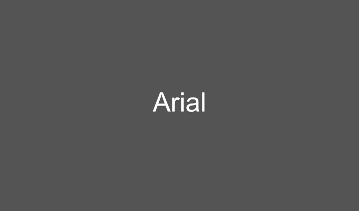
Arial is a clean, modern sans-serif font that offers exceptional clarity and neutral appearance.
Developed as a more affordable alternative to Helvetica, Arial has become one of the most widely used fonts in professional settings.
Its simple, unadorned letterforms provide excellent legibility across all media, from printed documents to digital displays.
The font’s uniform stroke width and open character design make it particularly effective for documents that need to be read quickly or in challenging conditions.
What Makes it Ideal for Military Documents?
Arial’s clean, no-nonsense appearance aligns perfectly with military efficiency and directness.
Its superior legibility makes it an excellent choice for field manuals, quick reference guides, and operational instructions where clarity is paramount.
The font performs exceptionally well in digital formats, making it ideal for documents that will be viewed on various devices and screens.
Also Read: Best Fonts For Outlook Email
7. Calibri
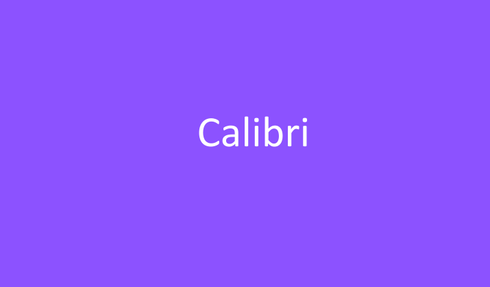
Calibri is a modern sans-serif font designed specifically for screen reading while maintaining excellent print quality.
As Microsoft’s default font for many applications, it offers a contemporary, professional appearance with subtle curves that soften its overall look.
The font features slightly rounded edges and open letterforms that enhance readability, particularly at smaller sizes.
Its character spacing is optimized for both digital and print media, making it versatile for various document types.
What Makes it Ideal for Military Documents?
Calibri strikes an ideal balance between professionalism and approachability, making it suitable for both internal communications and external presentations.
Its optimized design for digital viewing makes it perfect for documents that will be shared electronically or viewed on tablets and laptops in the field.
The font’s clean appearance helps maintain focus on critical information while its subtle warmth makes it appropriate for training materials and personnel communications.
Check Out: Best Canva Fonts That Look Like Calibri
8. Book Antiqua

Book Antiqua is a serif font that combines classical typography principles with modern readability requirements.
Based on the Palatino typeface family, it features distinctive character shapes and moderate contrast that create an elegant yet approachable appearance.
The font’s well-proportioned letterforms and generous spacing make it highly legible in both print and digital formats.
Its slightly calligraphic quality adds sophistication without sacrificing clarity or professionalism.
What Makes it Ideal for Military Documents?
Book Antiqua’s excellent readability characteristics suit it for comprehensive training manuals and policy documents that require extended reading.
Its balanced design works well for documents that need to convey both authority and accessibility, such as public relations materials and community outreach publications.
Explore: Best Fonts For Legal Documents
9. Franklin Gothic

Franklin Gothic is a robust sans-serif font family known for its strong, industrial character and excellent legibility.
Originally designed in the early 20th century, this font features condensed letterforms and bold, clear strokes that maintain readability even in challenging conditions.
Its sturdy construction and no-nonsense appearance make it particularly suitable for signage, forms, and documents that need to convey information quickly and clearly.
The font family includes various weights, providing flexibility for different document hierarchy needs.
What Makes it Ideal for Military Documents?
Franklin Gothic’s industrial strength and clarity make it perfect for field documents, safety manuals, and operational instructions that must be readable in adverse conditions.
Its condensed design allows for maximum information density, which is valuable for reference cards, quick guides, and forms with limited space.
The font’s various weights provide excellent options for creating clear document hierarchies in training materials and procedural guides.
Also Read: Easiest Fonts For Childrens’ Books
10. Trebuchet MS
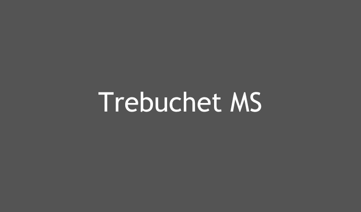
Trebuchet MS is a humanist sans-serif font designed for optimal screen display while maintaining professional print quality.
Named after the medieval siege engine, this font combines clean, modern letterforms with subtle design details that enhance readability and visual appeal.
Its open character shapes and generous spacing make it highly legible at various sizes, while its friendly yet professional appearance works well across different document types.
The font’s slightly condensed width makes efficient use of space without sacrificing clarity.
What Makes it Ideal for Military Documents?
Trebuchet MS’s clear letterforms and good spacing reduce reading fatigue, which is important for lengthy briefings and educational materials.
Its modern appearance helps military documents maintain contemporary relevance while preserving necessary formality and authority.
Also Read: Best Fonts For YouTube Thumbnails
Final Words
Selecting the appropriate font for military documents requires balancing multiple factors including readability, professionalism, tradition, and practical functionality.
Each of these ten fonts offers unique advantages that make them suitable for different types of military documentation.
Remember that consistency within document sets and adherence to organizational style guides should always take precedence over personal preference.
The goal is to ensure that critical information is communicated clearly, efficiently, and with the appropriate level of authority that military documentation demands.
Enjoyed the post?


