Email remains the backbone of work and office communication.
How good you draft and write your emails is what coveys how professional you are.
While all the parts of an email matter, including the tone, grammar, sentence structuring, subject line, and signature line, you can’t afford to take the text font for granted either.
Eventually, it’s the font that determines how your message is received.
If you use Microsoft Outlook for your communication needs, you must prioritize these fonts over others.
Not only do they enhance readability, convey professionalism, but also ensure your message displays correctly across different devices and email clients.
Here are the ten best fonts for Outlook emails.
Also Read: Best Canva Fonts That Look Like Stamp
1. Calibri
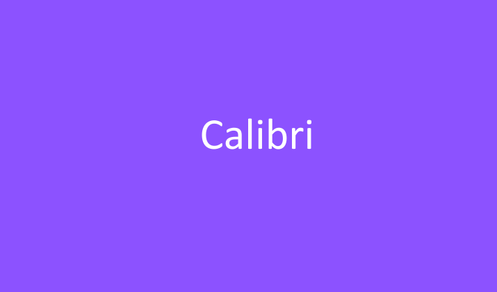
Calibri has served as Microsoft’s default font across Office applications since 2007, making it the most universally recognized and widely used font in professional settings.
This modern sans-serif typeface was specifically designed for on-screen reading, featuring subtle curves and clean lines that reduce eye strain during extended reading sessions.
What makes Calibri particularly excellent for email communication is its optimal balance between formality and approachability.
It’s professional enough for executive correspondence yet friendly enough for everyday team communications.
The font’s slightly rounded characters create a warm, human touch while maintaining crisp readability at various sizes, from small mobile screens to large desktop displays.
Its widespread adoption means that recipients will view your emails exactly as intended, regardless of their email client or operating system.
Check Out: Best Fonts For Military Documents
2. Arial
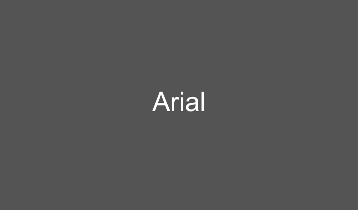
Arial stands as one of the most reliable and universally supported fonts across all digital platforms, making it an exceptional choice for Outlook emails that need to reach diverse audiences.
This clean, geometric sans-serif font offers excellent legibility at any size, ensuring your message remains clear whether viewed on a smartphone during a commute or on a large monitor in a conference room.
Arial’s neutral character makes it suitable for virtually any type of professional communication, from formal announcements to casual updates.
The font’s wide availability across operating systems eliminates formatting concerns, while its straightforward design ensures that your content takes center stage rather than being overshadowed by typographic choices.
For professionals who prioritize reliability and universal compatibility in their email communications, Arial provides a safe, professional foundation that never goes out of style.
Explore: Best Fonts For College Essays, Reports
3. Helvetica
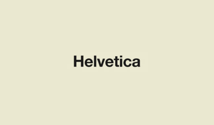
Helvetica represents the gold standard of modern typography, bringing decades of design excellence to your Outlook emails.
This iconic Swiss typeface is renowned for its perfect balance of neutrality and character, offering a clean, sophisticated appearance that commands respect in professional settings.
The font’s exceptional readability stems from its carefully crafted proportions and spacing, making it ideal for both brief messages and lengthy email content.
Helvetica’s timeless design ensures that your emails will appear current and professional for years to come, while its widespread recognition among design-conscious professionals can subtly communicate attention to detail and quality.
The font works particularly well for creative industries, consulting firms, and any organization that values design sophistication in their communications.
Also Read: Best Coding Fonts In Word
4. Times New Roman
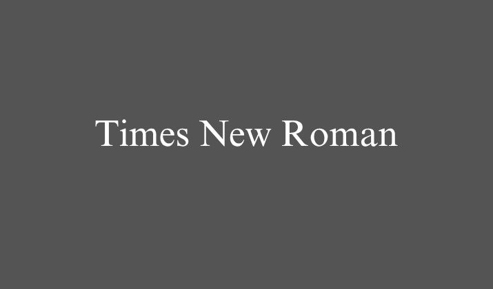
Times New Roman brings classical elegance and scholarly authority to professional email communication, making it the preferred choice for formal correspondence, legal communications, and academic exchanges.
This traditional serif font has been the standard for printed documents for decades, and its transition to digital communications carries with it an inherent sense of gravity and professionalism.
The font’s serif design aids reading comprehension by guiding the eye along lines of text, making it particularly effective for longer email content such as detailed proposals, policy announcements, or comprehensive reports.
Times New Roman’s association with formal documentation makes it ideal for correspondence with clients, stakeholders, or situations where maximum formality is required.
Its universal availability ensures consistent display across all email platforms and devices.
Also Read: Best Fonts That Look Like Rope
5. Georgia

Georgia was specifically engineered for screen reading, combining the elegance of traditional serif fonts with the clarity demands of digital communication.
This font excels in Outlook emails because its generous spacing and robust character design ensure excellent readability even at smaller sizes or on lower-resolution displays.
Georgia strikes an ideal balance between approachability and professionalism, making it perfect for communications that need to be both authoritative and welcoming.
The font’s slightly larger x-height compared to other serif fonts means that text appears more substantial and easier to read in email format.
Georgia works exceptionally well for newsletter-style communications, detailed explanations, or any email where you want to combine professional credibility with reader-friendly design.
Its distinctive character makes it memorable while remaining entirely appropriate for business use.
Also Read: Best Google Fonts That Look Like Water
6. Verdana
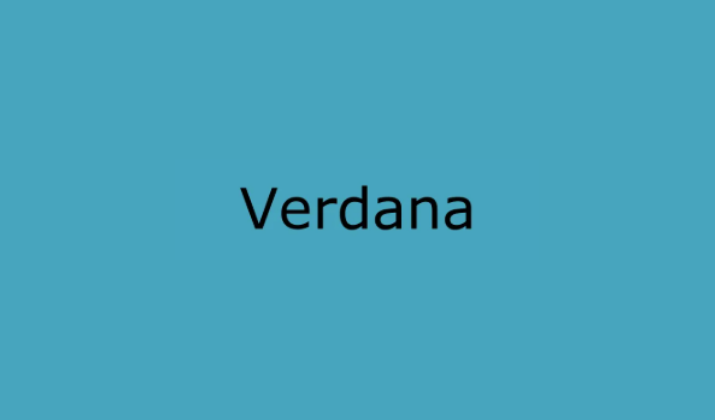
Verdana was purpose-built for digital screens, making it one of the most readable fonts available for Outlook email communication.
Its wide character spacing and large x-height ensure that text remains clear and legible even when viewed on small screens or at lower resolutions.
This sans-serif font’s generous proportions make it particularly valuable for emails that will be read by diverse audiences, including those who may have visual difficulties or are reading on mobile devices.
Verdana’s friendly, open appearance makes it excellent for customer service communications, team updates, and any correspondence where clarity and accessibility are paramount.
While slightly more casual than fonts like Times New Roman or Helvetica, Verdana maintains sufficient professionalism for most business contexts while prioritizing the reader’s comfort and comprehension above all else.
Explore: Best Google Doc Fonts That Look Like Blood
7. Tahoma
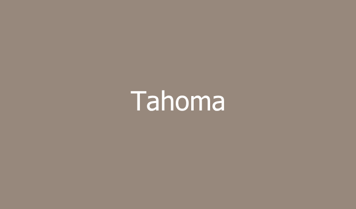
Tahoma offers a compact, efficient design that maximizes screen real estate while maintaining excellent readability in Outlook emails.
This Microsoft-designed font features tight letter spacing and a relatively narrow character width, allowing you to fit more content in your emails without sacrificing clarity.
Tahoma’s clean, modern appearance makes it suitable for a wide range of professional communications, from internal memos to client correspondence.
The font’s subtle personality gives it more character than purely neutral options like Arial while remaining thoroughly professional.
Tahoma works particularly well for emails that need to convey substantial information efficiently, such as project updates, meeting summaries, or detailed instructions.
Its slightly condensed nature makes it ideal for mobile-first communication strategies where screen space is at a premium.
Explore: Best Fonts For Professional Emails & Presentations
8. Trebuchet MS
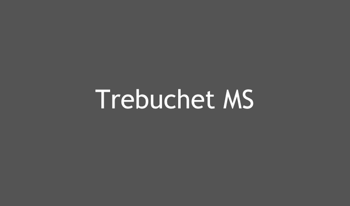
Trebuchet MS brings a contemporary, slightly humanistic touch to professional email communication, offering more personality than standard business fonts while maintaining complete appropriateness for workplace correspondence.
This sans-serif font features subtle curves and varied stroke weights that create visual interest without compromising readability.
Trebuchet MS works exceptionally well for creative industries, modern startups, and organizations that want to appear forward-thinking and approachable in their communications.
The font’s distinctive character makes emails more memorable while never appearing unprofessional or casual.
Its excellent screen optimization ensures that your carefully crafted messages display beautifully across all devices and email clients.
For professionals who want to stand out subtly from the sea of Arial and Calibri emails while maintaining universal compatibility, Trebuchet MS offers the perfect solution.
Explore: Best Fonts For Legal Documents
9. Book Antiqua
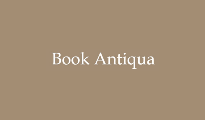
Book Antiqua brings literary sophistication and classical beauty to professional email communication, making it ideal for industries where tradition, scholarship, and refined communication are valued.
This elegant serif font draws inspiration from classical typography while being optimized for modern digital reading.
Book Antiqua works particularly well for formal announcements, executive communications, and correspondence in fields such as law, academia, publishing, or luxury goods where an elevated tone is appropriate.
The font’s graceful serifs and balanced proportions create an impression of thoughtfulness and care in communication, suggesting that the sender has taken time to craft their message thoughtfully.
While more ornate than standard business fonts, Book Antiqua remains entirely readable and professional, offering organizations a way to distinguish their communications with subtle elegance.
Also Read: Best Fonts For YouTube Thumbnails
10. Century Gothic
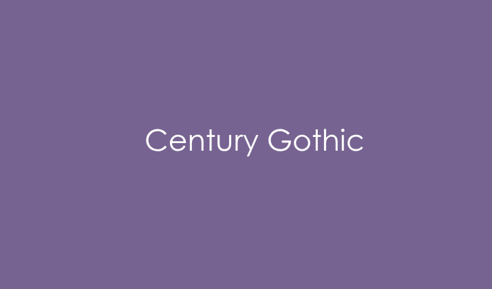
Century Gothic rounds out our list with its distinctive geometric design and modern appeal, offering a fresh alternative to traditional business fonts while maintaining professional credibility.
This clean, circular sans-serif font creates a contemporary, efficient impression that works well for technology companies, consulting firms, and any organization that wants to appear current and forward-thinking.
Century Gothic’s unique character gives emails a memorable quality without being distracting or inappropriate for business use.
The font’s clean lines and open spacing ensure excellent readability across all devices and email platforms.
Its slightly condensed width makes it efficient for longer email content while its distinctive style helps your communications stand out in crowded inboxes.
For professionals seeking a modern, distinctive font that remains thoroughly appropriate for business communication, Century Gothic provides an excellent balance of personality and professionalism.
Check Out: Best Canva Font Pairings
11. Consolas
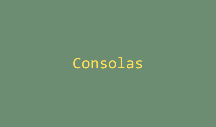
Consolas distinguishes itself from every other font on this list by belonging to the monospace category, meaning that every single character, from the narrow lowercase “i” to the wide uppercase “M,” occupies exactly the same amount of horizontal space.
This uniform spacing was specifically engineered by Microsoft for use in coding and development environments, but it offers substantial value for email communication whenever your message includes code snippets, data tables, spreadsheet references, and financial figures.
Consolas was carefully designed to eliminate the ambiguity that plagues many fonts between visually similar characters, most notably distinguishing clearly between the numeral zero and the capital letter O, or between the numeral one and the lowercase letter L, differences that can cause serious errors in technical or financial communications if misread.
For IT professionals, software developers, data analysts, engineers, or anyone who regularly needs to embed technical content directly within their email correspondence, Consolas ensures a level of precision and clarity that helps prevent costly misunderstandings.
12. Garamond

Garamond carries an extraordinary typographic legacy, tracing its roots back to the sixteenth-century punch-cutting work of French typographer Claude Garamond.
His elegant letterforms helped define the Renaissance era of European printing and continue to influence typography design nearly five hundred years later.
This deep historical pedigree infuses modern digital versions of Garamond with an unmistakable sense of classical proportion, refined delicacy, and understated sophistication that few other fonts can authentically replicate.
While noticeably more delicate and lighter in weight than most other fonts discussed here, Garamond’s sophisticated, timeless appearance makes it an exceptional choice for law firms, luxury brands, high-end consultancies, and wealth management firms.
It’s ideal for any organization specifically wanting to project deep heritage, established tradition, and meticulous attention to detail through their written correspondence.
One practical consideration worth noting is that Garamond tends to appear visually smaller than other fonts even when set at an identical point size, owing to its more compact x-height and delicate stroke weights.
That’s why many designers recommend increasing the font size slightly, often by one or two points, to maintain optimal readability and ensure the font’s elegant details don’t become lost or illegible across different email clients, screen resolutions, and viewing devices.
13. Corbel
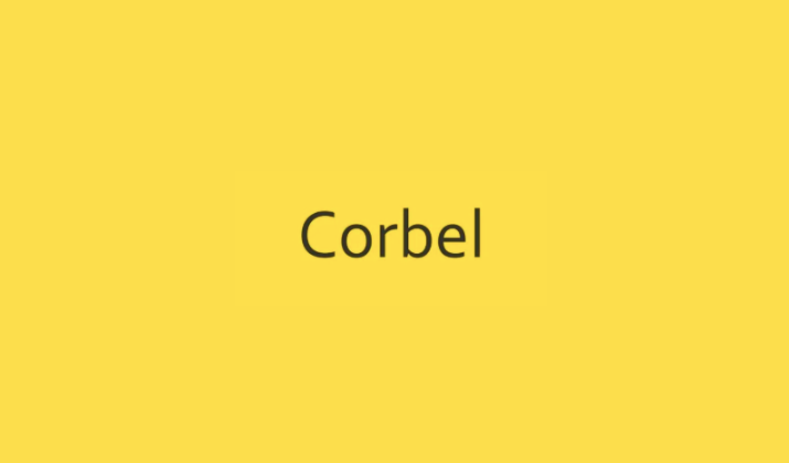
Released by Microsoft as part of the ClearType font collection alongside Cambria and Calibri, Corbel features gently rounded terminals at the ends of strokes and remarkably consistent letterforms throughout the alphabet.
It creates an overall aesthetic that feels friendly and welcoming without ever compromising the polish and professionalism expected in serious business correspondence.
This balanced design philosophy makes Corbel exceptionally effective across a genuinely wide variety of business contexts, from front-line customer service communications and support ticket responses to internal team updates, project status reports, and even client-facing proposals.
The font renders consistently clean and crisp across different screen resolutions, operating systems, and email clients, meaning you can trust it to look equally professional whether your recipient is using a high-end desktop monitor or checking email quickly on their phone during a commute.
Corbel’s balanced, humanist design makes it particularly well-suited for organizations that want their communications to feel personable and accessible while still maintaining the credibility and polish that professional correspondence demands.
14. Segoe UI
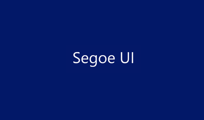
As the default typeface woven throughout the entire Windows operating system, Segoe UI enjoys a level of familiarity that few other fonts can claim.
This ubiquity translates into a subtle but powerful advantage for email communication. Recipients encounter this font constantly in their taskbars, system menus, notification pop-ups, and countless Microsoft applications. This means that emails set in Segoe UI feel native and unobtrusive rather than jarring or foreign to the reading experience.
Engineered specifically for exceptional clarity on digital displays, Segoe UI features clean, modern letterforms with carefully balanced proportions that render beautifully whether viewed at a tiny size in a crowded inbox preview or expanded to full size in the reading pane.
Beyond its technical merits, there’s a psychological dimension to choosing this font. Because it’s so deeply associated with trusted, everyday computing experiences, emails written in Segoe UI can benefit from an inherent sense of legitimacy and trustworthiness.
15. Lucida Sans
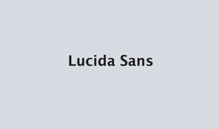
Lucida Sans belongs to the humanist sans-serif category of typefaces, a design philosophy that deliberately incorporates subtle organic irregularities and calligraphic influences into what would otherwise be a purely geometric font structure.
This results in letterforms that feel warmer, more approachable, and less mechanically rigid than fonts like Arial while still maintaining the clean simplicity that makes sans-serif fonts so effective for screen reading.
The open counters, or the enclosed spaces within letters like “e,” “a,” and “o,” combined with consistent stroke widths throughout the alphabet, contribute to exceptional legibility even across lengthy email bodies filled with dense paragraphs of information.
Lucida Sans performs reliably whether your recipient opens your email on a large desktop monitor or a compact smartphone screen, never losing clarity or becoming difficult to parse.
The overall effect is a typeface that strikes a genuinely professional yet personable tone, making it a favored choice among consultants, educators, healthcare providers, and service-based businesses.
16. Cambria
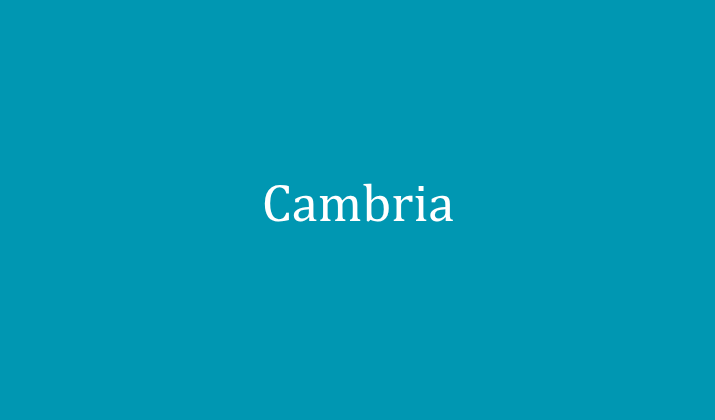
Developed as part of Microsoft’s ClearType font collection, Cambria features noticeably sturdier strokes and more generous internal spacing than traditional serif fonts like Times New Roman.
This allows the elegant flourishes and small decorative strokes at the ends of letters to remain crisp and legible rather than blurring together at smaller sizes.
This careful screen-optimized engineering means Cambria retains its inherent sense of tradition, formality, and gravitas while completely avoiding the readability compromises that make some serif fonts feel outdated or impractical for modern email communication.
The font performs consistently well whether displayed on a high-resolution 4K monitor or a basic mobile device screen, making it a dependable choice regardless of how your recipients access their inbox.
Cambria works particularly well for formal business correspondence, including academic, research communications, and legal documents.
17. Candara
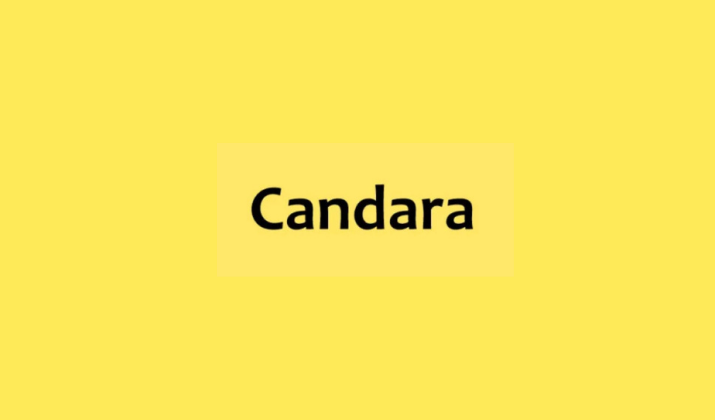
Candara belongs to Microsoft’s celebrated ClearType font collection, a group of typefaces specifically engineered in the mid-2000s to take full advantage of modern screen rendering technology and deliver noticeably sharper, more comfortable reading experiences on digital displays.
What makes Candara distinctive is its humanist sans-serif design, which incorporates subtle calligraphic influences and gently flowing curves into letterforms that would otherwise follow a strict geometric structure, resulting in a typeface that feels warm and organic rather than mechanically rigid.
The rounded stroke endings and slightly condensed letter widths give Candara a soft, contemporary appearance that reads as both approachable and quietly sophisticated.
This font performs particularly well in email communications aimed at building rapport, such as sales outreach, client relationship management, or team collaboration messages, where you want recipients to feel a sense of ease and openness rather than corporate distance.
Candara’s excellent screen optimization ensures it remains crisp and legible across various devices and resolutions.
18. Constantia
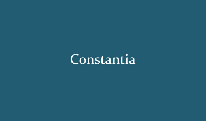
Constantia stands out as one of the first serif typefaces specifically designed from the ground up for comfortable on-screen reading, predating even Cambria in Microsoft’s broader effort to modernize serif typography for the digital age.
Its design incorporates old-style serif characteristics, including subtle variations in stroke weight and gently tapered terminals, while carefully avoiding the overly thin hairlines and cramped spacing that made many traditional serif fonts difficult to read on early computer monitors.
The result is a typeface that carries genuine warmth and classical elegance while remaining thoroughly practical for everyday digital correspondence.
Constantia works exceptionally well for communications where you want to convey thoughtfulness and substance, such as detailed project proposals, editorial content, academic correspondence, or long-form email newsletters.
Because it was engineered specifically with body text and paragraph-length content in mind, Constantia tends to outperform many other serif fonts when your email requires readers to engage with substantial blocks of text.
19. Palatino Linotype
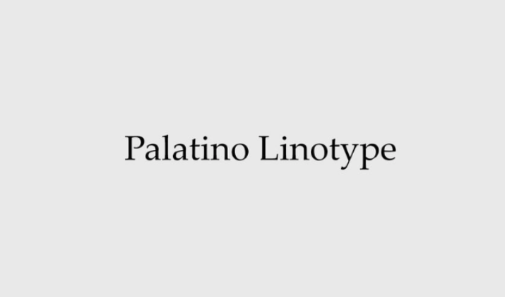
Palatino Linotype traces its design lineage to renowned German typographer Hermann Zapf, who created the original Palatino typeface in the late 1940s drawing inspiration from the elegant, humanist letterforms of Italian Renaissance calligraphy and early printing traditions.
This rich artistic heritage gives Palatino Linotype a distinctive combination of classical refinement and genuine legibility, with generously proportioned letters, moderate stroke contrast, and open, airy spacing that sets it apart from more compressed or heavily stylized serif fonts.
The typeface manages to feel simultaneously scholarly and accessible, carrying an air of intellectual credibility without veering into the stiff formality that characterizes some traditional serif options.
Palatino Linotype performs particularly well in email communications from academic institutions, publishing professionals, and research organizations.
Because Palatino Linotype remains less commonly used than fonts like Times New Roman or Georgia, choosing it can help your emails feel distinctive and considered.
20. Gill Sans
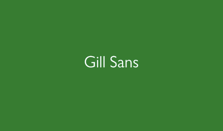
Gill Sans traces its origins to renowned British sculptor and typeface designer Eric Gill, who created the original Gill Sans in the late 1920s drawing inspiration from the clean, humanist letterforms of London Underground signage designed by his mentor Edward Johnston.
The typeface features distinctive character shapes, including a notably rounded lowercase “a” and “t,” along with generous, open counters that contribute to strong legibility even at smaller sizes on screen.
Gill Sans carries an air of understated British professionalism, making it a particularly fitting choice for corporate communications, publishing, and design agencies.
Its balanced proportions and consistent stroke weights ensure the font renders cleanly across different screen resolutions and email clients.
Final Thoughts
Though there are plenty of other fonts that you can use for your emails on Outlook, these are some of the tried-and-tested typefaces that never fail.
You may call them age-old, but these fonts are your safest bet irrespective of the industry you’re in.
They offer a sweet spot between personality and professionalism, ensuring your chosen font enhances rather than distracts from your message.
Pick any of these and get ready to press that ‘Send’ button.
Enjoyed the post?