
The thumbnail is the first impression of your YouTube video. It’s the digital handshake between you and potential viewers.
A compelling thumbnail can be the difference between a scroll-past and a click.
While eye-catching imagery is crucial, the typography you choose plays an equally vital role in communicating your video’s message clearly and instantly.
The right font can reinforce your brand identity, enhance readability even at small sizes, and convey the tone of your content before a single word is spoken.
In this blog post, we’ll explore the ten best fonts for YouTube thumbnails that strike the perfect balance between visibility, personality, and professionalism to help your videos stand out in the jam-packed video-sharing world.
Let’s get started.
Also Read: Best Fonts For Emails & Presentations
1. Montserrat

Montserrat offers the perfect balance of professionalism and approachability, making it an excellent choice for a wide range of YouTube niches.
Created by Julieta Ulanovsky, this geometric sans-serif font features clean lines and even spacing that maintain legibility even when scaled down to thumbnail size.
Its varied weight options, from thin to extra bold, provide flexibility for emphasis and hierarchy in your thumbnail text.
Many successful YouTubers in tech, education, and business categories favor Montserrat for its modern look that doesn’t sacrifice readability.
The font’s slightly rounded terminals give it a friendly feel while maintaining a contemporary edge, making your thumbnails appear current without being trendy to the point of quick obsolescence.
Also Read: Best PPT Fonts That Look Like Chalk
2. Impact

Despite being one of the older fonts on this list, Impact remains a powerhouse for YouTube thumbnails because of its incredible legibility at small sizes.
Its ultra-bold, condensed character design creates maximum visual punch with minimal space, allowing creators to include more text without cluttering the thumbnail.
The narrow letterforms with minimal spacing between characters ensure that words hold together as a cohesive unit, creating blocks of text that can be easily distinguished against busy backgrounds.
Impact has become somewhat synonymous with meme culture, which can be leveraged intentionally by channels with a more casual, humorous approach.
When you need your message to be unmistakable at a glance, Impact delivers with its aptly named visual strength.
Also Read: Best Fonts For Teachers
3. Bebas Neue

Bebas Neue has earned its reputation as a thumbnail powerhouse through its perfect combination of high impact and space efficiency.
This all-caps sans-serif font features narrow letterforms with consistent width, allowing for maximum text visibility even in limited space.
Its clean, geometric design projects confidence and authority, making it particularly effective for channels focused on news, sports, technology reviews, and other content where establishing credibility is essential.
Despite being condensed, Bebas Neue maintains excellent readability at smaller sizes, ensuring your message comes across clearly even when viewers are scrolling quickly.
Its popularity among professional YouTubers speaks to its effectiveness, channels with millions of subscribers consistently rely on its bold presence to drive clicks.
Also Read: Best Fonts For Reports & Professional Documents
4. Oswald

Oswald excels in YouTube thumbnails through its versatile weight range and excellent screen readability.
Originally designed as a reworking of classic gothic and sans-serif typefaces, Oswald has been optimized specifically for web use, making it perfect for digital platforms like YouTube.
Its condensed letterforms allow for efficient use of limited thumbnail space without sacrificing legibility.
The font features clean lines with just enough character to avoid appearing generic, striking an excellent balance between professionalism and personality.
With six weight variations from light to heavy, Oswald gives creators precise control over visual hierarchy and emphasis.
This makes it suitable for nearly any content category, from gaming channels that need bold headlines to cooking channels that might use its lighter weights for elegant subtext.
Check Out: Best Fonts For Legal Documents
5. Bangers

Bangers brings comic book energy and explosive personality to YouTube thumbnails, making it perfect for content that aims to excite and entertain.
This playful, hand-drawn font by Vernon Adams captures attention with its irregular baselines, varied letter heights, and slight tilt that creates a sense of movement and energy.
The font’s naturally bold weight ensures visibility even against complex backgrounds, while its slightly condensed nature helps fit more text into limited thumbnail space.
Bangers works exceptionally well for gaming channels, reaction videos, challenge content, and other high-energy niches where conveying excitement is paramount.
The letterforms themselves suggest action and enthusiasm, helping to communicate the tone of your video before viewers even click.
While distinctly casual, Bangers maintains surprisingly good readability compared to many decorative fonts.
Also Read: Best Canva Fonts For Quotes
6. Anton

Anton delivers exceptional impact through its ultra-bold weight and tall x-height, creating text that commands attention even when scaled down to thumbnail size.
The sans-serif typeface features slightly condensed letterforms that allow for efficient use of space without compromising visibility.
Anton’s clean, geometric design projects confidence and authority while maintaining excellent readability against various background types.
The font includes only a single weight, but that singular bold presence is precisely what makes it so effective for thumbnail headlines where maximum visibility is required.
Many successful channels in competitive niches like fitness, business advice, and technology reviews rely on Anton to help their thumbnails stand out in search results and recommendation feeds.
Its balanced combination of boldness and clarity makes text pop without appearing clumsy or overdesigned.
Check Out: Best Handwriting Fonts In Word
7. Roboto

Google’s Roboto has become a favorite among YouTube creators who prioritize clean aesthetics and exceptional legibility across devices.
As Android’s system font, Roboto was specifically designed for clarity on screens of all sizes, a quality that translates perfectly to YouTube thumbnails viewed on everything from smartphones to smart TVs.
Its geometric forms are constructed with open curves and optimized spacing that maintain readability even at small sizes.
Roboto’s comprehensive family includes multiple weights and widths, giving creators precise control over visual hierarchy while maintaining a cohesive look.
The font’s neutral yet friendly character makes it versatile enough for almost any content category, from professional tutorials to entertainment vlogs.
For creators seeking a contemporary, professional appearance that won’t distract from thumbnail imagery, Roboto offers the perfect balance of visibility and refinement.
Check Out: Best Fonts For Insta Bio
8. Luckiest Guy
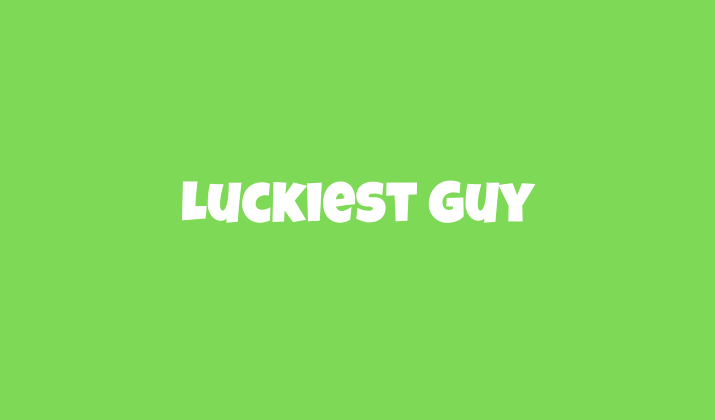
Luckiest Guy brings playful energy and unmistakable boldness to YouTube thumbnails with its chunky, hand-drawn appearance.
This heavyweight champion among fonts features extra-thick strokes, slightly irregular character shapes, and a natural bounce that creates visual excitement.
Originally inspired by vintage advertising typography, Luckiest Guy captures attention with its nostalgic yet timeless appeal.
The font’s exceptional weight makes it particularly effective for thumbnails that need to be legible even when heavily composited over busy backgrounds or images.
Family-friendly content creators, particularly those targeting younger audiences in gaming, crafts, or entertainment niches, often leverage Luckiest Guy’s approachable personality.
While best used sparingly for maximum impact (typically just 2-3 words), this font turns simple phrases into powerful visual elements that dramatically increase click-through rates for the right content categories.
Also Read: Easiest Fonts For Children Books
9. Playfair Display

Playfair Display brings sophisticated elegance to YouTube thumbnails for content creators in more refined niches.
This serif typeface features dramatic thick-thin transitions and distinctive character shapes that exude premium quality and thoughtfulness.
Unlike most thumbnail fonts that prioritize bold impact, Playfair succeeds by creating visual contrast through its classical grace among the sea of sans-serif competitors.
The font works exceptionally well for channels focused on literature, history, luxury lifestyle, fine dining, classical music, and other categories where conveying depth and expertise takes precedence over maximum visibility.
Playfair’s high-contrast design actually improves readability when set against simple, uncluttered backgrounds, particularly when using its bold or black weights.
For creators seeking to position their content as authoritative and carefully crafted, Playfair Display communicates these qualities instantly through its timeless elegance.
Explore: Best Fonts For Resume
10. Poppins

Poppins has rapidly gained popularity among YouTube creators for its perfect blend of friendly approachability and geometric precision.
The geometric sans-serif font features uniform, circular shapes with clean lines that maintain excellent legibility at various sizes.
What sets Poppins apart is its harmonious proportions and slightly rounded terminals that create a welcoming, modern appearance without sacrificing professionalism.
With weight options ranging from thin to bold, Poppins offers versatility for different thumbnail requirements, use heavier weights for primary headlines and lighter weights for supporting text.
The font performs exceptionally well on lifestyle channels, tech tutorials, educational content, and business-focused videos where a contemporary, trustworthy impression is essential.
Poppins’ balanced character creates thumbnails that feel current and polished without appearing cold or overly corporate.
Also Read: Best Fonts For Vision Boards & Journaling
Conclusion
The font you choose for your YouTube thumbnails does more than just convey information.
It communicates your brand’s personality, establishes viewer expectations, and can significantly impact your click-through rates.
The best thumbnails use typography strategically, selecting fonts that remain legible at small sizes while reinforcing the content’s tone and subject matter.
Keep in mind that your thumbnail needs to be instantly comprehensible, since most viewers make clicking decisions in seconds.
Hence, prioritize clarity and impact over complexity.
Enjoyed the post?


