
The cut-out magazine letter aesthetic has captivated designers for decades, evoking everything from ransom notes in thriller movies to edgy punk rock album covers.
This distinctive style combines irregular letter shapes, varying sizes, and mismatched typography to create a raw, handmade feel that’s impossible to replicate with standard fonts.
Whether you’re working on a poster design, creating social media graphics, or adding gritty character to your project, these fonts capture that authentic cut-and-paste magazine collage look without the scissors and glue.
Let’s explore these beautiful fonts.
Also Read: Best Fonts That Look Like Yarn
1. Kingthings Extortion

Kingthings Extortion delivers the perfect ransom note aesthetic with its deliberately chaotic mix of letterforms that appear hastily cut from different publications.
Each character has a unique appearance, mimicking the look of letters grabbed from various magazine headlines and newspaper clippings.
The irregular spacing and mismatched styles create an authentic DIY collage feel.
Also Read: Best Google Fonts That Look Like Typewriter
2. Laundromat 1967
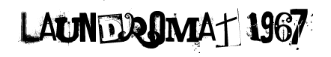
Laundromat 1967 captures the gritty, urban aesthetic of vintage signage and worn magazine pages.
The font features letters that look like they’ve been cut from aged publications, complete with subtle texture and weathering effects.
Its retro feel makes it perfect for projects requiring that authentic 1960s underground publication look.
Check Out: Best Google Fonts That Look Like Graffiti
3. Freakshow
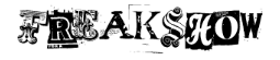
Freakshow embraces the carnival poster tradition with letters that appear torn from various circus and sideshow advertisements.
Each character has a slightly different weight and style, creating the impression of a hastily assembled message using whatever printed materials were available.
The font excels at creating dramatic, attention-grabbing headlines.
Also Read: Best Canva Fonts That Look Like Stamp
4. Brandsom
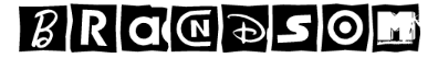
Brandsom specializes in the classic kidnapper’s note appearance with letters that look genuinely cut from magazine headlines.
The font includes subtle shadows and torn edges that enhance the three-dimensional cut-out effect.
Each character appears to be carefully selected from different typography sources, creating perfect randomness.
Explore: Best Canva font Pairings
5. CS Flosie
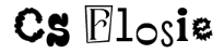
CS Flosie offers a more playful take on the cut-out magazine aesthetic, featuring letters that appear to be scissored from fashion magazines and lifestyle publications.
The font maintains good readability while providing that distinctive handcrafted collage appearance.
Its clean cuts and consistent sizing make it ideal for designs requiring a more polished look.
Explore: Best Google Fonts That Look Like Water
6. CS Anika Drawn
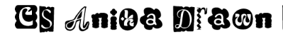
CS Anika Drawn combines the cut-out aesthetic with hand-drawn elements, creating letters that look like they’ve been cut from magazines and then outlined or modified by hand.
This unique approach adds an extra layer of authenticity to the ransom note style, suggesting both cutting and manual customization.
Also Read: Best Google Doc Fonts That Look Like Blood
7. CS Ranger
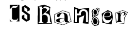
CS Ranger captures the rugged, outdoor magazine aesthetic with letters that appear cut from adventure and nature publications.
The font features bold, sturdy letterforms with rough edges that suggest they’ve been hastily assembled for urgent communication.
It’s perfect for projects requiring a more masculine, outdoorsy version of the cut-out style.
Discover: Best Fonts That Look Like Rope
8. Dirty Punk
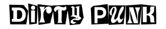
Dirty Punk embodies the underground music scene with letters that look like they’ve been torn from concert flyers and zine publications.
The font features deliberately messy cuts and irregular spacing that perfectly captures the rebellious, anti-establishment aesthetic of punk culture.
Each character appears authentically distressed and weathered.
Also Read: Best Word Fonts For Coding
9. CS Benji
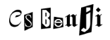
CS Benji provides a friendlier approach to the cut-out magazine style, with letters that appear to be carefully cut from children’s magazines and educational materials.
The font maintains the authentic collage look while offering better legibility and a less threatening appearance.
This makes it perfect for creative projects that need the style without the menace.
Explore: PPT Fonts That Look Like Chalk
10. CS Libra
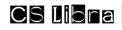
CS Libra balances the chaotic nature of cut-out letters with more refined typography, featuring characters that appear to be selected from high-quality magazine headlines and advertisements.
The font offers the authentic magazine collage aesthetic while maintaining excellent readability and professional appearance.
The font is ideal for commercial applications of the cut-out style.
Explore: Best Fonts For Military Documents
Conclusion
These cut-out magazine letter fonts offer designers an instant way to achieve that authentic, handcrafted collage aesthetic without spending hours with scissors and glue.
From the chaotic urgency of Kidnap to the refined precision of Magazine, each font brings its own personality to the cut-out style.
Be it creating edgy graphics, vintage-inspired designs, or simply wanting to add some rebellious character to your typography, these fonts provide the perfect foundation for capturing that distinctive magazine ransom note look.
Enjoyed the post?


![Why Are My Canva Images Blurry? [Explained]](https://rigorousthemes.com/blog/wp-content/uploads/2023/10/MicrosoftTeams-image-3-768x402.png)

