The Delivery App Sales Power BI Dashboard offers a powerful way to visualize business performance across multiple dimensions.
Designed for executives, managers, and analysts, it provides clear insights into sales patterns, customer behavior, and outlet performance.
By consolidating complex data into intuitive visuals, this dashboard makes it easier to track overall growth and identify opportunities for improvement in delivery app operations.
What Does this Dashboard Show?
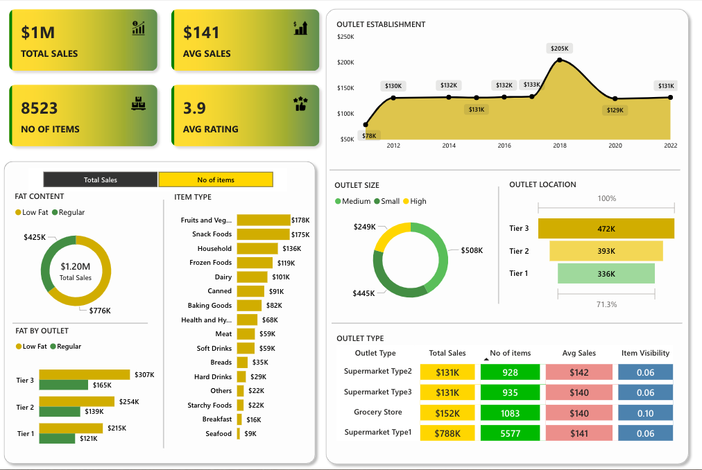
This dashboard highlights sales trends over a 10-year period, from 2012 to 2022, with a notable revenue peak of $205K in 2018.
It breaks down sales by fat content, showing the contribution of low-fat versus regular products, and further classifies revenue by item categories such as fruits and vegetables ($178K) and snack foods ($175K).
Outlet size and location are also analyzed, revealing that Tier 3 outlets outperform others with $472K in sales, while Tier 1 generates $336K.
The dashboard goes deeper with outlet type comparisons, analyzing supermarkets and grocery stores across key metrics like total sales, number of items sold, average sales, and visibility ratios.
Check Out Other Power BI Dashboards:
- Team Performance Dashboard
- Attendance Tracker Dashboard
- Carbon Emission Footprint Dashboard
- Player Performance Dashboard
- Procurement Dashboard
- Healthcare Analysis Dashboard
- Weather Analysis Dashboard
- Transportation & Logistics Dashboard
Uses
-
Food Delivery Platform Analytics: Helps delivery apps monitor product category performance and customer demand patterns.
-
Retail Chain Performance Management: Retail managers can evaluate sales across multiple outlet types and locations to optimize store strategies.
-
Franchise Business Monitoring: Franchisors can track consistency in sales and product performance across franchise outlets.
-
Supply Chain Optimization: Data-driven insights highlight which product categories need stronger inventory support to meet customer demand.
-
Market Penetration Analysis: Location-based insights help businesses identify growth opportunities in Tier 2 and Tier 3 regions.
Users’ Feedback
Users appreciate the dashboard’s clean, modern design with its golden gradient color scheme that brings clarity and elegance to the visuals.
The integration of multiple charts within a consistent visual language ensures smooth navigation across data points.
Donut charts and horizontal bar graphs are strategically used to present comparisons clearly, making the dashboard both functional and visually engaging.
Power BI Dashboards Worth Exploring:
- Retail Dashboard
- Airport Performance Dashboard
- Customer Analysis Dashboard
- HR Analytics Dashboard
- Inventory Insight Dashboard
- Energy Usage Dashboard
- Sales Scorecard Dashboard
- Social Media Monitoring Dashboard
Enjoyed the post?