In today’s digital world, everything around us consists of data, but not all of it is accurate.
We use this data to gauge whether something is true or false, but it is not often that we see this data in its raw form.
Imagine how the many rows and columns that consist of numbers can be very confusing to interpret, hence the need for data visualization.
Data visualization helps us to present patterns to make sense of the data at our disposal. It is the translation of data into visuals such as charts and graphs to communicate trends.
However, as beneficial as data visualization is to interpreting data, it can also be used to bend the truth and misrepresent trends.
In this article, I will show you 15 common misleading data visualization examples.
Misleading Data Visualization Examples
1. Cherry Picking

Cherry-picking is coined from the notion that if you only pick the healthiest and ripest fruit, anyone that sees you do that may be forced to believe that all of the fruits on the tree are healthy, even though that isn’t the case.
This phenomenon is very common in the veterinary space, where vets are only likely to report on positive trials when testing the responses of some animals such as cats and dogs.
This mostly happens when they’ve been funded by pharmaceutical companies.
This is also very prevalent during industry trials for drugs for humans such as antidepressants.
The results don’t often level up when you go through a government-funded study of the same drugs.
Cherry-picking is dangerous for the obvious fact that the researcher may be wrong. The study may contain some hidden complexities that can only be retrieved through further data.
It is often easy to spot out a case of cherry-picking.
For starters, the research will consist of only a few subjects and only a small amount of data obtained from them would be made available.
Also, the researcher will often repeat some particular examples and use generalities, which would only go to show that the study isn’t saturated.
Also Read: Bad Data Visualization Examples
2. Cumulative VS. Annual Data
Cumulative data is when you add successive inputs in the data model to ensure that the graph only rises after each input.
Whereas annual data will show the data for each year.
The individual years could be increasing or decreasing which paints a truer picture of the situation.
Surely you have seen the Worldometer COVID-19 graph or similar graphs.
There has been an abundance of them during this pandemic period. These graphs often display the cumulative number of cases in the area under review.
 Cumulative data representation is also often
used by companies to make their sales appear more than they actually are in real life.
Apple was criticized for this in 2013 when the CEO, Tim Cook made a presentation showing only the cumulative number of iPad sales.
A lot of people felt that it was intentionally done to suppress the dwindling sales of iPads.
While cumulative data may come with the advantage of showing changes in growth and total number, you will need to look deeper before you can interpret some very important changes.
You may have better luck solving calculus.
3. Omitting the baseline
Bar Graphs are known to misrepresent data through the manipulation of the scale of the y-axis.
This is one visualization tool that is often used by politicians to exaggerate how certain things have fared under their administration.
For example, if a politician wants to exaggerate how the high school graduation rate has increased under his tenure, he can begin the y-axis of the graph from 50% rather than 0.
In that case, the difference between 65% and 70% becomes more significant than if he began from 0.
This is referred to as truncating the graph in data visualization.
News agencies also use this technique to mislead readers and viewers, but it is not all the time that they are purposely trying to mislead readers.
Sometimes they do this to be unique or creative with a graph but may end up getting themselves in trouble instead.


You will also find this type of misleading data visualization in the tech space, music industry, and virtually anywhere else where people are trying to back up their claims.
4. Misleading pie chart
Data manipulation is commonly used in politics to make a particular group or person look better than they actually are. The pie chart is one visualization agent that is used to achieve this.
You must have seen several pie charts used to represent different proportions, such as showing which political party voters are likely to choose, but what if participants in a survey were allowed to choose more than one political party?
I’m that case, you may end up with more than 100%. Presenting this on a pie chart is where it becomes tricky because it is meant to show proportions of a whole where each group is distinct.
A pie chart will make it appear as though a huge percentage of voters have chosen that particular candidate alone.
If you want to depict such data accurately with a visualization element like a pie chart, then your best bet will be to use a Venn diagram.
The Venn diagram will show how many votes each candidate received and where they overlap.
5. Manipulating the Y-axis
This is very similar to our previous example, but kind of opposite too. In this case, the baseline and the axis are included in the graphs, but they are changed so much that they lose their original value.
Data manipulators do this by changing the scale of the graph to either suppress or exaggerate a change.
In the data visualization space, it is known as axis changing, and it is a very common tool that is often used to push false narratives on social media.
For example, a graph about global warming can include temperatures from -10 degrees to over 100 degrees all in a bid to make the line as flat as possible.
This is often used to push false narratives that global warming is not real or is exaggerated.
This type of misleading data is usually not done by mistake. The manipulators often know what they are doing, but they choose to push the wrong narrative nonetheless.
Sometimes it only takes a single change and they can completely flip a story that could cost you a lot.
For example, the scale a credit bureau decides to use can make your credit rating look very good or bad. A score of 634 out of 700 is way different than a score of 634 out of 850.


Mind you, not all misleading data are represented in line graphs or bar charts. They can also be represented with pie charts.
6. Using the wrong graph
In the above examples, we have talked about how people intentionally misrepresent data visualization to push their own agenda, but it can also be a result of sheer incompetence.
More often than not, people unintentionally pick the wrong visualization tool to represent data and it just comes out wrong.
This is very common with pie charts, but that is not to say that it is the pie chart’s fault. Far from it. It is usually the fault of the person who picks the pie chart in the first place.
This pie chart from the NFL draft is a typical example of what we are talking about:

At first glance can you decipher what it’s trying to say? Heck, It is likely that you will not be able to understand it even if you spend the whole day looking at it.
A bar graph would have made a whole lot of sense for whatever data they are trying to represent there.
We see a lot of data misrepresentation like this especially when brands are trying to be too creative with their graphs or charts.
Even if you want your data to appear less boring then you must devise other ways to do so than to sacrifice its accuracy.
You Might Want To Read: Best Tableau Courses
7. Going against convention
When it comes to data visualization, going against long-held conventions or associations is usually a bad idea.
I mean, we have become so accustomed to using the colors red and green to represent loss and profit respectively, so imagine a graph where red is used to represent profit, and green is used to depict loss.
It would be total chaos.
What if an overzealous reporter who is covering an election decides to represent Democrats with red and Republicans with blue.
That would turn out to be confusing for a lot of people.
Look at the graph below that shows the rate of STI across America.
One would expect that the darker color would depict high levels while the lighter color will show low levels, but the reverse is the case.

This goes against common reasoning but was likely done to mislead the audience on purpose.
Below is another misleading graph on gun deaths.
In fact, it is one of the most misleading graphs I have ever come across, especially because of how obvious the intention of the maker was.

The graph is actually an upside-down version of what it should be.
It was made to look as though gun deaths in Florida were going down when in actuality, it was spiking.
It is obvious that this was done to push an agenda by unrepentant data manipulators.
Check Out: Best Tableau Retail Dashboard Examples
8. Overloading readers with data
This is one common mistake I have seen one too many times.
I’m not sure if they are intentional or not, but including too much data on a single visual will end up confusing an audience rather than helping them.
A good example is the recent COVID-19 graph that was shared by the White House.

Don’t beat yourself up if you cannot make out anything of the graph.
Frankly, it will take a genius to understand this without using a magnifying glass.
It’s not just the number of trend lines that I find impossible to read, the legends on the side do not help matters either.
The graph would be readable if the creator isolated the different states or made different graphs for each state.
9. Omitting data
Some data analysts feel like it is better to omit data than lie about it. They got one thing right, lying about data is terrible, but omitted data is equally a bad idea.
By omitting data you are creating a gap for anyone to place trends that do not exist and in the same vein, some crucial insights can go unnoticed.
When you leave out data, you are leaving it open to interpretation and all sorts of conclusions can be drawn on it.

That being said, data manipulators intentionally omit data to mislead readers.
On the other hand, data can be omitted as a result of laziness on the part of the creator, so they make their work easier by leaving out some data points like dips and spikes.
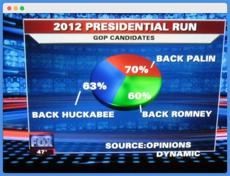
10. Number don’t add up
It is a rule in statistics that the numbers should add up to 100% when you draw a pie chart or a stacked up bar chart.
As ridiculous as mistakes go, it is high up on the list, but still, the mistake gets made too many times.
Take a look at this presidential election chart from Fox News in our previous example.
Did you spot the mistake yet? Of course, you did. The percentages for the three candidates do not add up to 100%. Instead, it is a whopping 193%.
Like we have said before, the survey leading to this result must have allowed for more than one response and a Venn diagram would have been better suited to represent the idea, but Fox opted for a pie chart.
Aside from the numbers not adding up, the size of the pies also tells a different story.
It gives an impression that each of the candidates has close to a third of the total number, which is far from the truth.
11. Not using annotations
Well, it might be an exaggeration to call this a mistake since using annotations for visuals should be at your own discretion, but it is good practice to include them every time you draw a chart.
Your charts will likely be seen by different demographics, so there will be times where visuals alone will not suffice.
In those situations, only works with qualifying text and numbers would make sense to the confused readers.
For example, take a look at the chart below.

It looks good and the axes are properly labeled, right? But wouldn’t you like to know what happened in 2015 that caused the dip in sales?
A good annotation will make a lot of sense in this type of situation.

Doesn’t it look better this way?
12. Improper bubble sizes
Each element in a visual has its usefulness and it is not different for bubble charts. They are used to display three-dimensional data in two-dimensional formats.
In a bid to represent data with bubbles, a lot of people often vary the radius rather than the area to display the data. Look at the bubble chart below to get an idea of what I am talking about. 
Looking at the chart, I can already see that there are a couple of issues with it, but for the purpose of driving home this point, let’s take a look at the first two bubbles from the left.
One represents $0.92 billion and the other represents $1.84 billion, but doesn’t it seem off to you?
Judging from the size of the bubbles, you would think that the larger bubble is at least 4 times the size of the other one when in reality, it is only twice the size.
So if the texts were absent, then it would have certainly been misunderstood.
That’s what is bound to happen anytime you vary radius instead of area.
13. Hard to compare
It is very common for business owners with a presence across the globe to compare their market share in different countries.
Data visualization comes in handy here, but in some instances, it can make it more difficult to compare.
Take a look at these two visuals:


Which would you find easier to read?
Definitely the bar charts, so it beats me while anyone would want to use a pie chart to display this type of data, but many businesses do.
To avoid such mistakes, look at them from the reader’s perspective. Or better yet, show the charts to a friend before you publish.
14. Wrong audience
Finally, it is important to note that you cannot create visualizations that will satisfy all audiences.
When creating a visual, think about who your target audience is and what kind of data they can digest.
Imagine presenting a complicated chart about how nations with high emission rates are the greatest victims of climate change to a bunch of third graders.
That would be way off.
15. Correlating causation
Correlation doesn’t always mean causation and it’s hard to forget that in today’s internet world.
Unfortunately, this has spilled into the data industry and we are beginning to see more and more researchers making conclusions based on correlation instead of causation.
The graph below shows how misleading correlation causation visuals can be.

Final Words
There are most ways in which data can be manipulated, but the above ones are some of the most common.
Armed with this knowledge, you can be warier of the kind of data that you entertain and make more informed choices.
Enjoyed the post?