
Executives don’t really have time to dig through spreadsheets all day, right? They need answers, not endless rows of numbers.
That’s where the Executive Insights Power BI Dashboard comes in. It takes the chaos of data and turns it into a clean, story-like view of how the business is doing.
Think of it as your business report card, only way less boring.
What the Dashboard Shows?
This dashboard is like a one-stop shop for performance metrics.
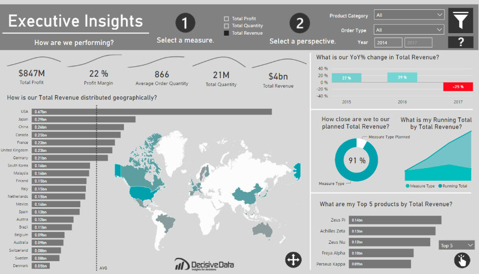
At the very top, it shows the big-ticket numbers: profit, profit margin, average order quantity, and total revenue.
Scroll a little deeper and you’ll see how revenue is spread across different countries, with a map that makes it crystal clear where your strongest markets are.
It even tracks year-over-year growth (with some brutal honesty when numbers dip!) and shows how close you are to hitting planned targets.
And if you’re wondering which products are your MVPs, the top five list has you covered.
Power BI Dashboards Worth Exploring:
- Retail Dashboard
- Airport Performance Dashboard
- Customer Analysis Dashboard
- HR Analytics Dashboard
- Inventory Insight Dashboard
- Energy Usage Dashboard
- Sales Scorecard Dashboard
- Social Media Monitoring Dashboard
Who Can Use This Dashboard?
The beauty of this setup is that it’s useful pretty much everywhere. Retailers can track which products are selling best across different regions.
Manufacturers can keep an eye on profit margins and order volumes.
Tech companies can see where their global customers are buying in, while service industries like finance or consulting can measure client growth and revenue.
In short, if your business runs on numbers, this dashboard is your friend.
What Stands Out About It
Here’s the kicker: This dashboard doesn’t just show data, it makes it digestible.
The colors are easy on the eyes, the graphs tell a clear story, and the map highlights hotspots without making you squint.
Even the YoY growth chart is straightforward: green bars for growth, red for losses, no decoding needed. It feels like someone cleaned up your data, dressed it in a sharp suit, and made it presentation-ready.
Recap
At the end of the day, the Executive Insights Power BI Dashboard is all about making data less intimidating and more actionable.
It gives you the high-level view, lets you dive into details when needed, and looks polished while doing it.
For any executive tired of slogging through endless reports, this is the shortcut to smarter decisions.
Check Out Other Power BI Dashboards:
- Team Performance Dashboard
- Attendance Tracker Dashboard
- Carbon Emission Footprint Dashboard
- Player Performance Dashboard
- Procurement Dashboard
- Healthcare Analysis Dashboard
- Weather Analysis Dashboard
- Transportation & Logistics Dashboard
Enjoyed the post?