Be it crafting a Halloween invitation, designing a horror movie poster, or adding dramatic flair to your creative writing project, the right font can make all the difference.
It distinguishes a mundane text from spine-tingling typography.
While Google Docs may not have fonts that literally drip with crimson, it does offer several typefaces that capture the essence of blood through their distressed, gothic, and menacingly organic characteristics.
These fonts evoke the visceral feeling of blood through their irregular edges, dramatic weight variations, and unsettling letterforms that seem to flow and congeal like the real thing.
Let’s explore ten Google Docs fonts that will give your text that perfectly unsettling, blood-like appearance that’s sure to make your readers’ hearts race.
Also Read: Best Google Fonts Like Helvetica, Futura, Avenir
1. Creepster
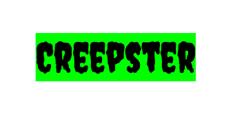
Creepster stands as the undisputed champion of blood-like fonts in Google Docs, with letterforms that appear to be melting and dripping down the page like fresh blood on a wall.
This display font features irregular, organic shapes with thick and thin variations that perfectly mimic the way blood pools and flows.
The characters have a hand-drawn quality with intentionally imperfect edges that create the illusion of liquid movement.
What makes Creepster particularly effective is how the letters seem to sag under their own weight, with some characters appearing to elongate downward as if gravity is pulling them into crimson puddles.
The font works exceptionally well for large headings and titles where you want maximum visual impact.
This makes it perfect for horror movie titles, Halloween party invitations, or any project that needs to immediately communicate danger and dread.
Discover: Best Fonts That Look Like Rope
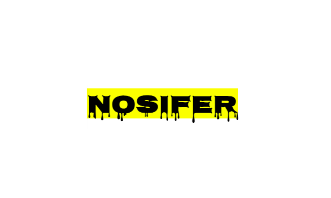
2. Nosifer
Nosifer brings a vintage horror aesthetic that combines the elegance of classic vampire films with the raw terror of dripping blood.
This font features sharp, angular serifs that resemble fangs, while maintaining the fluid, organic quality that makes text appear to be written in blood.
The letterforms have a gothic architecture influence, with tall, imposing characters that seem to loom over the reader like ancient tombstones.
What sets Nosifer apart is its ability to look both refined and terrifying simultaneously.
The letters maintain their readability while still conveying that essential blood-like quality through their dramatic weight distribution and sharp points.
The font’s name itself is a play on “Nosferatu,” and it captures that same blend of sophistication and horror that makes classic vampire stories so compelling.
Check Out: Best Cursive Fonts On Google Docs
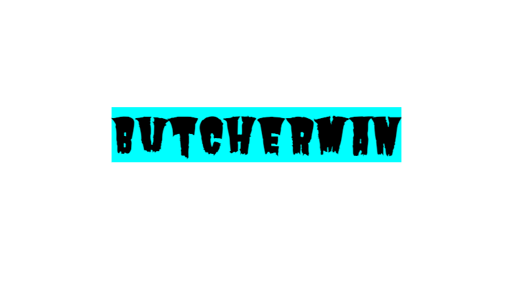
3. Butcherman
True to its ominous name, Butcherman delivers a font that looks like it was carved with a cleaver and stained with the aftermath of its work.
This slab serif font features thick, blocky letters with rough, weathered edges that create the impression of text that’s been literally cut into flesh and bone.
The characters have a distressed quality that makes them appear aged and stained, as if they’ve been exposed to the elements and marked by violence.
Butcherman’s heavy weight and condensed letterforms create a sense of compression and intensity, making each word feel weighty and threatening.
The font works particularly well when you want text that doesn’t just look like blood, but conveys the brutal force behind its creation.
It’s perfect for horror game titles, heavy metal band logos, or any design that needs to communicate raw, primal fear.
Explore the most common fonts and when should you use them in this interesting post.
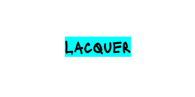
4. Lacquer
Lacquer brings a glossy, wet appearance that perfectly mimics the fresh, liquid quality of blood before it dries and coagulates.
This display font features thick, rounded letterforms with a three-dimensional quality that makes each character appear to be molded from viscous liquid.
The font’s bold weight and smooth curves create the impression of text that’s been formed by pouring thick blood and allowing it to settle into letter shapes.
What makes Lacquer particularly effective for blood-like applications is its lustrous quality. The letters appear to have a wet sheen that catches light the same way fresh blood does on skin or surfaces.
The characters have substantial presence and weight, suggesting the dense, heavy quality of coagulated blood, while maintaining enough sophistication to work in both subtle and overtly horror-themed designs.
Lacquer works exceptionally well for movie titles, book covers, or any design element that needs to convey both luxury and menace simultaneously.
Also Read: Best Word Fonts For Coding
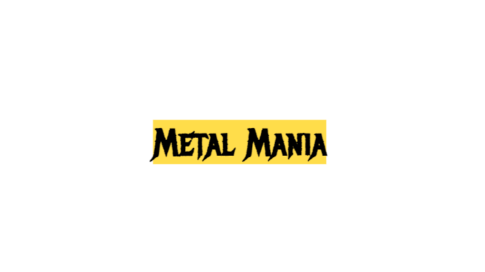
5. Metal Mania
Metal Mania lives up to its name by delivering typography that screams heavy metal album covers and horror movie credits.
This condensed display font features aggressive letterforms with sharp angles and dramatic weight variations that create the impression of text forged in fire and stained with blood.
The characters have a slightly distressed quality with rough edges that suggest wear and violence, while maintaining enough readability for effective communication.
What makes Metal Mania particularly blood-like is how the letters seem to pulse with energy and aggression.
The thick strokes appear swollen and engorged, while the thin areas create the impression of liquid being squeezed through narrow passages.
The font’s vertical emphasis and compressed width make text appear to tower menacingly over the reader, perfect for band names, horror movie titles, or any design that needs to communicate raw power and danger.
Explore: Worst Fonts Ever
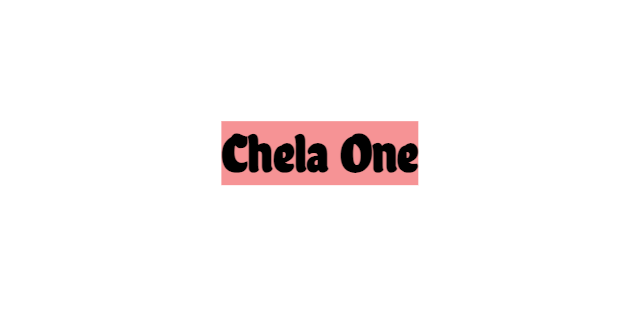
6. Chela One
Chela One brings a playful twist to blood-like typography, with rounded, bubble-like letters that take on a sinister quality when viewed through a horror lens.
While initially appearing friendly and approachable, this font’s soft, inflated letterforms can easily be interpreted as blood cells or droplets when used in the right context.
The characters have a three-dimensional quality that makes them appear to bulge from the page, creating the illusion of thick, viscous liquid that’s been allowed to pool and coagulate.
Chela One’s organic curves and varying weights give it an authentically fluid appearance, while its bold presence ensures maximum visual impact.
This font works particularly well for projects that need to subvert expectations.
Using cheerful-looking typography to deliver horrific messages creates a deeply unsettling cognitive dissonance that’s perfect for psychological horror applications.
Also Read: Best Fonts For Tattoo Quotes
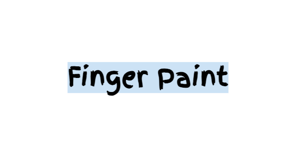
7. Finger Paint
Finger Paint captures the raw, primal essence of writing with blood through its deliberately crude and organic appearance.
This font looks exactly like its name suggests, text created by dipping fingers in paint (or blood) and smearing it across a surface.
The letterforms have an authentically hand-created quality with irregular edges, varying opacity, and organic flow that perfectly mimics how blood would behave when used as a writing medium.
What makes Finger Paint particularly effective is its imperfect, almost desperate quality.
The letters appear rushed and panicked, as if written by someone in extreme distress.
The font’s rough texture and uneven coverage create the impression of a surface that’s been stained rather than cleanly printed, adding to its blood-like authenticity.
This typeface works exceptionally well for messages that need to appear hastily scrawled, whether for horror movie props, escape room clues, or dramatic story elements.
Also Read: Best Free Cursive Fonts On Canva
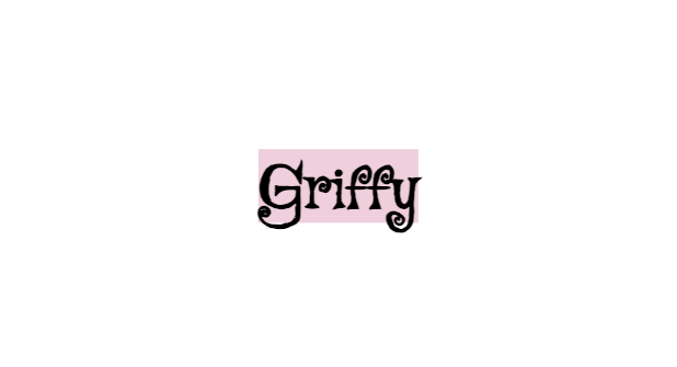
8. Griffy
Griffy combines vintage charm with sinister undertones, creating a font that appears to have been lifted from old horror movie posters and stained with decades of accumulated dread.
This serif font features elegant letterforms with slightly distressed edges that give it an aged, weathered appearance reminiscent of text that’s been exposed to the elements and marked by violence.
The characters maintain classical proportions while incorporating subtle irregularities that suggest decay and corruption.
What makes Griffy particularly blood-like is how its serifs and stroke endings create small points and flourishes that resemble the way blood naturally spreads and pools when it comes into contact with paper or fabric.
The font’s medium weight and balanced proportions make it highly readable while still maintaining its unsettling character.
This makes it perfect for body text in horror stories, vintage-inspired horror posters, or any design that needs to balance elegance with menace.
Check Out: Best Handwriting Fonts In Word
9. Jolly Lodger
Jolly Lodger presents a fascinating contradiction, a font whose name suggests cheerfulness but whose appearance evokes the macabre world of old carnival sideshows and traveling horror exhibits.
This condensed display font features tall, narrow letterforms with decorative elements that create the impression of text that’s been carved into wood and stained with blood over time.
The characters have a vintage circus aesthetic with ornate details that become sinister when viewed through a horror lens.
The font’s dramatic height and compressed width create vertical emphasis that makes text appear to drip downward, while its decorative elements add texture that resembles the irregular patterns blood makes when it dries and flakes.
Jolly Lodger works exceptionally well for carnival horror themes, vintage horror movie titles, or any project that needs to capture the unsettling atmosphere of abandoned amusement parks and traveling freak shows.
Explore: PPT Fonts That Look Like Chalk
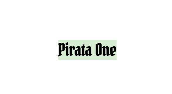
10. Pirata One
Pirata One rounds out our list with a font that captures the bloodthirsty essence of pirate lore and maritime horror.
This display font features bold, angular letterforms with sharp serifs and dramatic stroke contrasts that create the impression of text carved with a cutlass and stained with the blood of countless battles.
The characters have an aggressive, masculine quality with thick stems and thin crossbars that create dynamic tension within each letterform.
What makes Pirata One particularly blood-like is how its sharp angles and pointed serifs create the impression of weapons and violence, while its bold weight suggests the thick, viscous quality of coagulated blood.
The font’s nautical heritage adds an extra layer of menace, evoking images of pirates walking the plank and ships stained with the blood of their victims.
This typeface works perfectly for pirate-themed horror projects, maritime ghost stories, or any design that needs to communicate both adventure and danger.
Also Read: Canva Fonts That Look Like Calibri
Conclusion
Typography has the remarkable power to transform ordinary words into visceral experiences.
These ten Google Docs fonts prove that you don’t need specialized design software to create blood-chilling effects.
Each font on this list offers its own unique interpretation of what blood-like text should look like.
The key to using these fonts effectively lies in understanding their individual personalities and matching them to your project’s specific needs.
Also Read: Best Word Fonts That Look Like Kids’ Handwriting

