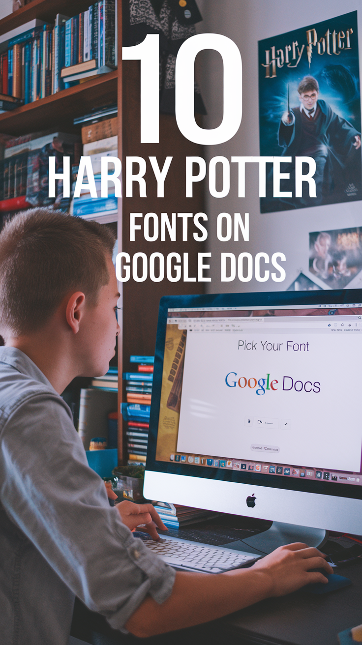
The wizarding world of Harry Potter continues to captivate fans across the globe, even years after the final book and movie were released.
Whether you’re creating invitations for a themed party, designing a school project, or simply want to add some magical flair to your documents, using Harry Potter-inspired fonts can transform ordinary text into something extraordinary.
Google Docs offers a selection of fonts that can help you recreate the enchanting typography of the Harry Potter universe.
In this blog post, we’ll explore ten fonts available on Google Docs that will bring the magic of Hogwarts to your documents.
Let’s get started.
1. Playfair Display

Playfair Display resembles the elegant serif typeface often seen in the chapter headings of the Harry Potter books. With its dramatic thick-to-thin transitions and pronounced serifs, this font captures the traditional, old-world charm of wizarding literature.
Best for: Chapter titles, headings, and formal invitations to wizarding events.
How to use it: Select “Playfair Display” from the font dropdown menu in Google Docs. For an even more authentic look, use it in bold and slightly increase the size.
2. Special Elite

If you’re looking to recreate the worn, slightly distressed typewriter look of official Ministry of Magic documents or the Daily Prophet newspaper, Special Elite is your go-to font. Its imperfect, vintage appearance gives your text an authentic wizarding bureaucracy feel.
Best for: Ministry of Magic memos, Daily Prophet articles, or wanted posters for escaped prisoners from Azkaban.
How to use it: Choose “Special Elite” from the font menu and consider adding a slight beige background to your document for an aged parchment effect.
3. Crimson Text
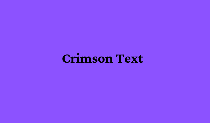
Crimson Text is reminiscent of the text used in the interior pages of the Harry Potter books. This elegant serif font is highly readable while maintaining that classic literary quality that defines the wizarding world’s printed materials.
Best for: Body text for essays about magical creatures, potions recipes, or lengthy explanations of wizarding history.
How to use it: Select “Crimson Text” as your body text font, preferably in 11 or 12pt size for optimal readability.
4. Tangerine

For a touch of whimsical elegance that might be found on Hogwarts acceptance letters or certificates, Tangerine offers a script-like quality that suggests it was written with a quill. Its flowing curves and decorative style evoke the handwritten quality of personalized magical correspondence.
Best for: Invitations, certificates of achievement from Hogwarts, or decorative headers.
How to use it: Use “Tangerine” in larger sizes (16pt+) to ensure readability, and consider pairing it with a more standard font for body text.
5. UnifrakturMaguntia

This Gothic, blackletter-style font is perfect for recreating the masthead of the Daily Prophet or signs for shops in Diagon Alley. UnifrakturMaguntia has that old-world, medieval quality that is prevalent throughout the wizarding world’s aesthetics.
Best for: Store signs, newspaper headlines, or ancient spell book covers.
How to use it: Use “UnifrakturMaguntia” sparingly and in larger sizes, as it can be difficult to read in small text. It works best for short, impactful headlines or titles.
6. Philosopher (or Libre Baskerville)

While not exactly the same as the font used for the Harry Potter book titles, Libre Baskerville (or sometimes Philosopher is available) offers a similar serif style that captures the essence of the iconic book covers. Its balanced proportions and classic design make it instantly recognizable to fans.
Best for: Document titles, book cover recreations, or important headers.
How to use it: Select “Libre Baskerville” and use it in bold for titles. Consider adding a drop shadow effect for that classic Harry Potter title look.
7. Amatic SC

For a more whimsical, handwritten feel that might be found in notes from Hagrid or hand-painted signs at Weasleys’ Wizard Wheezes, Amatic SC provides a playful yet readable option. Its slightly irregular, hand-drawn quality adds character to casual wizarding communications.
Best for: Informal notes, fun signs, or content related to the more lighthearted aspects of the wizarding world.
How to use it: Choose “Amatic SC” for short phrases or titles. The regular weight can be too thin for small text, so consider using the bold option for better visibility.
8. Cinzel

Cinzel’s Roman-inspired design makes it perfect for the more formal, ancient aspects of the wizarding world. It resembles the kind of typography you might find on the Marauder’s Map or inscribed above the entrance to Gringotts Bank.
Best for: Formal proclamations, ancient spells, or architectural inscriptions.
How to use it: Use “Cinzel” in all caps for short, important phrases that need to convey authority or historical significance.
9. Satisfy

This script font can be used to recreate the flowing handwriting seen in personal letters between characters. Satisfy has an elegant yet natural flow that resembles how characters like Dumbledore or Hermione might write their correspondence.
Best for: Handwritten letters, personal notes, or signed documents.
How to use it: Select “Satisfy” for shorter passages meant to look handwritten. Consider using a dark blue or emerald green color to mimic ink from a quill.
10. IM Fell English
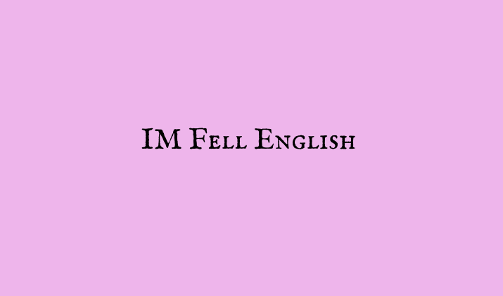
With its slightly irregular character forms and traditional serif design, IM Fell English perfectly captures the aged quality of textbooks used at Hogwarts like “Fantastic Beasts and Where to Find Them” or “Advanced Potion Making.” The font has subtle imperfections that give it an authentic, printed-on-parchment appearance.
Best for: Recreating pages from wizarding textbooks, ancient scrolls, or historical documents.
How to use it: Choose “IM Fell English” for body text in documents meant to look like they came from the Hogwarts library. Pair it with slightly yellowed page backgrounds for an aged effect.
Conclusion
Incorporating these Harry Potter-inspired fonts into your Google Docs can instantly transport your writing to the magical world created by J.K. Rowling.
Whether you’re drafting invitations for a themed party, creating educational materials, or simply adding some wizarding charm to your personal projects, these fonts offer versatile options to capture different aspects of the Harry Potter aesthetic.
Remember that the true magic of typography lies in how you combine and use these fonts. Consider pairing an ornate header font with a more readable body text, and use decorative fonts sparingly for maximum impact.
You might also experiment with text colors, such as deep reds for Gryffindor-themed content or emerald greens for Slytherin projects.
Enjoyed the post?