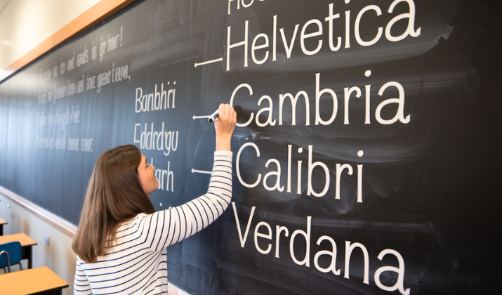
Typography has always been a crucial element in album artwork, serving as the visual voice that complements an artist’s musical narrative.
Taylor Swift, known for her meticulous attention to detail and artistic evolution, has consistently used typography as a powerful storytelling tool across her discography.
Each font choice reflects not only the sonic landscape of her albums but also her personal growth and artistic reinvention.
From her country roots to her pop transformation and indie folk exploration, Swift’s typographic choices have become as iconic as her melodies, creating a visual language that resonates deeply with her fanbase and design enthusiasts alike.
Let’s take a look at some of the best Taylor Swift fonts that amplified her albums with her style and flavor over the years.
1. Taylor Swift (2006) – Handwritten Script
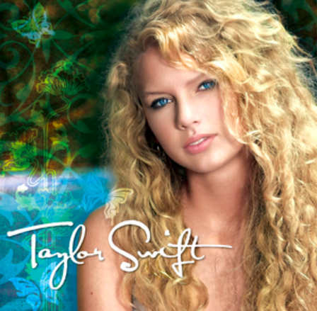
The debut album’s handwritten script font immediately established Taylor Swift as an authentic, personal artist.
The flowing, cursive lettering mimics the intimacy of a handwritten diary entry, perfectly complementing the album’s confessional songwriting style.
This typographic choice was revolutionary for a country debut, as it avoided the typical bold, Western-style fonts common in the genre.
Instead, the delicate script suggested vulnerability and youth, promising listeners a glimpse into the private thoughts of a teenage songwriter.
The font’s organic curves and natural flow created an immediate emotional connection, making fans feel as though they were reading personal letters rather than simply viewing an album cover.
Also Read: Most Common Fonts & When To Use Them?
2. Fearless (2008) – Elegant Serif
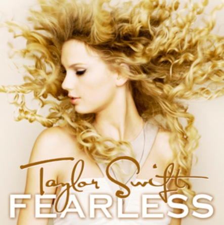
“Fearless” marked Swift’s typographic maturation with its sophisticated serif font, signaling her evolution from teenage newcomer to confident artist.
The golden, ornate lettering exudes warmth and optimism, perfectly capturing the album’s themes of young love and fearless dreams.
The serif details add a touch of classical elegance while maintaining approachability, reflecting Swift’s ability to blend traditional country storytelling with contemporary pop sensibilities.
This font choice demonstrated her growing artistic confidence and hinted at her future crossover potential.
The typography’s balance between playfulness and sophistication mirrored the album’s content, which tackled both teenage experiences and more mature emotional landscapes.
Also Read: Timeless Wedding Invitation Fonts
3. Speak Now (2010) – Whimsical Fantasy
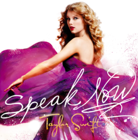
The “Speak Now” font embraces pure fantasy with its fairytale-inspired lettering, complete with decorative flourishes and magical elements.
This typographic choice perfectly aligned with the album’s conceptual framework of storytelling through song, positioning Swift as a modern-day bard weaving musical tales.
The font’s ornate details and fantastical elements reflected the album’s theatrical nature and Swift’s growing confidence as a songwriter who could craft entire narratives within single songs.
The whimsical serif design suggested enchantment and wonder, inviting listeners into a world where every song was a chapter in an elaborate storybook.
This typography marked a pivotal moment where Swift fully embraced her role as a storyteller-performer.
Explore: Google Fonts That Look Like Graffiti
4. Red (2012) – Bold Sans-Serif
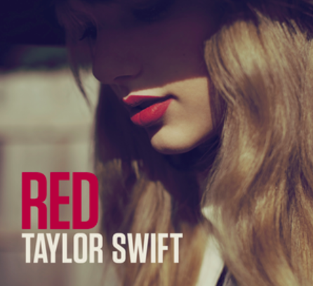
“Red” introduced a dramatic shift with its stark, bold sans-serif typography that perfectly embodied the album’s emotional intensity.
The clean, powerful lettering reflected Swift’s transition into a more mature artistic phase, where she wasn’t afraid to explore darker, more complex emotions.
This typographic choice was deliberately modern and edgy, signaling her departure from country music’s traditional aesthetic conventions.
The font’s strength and clarity mirrored the album’s themes of passionate love and heartbreak, creating a visual representation of the emotional roller coaster contained within.
The bold sans-serif design also hinted at Swift’s impending full transition to pop music, establishing a more contemporary visual identity.
Explore: Google Fonts Like Typewriter
5. 1989 (2014) – Retro Pop
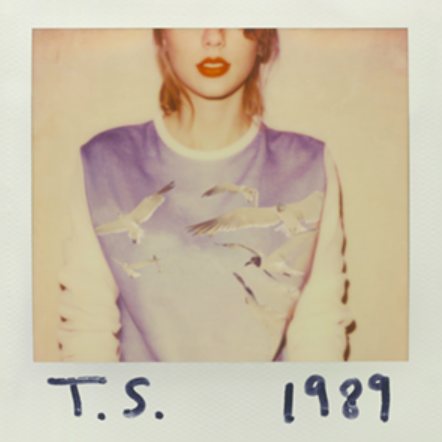
The “1989” typography transported listeners directly to the 1980s with its distinctive retro styling that perfectly captured the album’s nostalgic pop aesthetic.
The font’s angular design and geometric elements evoked the era’s digital revolution and synthesizer-driven music, creating an immediate visual connection to the sounds within.
This typographic choice was Swift’s most radical departure yet, completely abandoning any trace of country aesthetics in favor of pure pop culture references.
The retro styling wasn’t just nostalgic, it was a bold statement about Swift’s artistic reinvention and her ability to master entirely new musical territories.
The font’s playful yet sophisticated design reflected the album’s perfect balance of accessibility and artistic ambition.
Also Read: Best Google Doc Fonts That Look Like Blood
6. Reputation (2017) – Gothic Newspaper
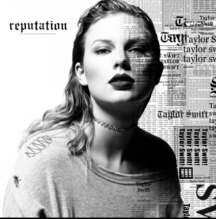
“Reputation” featured perhaps Swift’s most controversial typographic choice: a gothic newspaper-style font that immediately suggested scandal, headlines, and media scrutiny.
This design decision was both defensive and offensive, acknowledging the media narratives surrounding Swift while simultaneously reclaiming control of her story.
The font’s association with newspaper headlines was no accident—it directly addressed the tabloid culture that had dominated Swift’s public narrative.
The gothic elements added a darker, more mysterious quality that perfectly complemented the album’s themes of reinvention and revenge.
This typography marked Swift’s most defiant artistic statement, using visual design to confront her critics head-on.
Discover: Best Fonts That Look Like Rope
7. Lover (2019) – Pastel Script
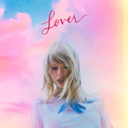
After the darkness of “Reputation,” “Lover” introduced a complete visual reset with its soft, pastel script font that radiated warmth and romance.
The dreamy, flowing lettering perfectly captured the album’s return to optimism and celebration of love in all its forms.
This typographic choice represented Swift’s artistic rebirth, demonstrating her ability to completely transform her visual identity to match her evolving sound and perspective.
The script’s gentle curves and soft colors created an atmosphere of comfort and joy, inviting listeners into a more mature but hopeful emotional landscape.
The font’s handcrafted quality suggested authenticity and personal connection, marking Swift’s return to more intimate storytelling.
Also Read: Best Google Fonts Like Water
8. Folklore (2020) – Minimalist Serif
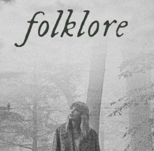
“Folklore” stripped everything down to its essence with a simple, elegant serif font that emphasized the album’s introspective, literary qualities.
This minimalist approach was revolutionary for Swift, whose previous albums had featured increasingly elaborate visual designs.
The understated typography reflected the album’s indie folk aesthetic and its focus on storytelling over spectacle.
The font’s classical proportions and timeless design suggested permanence and literary weight, positioning the album as serious artistic work rather than commercial pop product.
This typographic choice demonstrated Swift’s confidence in her songwriting abilities and her willingness to let the music speak for itself without visual distractions.
Also Read: Harry Potter Fonts On Canva
9. Evermore (2020) – Woodland Serif
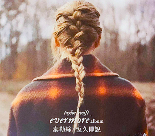
“Evermore” continued the literary tradition established by “Folklore” but with a more organic, nature-inspired serif font that evoked forest mysteries and ancient wisdom.
The typography’s earthy quality perfectly complemented the album’s themes of seasonal change and emotional growth.
This font choice suggested depth and timelessness, positioning the album as a continuation of Swift’s exploration into more mature, contemplative territory.
The woodland-inspired elements created a sense of natural beauty and organic growth, reflecting the album’s themes of healing and renewal.
The typography’s connection to nature reinforced the album’s position as a sister record to “Folklore,” while establishing its own distinct visual identity.
Also Read: The 1975 Barbie Font – Tips For Designers
10. Fearless (Taylor’s Version) (2021) – Golden Revival
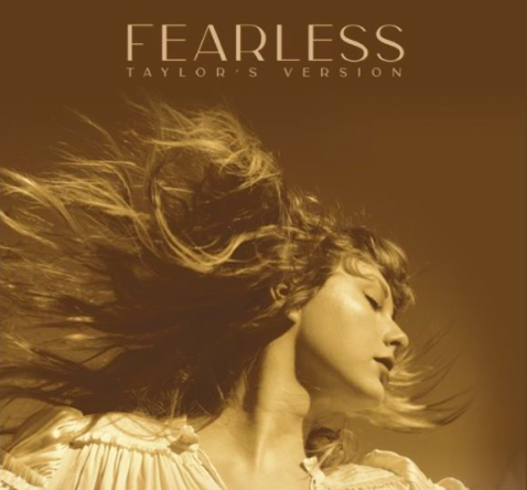
The re-recording of “Fearless” required a delicate typographic balance: honoring the original while asserting Swift’s current artistic ownership.
The updated golden serif font maintained the warmth and optimism of the original while adding subtle modern refinements that reflected Swift’s artistic growth.
This typography became a template for how Swift would approach her re-recordings—respectful to the past but confidently contemporary.
The font’s enhanced elegance demonstrated how Swift’s artistic perspective had evolved while maintaining the core emotional authenticity that made the original so powerful.
The golden color scheme reinforced themes of value and worth, subtly referencing Swift’s fight for artistic ownership.
11. Red (Taylor’s Version) (2021) – Enhanced Bold
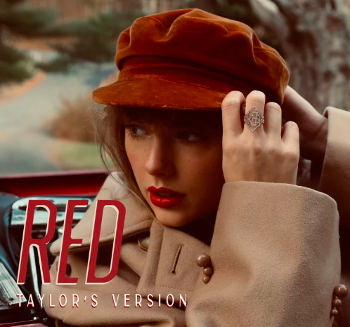
The “Red (Taylor’s Version)” typography took the original’s bold sans-serif concept and enhanced it with additional depth and sophistication.
The updated font maintained the emotional intensity of the original while adding layers of complexity that reflected Swift’s artistic maturation.
This typographic evolution demonstrated how the same emotional content could be presented with greater nuance and artistic confidence.
The enhanced design suggested that while the songs remained emotionally true to their original forms, Swift’s perspective on them had deepened and evolved.
The typography became a visual representation of artistic growth and the power of reclaiming one’s creative work.
Discover: Best Fonts For Tattoo Quotes
12. Midnights (2022) – Retro-Future
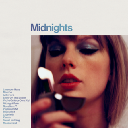
“Midnights” introduced a fascinating typographic concept that blended retro aesthetics with futuristic elements, creating a unique visual identity that suggested both nostalgia and innovation.
The font’s design perfectly captured the album’s late-night introspective mood while maintaining a sense of contemporary sophistication.
This typographic choice reflected Swift’s ability to synthesize different eras and influences into something entirely new and personal.
The midnight-inspired design elements created an atmosphere of quiet contemplation and artistic introspection, inviting listeners into Swift’s most personal creative space.
The font’s balance of familiarity and innovation mirrored the album’s blend of confessional songwriting and modern production techniques.
13. The Tortured Poets Department (2024) – Literary Typewriter
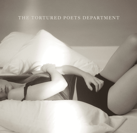
The most recent addition to Swift’s typographic evolution, “The Tortured Poets Department” embraces a literary typewriter aesthetic that immediately positions the album within a tradition of confessional poetry and artistic suffering.
This font choice suggests raw authenticity and unfiltered emotional expression, as if the songs were typed directly from Swift’s creative consciousness.
The typewriter styling evokes images of late-night writing sessions and stream-of-consciousness creativity, perfectly aligning with the album’s themes of artistic process and emotional vulnerability.
This typography represents Swift’s most direct connection to literary tradition, positioning her work within the broader context of confessional art and poetic expression.
Also Read: Best Barbie Fonts On Cricut
Conclusion
Taylor Swift’s typographic journey across thirteen major releases reveals a sophisticated understanding of visual storytelling that parallels her musical evolution.
Each font choice serves as a carefully considered artistic statement, creating immediate emotional connections and setting expectations for the musical journey ahead.
From the intimate handwritten script of her debut to the literary typewriter aesthetic of her latest work, Swift has consistently used typography as a powerful tool for artistic expression and fan communication.
Enjoyed the post?