There’s something undeniably nostalgic about typewriter fonts.
They evoke memories of vintage office spaces, classic literature, and the satisfying click-clack of mechanical keys.
Be it designing a retro-themed website, creating vintage-inspired graphics, or simply adding substance to your text, typewriter fonts never fail to deliver that authentic, mechanical aesthetic.
Google Fonts offers an excellent selection of typewriter-inspired fonts that capture this classic charm while remaining highly readable and web-friendly.
Take a look at some of the best Google fonts that perfectly capture the essence of vintage typewriters.
Also Read: Best Fonts That Look Like Cut Out Magazine Letters
1. Courier Prime
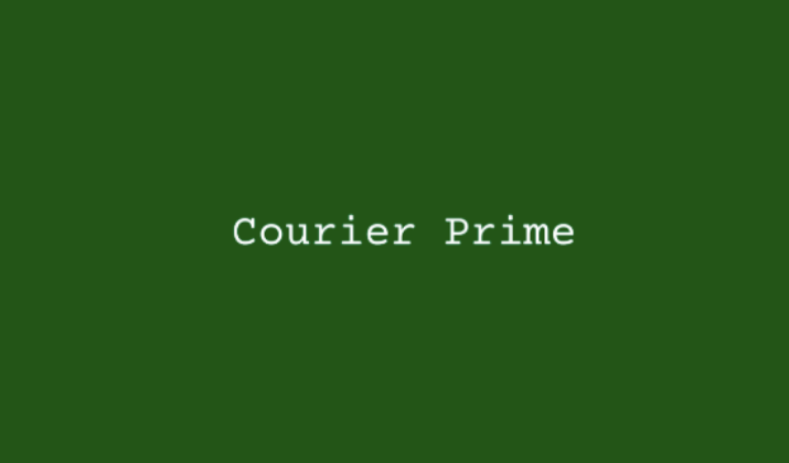
Courier Prime is perhaps the most authentic typewriter font in Google’s collection.
Designed specifically to improve upon the classic Courier font, it maintains the essential monospaced character while offering better readability on screens.
The font features crisp, clean lines with just enough character to feel vintage without being overly stylized.
It’s perfect for long-form content, code snippets, or any design where you need that classic typewriter feel with modern functionality.
Also Read: Best Fonts That Look Like Yarn
2. Special Elite

Special Elite takes the typewriter aesthetic and cranks up the vintage factor.
This font looks like it came straight from a well-used 1940s typewriter, complete with ink splatters and weathered edges.
The characters have a slightly distressed appearance that adds authenticity to any retro design.
It’s ideal for headlines, short blocks of text, or creative projects where you want maximum vintage impact.
Check Out: Best Google Fonts That Look Like Graffiti
3. Cutive Mono
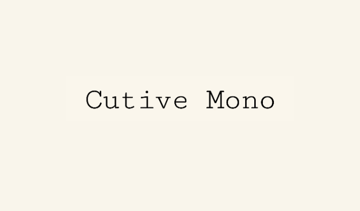
Cutive Mono strikes a perfect balance between typewriter charm and contemporary readability.
While maintaining the essential monospaced structure, it offers cleaner lines and more refined character shapes than heavily distressed alternatives.
The font works exceptionally well for both body text and display purposes, making it versatile for various design applications from websites to print materials.
Also Read: Best Canva Fonts That Look Like Stamp
4. Anonymous Pro
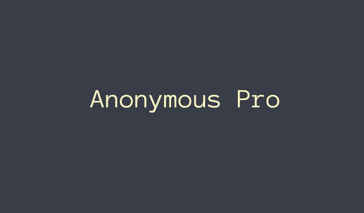
Originally designed for coding, Anonymous Pro has that distinctive typewriter feel with excellent legibility.
The font features clean, geometric shapes with consistent spacing that makes it perfect for technical documentation, programming interfaces, or any design requiring a modern take on the classic typewriter aesthetic.
Its four weights (regular, italic, bold, and bold italic) provide flexibility for different design needs.
Explore: Best Google Fonts That Look Like Water
5. Nova Mono

Nova Mono brings a slightly futuristic twist to the typewriter genre.
While maintaining the essential monospaced character, it features more geometric, streamlined letterforms that feel both vintage and contemporary.
The font works beautifully for tech-related content, modern interfaces, or any project that needs a typewriter feel with a cleaner, more architectural approach.
Also Read: Best Google Doc Fonts That Look Like Blood
6. Overpass Mono
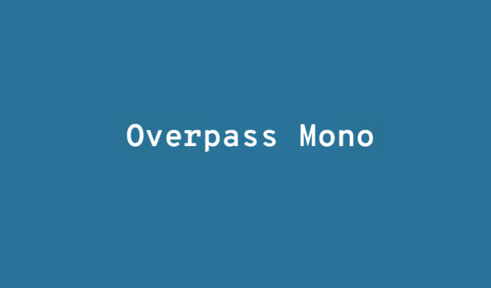
Overpass Mono combines the structural integrity of typewriter fonts with modern design sensibilities.
Based on the Highway Gothic typeface used on road signs, it offers exceptional legibility while maintaining that monospaced character essential to typewriter aesthetics.
The font includes multiple weights and styles, making it incredibly versatile for both digital and print applications.
Discover: Best Fonts That Look Like Rope
7. PT Mono
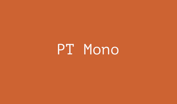
PT Mono is a contemporary interpretation of monospaced typefaces with subtle typewriter influences.
Designed as part of the PT font family, it offers clean, readable characters with just enough personality to feel distinctive.
The font works particularly well for technical documentation, code displays, or any modern design that needs a hint of typewriter character without being overly vintage.
Also Read: Best Word Fonts For Coding
8. Source Code Pro
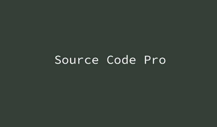
While primarily designed for programming environments, Source Code Pro has strong typewriter DNA.
The font features clean, consistent letterforms with excellent readability at small sizes.
Its multiple weights and comprehensive character set make it perfect for both technical applications and creative projects that need a modern, professional typewriter feel.
Explore: PPT Fonts That Look Like Chalk
9. Roboto Mono

Roboto Mono brings Google’s popular Roboto design philosophy to the monospaced world.
While more contemporary than traditional typewriter fonts, it maintains the essential character spacing and structural elements that give typewriter fonts their distinctive feel.
The font offers excellent screen readability and works well for both body text and display applications.
Explore: Best Fonts For Military Documents
10. Inconsolata
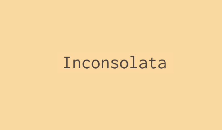
Inconsolata is a humanist monospaced font that captures the essence of typewriter design while prioritizing readability and elegance.
The font features slightly condensed letterforms with subtle curves that soften the mechanical feel while maintaining the essential typewriter character.
It’s perfect for long-form reading, coding interfaces, or any application where you need extended readability with typewriter aesthetics.
Explore: Taylor Swift Fonts On Google Docs
Tips on Choosing the Right Typewriter Font
Here are some tips to consider when choosing the right font for your needs:
Readability vs. Character: Fonts like Special Elite maximize vintage character but may be harder to read in large blocks of text. Cleaner options like Courier Prime or Cutive Mono offer better readability while maintaining typewriter appeal.
Context and Audience: Consider whether your project calls for authentic vintage feel or a more modern interpretation of typewriter aesthetics. Technical projects might benefit from fonts like Source Code Pro, while creative projects might call for more characterful options like Special Elite.
Weight and Style Options: Some fonts offer multiple weights and styles, providing more design flexibility. Consider whether you need bold, italic, or light variations for your project.
Screen vs. Print: While all Google Fonts are optimized for web use, some work better than others for print applications. Test your chosen font in your intended medium.
Explore: Harry Potter Fonts On Google Docs
Final Thoughts
When using typewriter fonts effectively, remember that less is often more. These fonts have strong character, so use them strategically rather than overwhelming your design.
They work particularly well for headings, quotes, code snippets, or accent text rather than large blocks of body copy.
Consider pairing typewriter fonts with clean, modern sans-serif fonts for body text to create visual hierarchy and improve readability.
This combination gives you the best of both worlds – vintage character where you want it and optimal readability where you need it.
Enjoyed the post?