You unlock your phone, and there it is again: a bold, clean “H” staring back at you.
Sometimes it’s green. Sometimes it’s black, blue, or orange. Is it for Home? Health? Hotels? Dating? Savings?
The letter H is one of the most used app icons in the world. Why? Because it’s perfect for design. It’s symmetrical, strong, easy to read at small sizes, and it can stand for almost anything positive. Designers can make it soft and friendly or sharp and luxurious with just a color change.
If you’ve ever tapped an H logo and thought, “Wait, which app is this again?”, you’re not alone.
We audited the App Store and Google Play to find some of the most popular apps that use an H logo, what they actually do, and why their branding works so well.
Popular Apps That Have an “H” Logo
1. Houzz
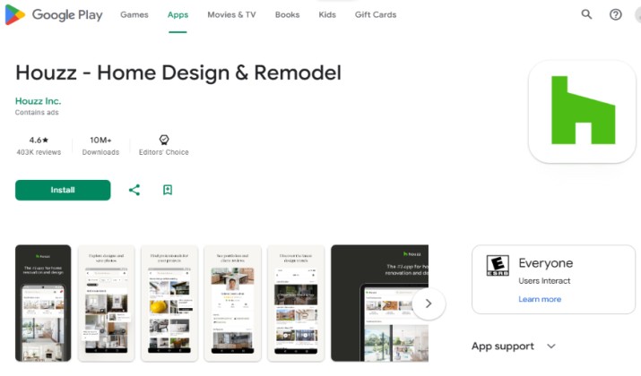
Logo: Bold lime-green H on white
Category: Home & Interior Design
What the H stands for: Home, House, Haven
Houzz has owned the green H for over a decade, and it’s still the most powerful H in the home space. What started as a photo-sharing site for designers is now a full construction management platform.
Thanks to its full suite of AI tools, you can now take a photo of your living room, use the Sketch feature to drop in products from the Houzz Marketplace, and instantly see how a new sofa would look.
For professionals, Houzz Pro includes estimates, invoices, 3D floor plans, mood boards, and client collaboration, all from your iPad.
Why the logo works: Green means growth, renewal, and freshness. The thick, blocky H feels like a doorway or a house frame. It’s trustworthy and modern.
For anyone dreaming of a renovation, that green H feels like the first step to a dream home. With over 20,000 ratings and a win as Google’s Best App, it’s not going anywhere.
Pro Tip: Use the “View in My Room” AR filter before you buy anything.
Also read: Fascinating Apps to Explore
2. History
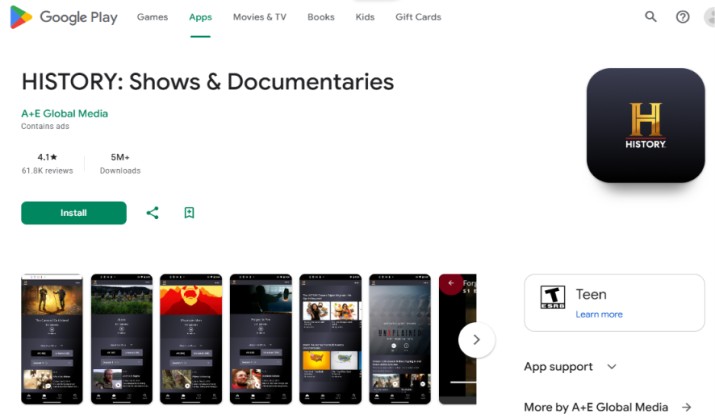
Logo: Gold textured H on black
Category: Education & Streaming
What the H stands for: History, Heritage
This is the official app for The History Channel, owned by A&E Networks. If you love documentaries, this H is a goldmine.
You can stream full episodes of Ancient Aliens, The Curse of Oak Island, Pawn Stars, Vikings, and hundreds of original documentaries without a cable login for many titles.
The app is organized by era such as Ancient, Medieval, and Modern, so you can binge by time period.
Why the logo works: The gold-on-black combination looks like a museum plaque or an old book cover. It instantly communicates authority, timelessness, and premium storytelling.
Unlike other streaming apps that feel disposable, the History H feels like a library. It’s not just entertainment; it’s a learning tool that parents and teachers trust.
Pro Tip: The app lets you download episodes for offline viewing on flights.
3. Hopscotch
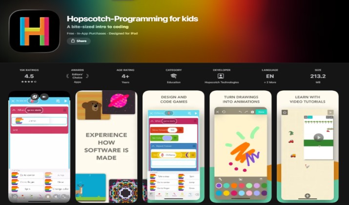
Logo: Colorful, bouncy multicolor H
Category: Kids Education
What the H stands for: Hopscotch, Hands-on Learning
Hopscotch is the app that makes coding feel like playing. Designed for kids ages 8-16, it replaces complex text code with bright visual blocks you drag and drop.
Kids can create their own games, animations, and stories, then publish them for the Hopscotch community to play. The concept is “hopping” from one level of learning to the next, which is exactly what the name means. It’s been featured by Apple in Education and is used in over 20,000 schools.
Why the logo works: The H is rounded, bubbly, and changes colors. It doesn’t feel intimidating like most coding apps. It signals play, creativity, and approachability. For parents tired of mindless games, this H represents productive screen time.
Pro Tip: Start with the “Make a Monster Dance” tutorial. Most kids finish their first game in 15 minutes.
Explore: Free Educational Apps for Kids
4. HuffPost
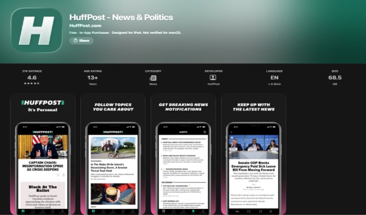
Logo: Minimalist blocky H
Category: News
What the H stands for: Headlines, Honesty
Formerly The Huffington Post, HuffPost is now part of BuzzFeed, Inc. but its iconic H remains one of the most recognized news icons on any home screen.
The app focuses on speed and clarity. You get breaking news alerts, politics, opinion pieces, lifestyle, and long-form features. Unlike news aggregators, all content is from HuffPost’s own global newsroom. In a crowded news market, its minimalist design is its superpower — no clutter, just the story.
Why the logo works: A thick, black, newspaper-style H conveys seriousness, heritage, and boldness. It doesn’t need a fancy symbol. That single letter says “we have the headline.” It stands out among colorful apps because it’s so stark.
Pro Tip: Turn on “My Topics” to filter out politics and only get Good News and Life sections.
5. Hotels.com
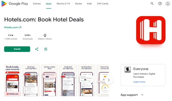
Logo: Red square with a single white H
Category: Travel
What the H stands for: Hotels, Hospitality
This is one of the purest H logos in travel. The app icon is nothing but a bold white H on a bright red background. No words, no extra symbols, just the letter.
Hotels.com is one of the most downloaded travel apps in the world, with over 100 million downloads. You can search and book from millions of properties worldwide, from boutique hotels to large resorts.
Its standout feature is the rewards program. You get a free reward night for every 10 nights you stay. The app also offers secret prices for members, free cancellation on most properties, and a price match guarantee.
Why the logo works: The red background creates a sense of urgency and excitement, like a great deal you should grab right now. The single white H is incredibly clean, bold, and readable even at a very small size on your home screen. It doesn’t need to spell out the whole word. That one letter alone instantly tells you this is about finding a hotel. For travelers, that little red square means a place to stay is always within reach.
Pro Tip: Always check the app for “Secret Prices.” These are app-only deals that can be up to 30% cheaper than the public price on the website, especially for last-minute bookings.
6. Hevy
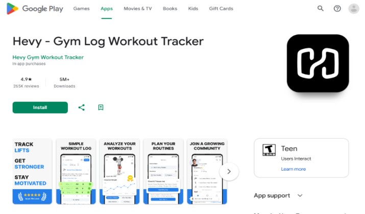
Logo: Black and white H on black background
Category: Health & Fitness / Strength Training
What the H stands for: Heavy, Hard Work
If you lift weights, you probably have this H on your home screen. Hevy is the number one workout tracker for strength training, with over 5 million downloads and a 4.9 rating from 200K+ reviews.
The app was built specifically for the gym. You can start a workout in one tap, add exercises from a library of 400+ movements with HD video demos, log your sets and reps, and it automatically calculates your total volume, personal records, and which muscle groups you hit that week.
It also has a built-in plate calculator, rest timer, and superset support. You can follow routines from pro bodybuilders or create and share your own.
Why the logo works: The black H is bold, heavy, and minimalist. It looks like a top-down view of a dumbbell or a weight plate. It feels strong and no-nonsense, exactly how gym culture likes it.
Pro Tip: Use the “Muscle Group Frequency” chart. It shows if you’re skipping legs or overtraining chest, the number one mistake beginners make.
7. Hinge
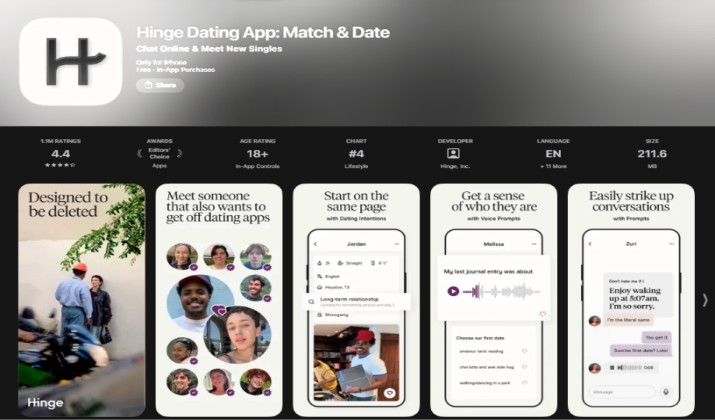
Logo: Black stylized H on white
Category: Dating / Relationships
What the H stands for: Human, Hope, Honest Connection
Hinge is now bigger than Tinder among Gen Z and millennials looking for relationships. Its tagline is “Designed to be Deleted” and it is owned by Match Group. In 2026, it led the US Dating App AI Visibility Index ahead of Tinder.
Unlike swipe-only apps, Hinge makes you engage with content. Every profile has three photo prompts and three written prompts like “Dating me will look like…” or “My Love Language is…” You have to comment on a specific photo or answer to start a conversation.
It also has voice prompts, video prompts, and Rose features for standout likes. The algorithm learns what you like and its “Most Compatible” feed gets smarter every day.
Why the logo works: The black stylized H on a white background is sophisticated and magazine-like. It doesn’t look like a hookup app with neon colors. It looks intentional and grown-up, which matches its mission for authentic connection.
Pro Tip: Don’t just Like a photo. Comment on their prompt. Profiles with comments get 3x more responses.
You might like this: Dating Apps Like Hinge
8. Happn
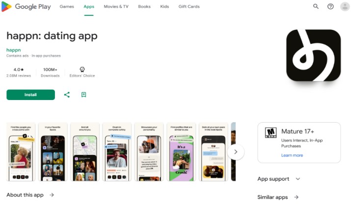
Logo: White, stylized, small H on a black background
Category: Dating / Social Discovery
What the H stands for: Happenstance, Here
Happn is built for serendipity, and it has found a strong niche among users. With over 140 million global users, it is one of the most downloaded dating apps in the world.
The concept is simple in its romanticism: the app shows you people you have literally crossed paths with in real life. That person you saw at Whole Foods, at the gym, on the subway, or at a coffee shop in SoHo. If they also have Happn, they appear in your timeline.
Your exact location is never revealed, only the general area where you crossed. If you both Like each other, it’s a Crush and you can chat. If not, they never know.
Why the logo works: The small H is friendly, modern, and optimistic. It often has a small tail that looks like a location pin or a speech bubble, tying together location and conversation. In a market tired of random swipes, this H promises something real and local.
Pro Tip: Check CrushTime. It’s a daily game that shows you four people you crossed paths with and you have to guess who liked you. It’s the fastest way to get matches.
9. Honey by PayPal
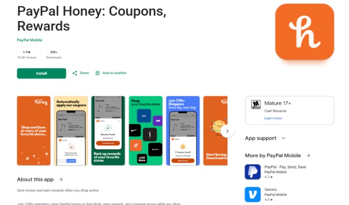
Logo: White H on orange background
Category: Shopping / Finance
What the H stands for: Honey, Help Save Money
This is the H that saves money. Honey, owned by PayPal, is one of the most installed shopping extensions, with over 10 million users on Chrome and a top-rated mobile app.
The concept is dead simple: when you check out on 30,000+ such as Amazon, Target, Best Buy, or Sephora, Honey automatically scans the internet for coupon codes and applies the best one.
The mobile app also has Droplist, where you save a product and Honey notifies you when the price drops, and you can earn Honey Gold that converts to PayPal cash.
Why the logo works: The orange is cheerful and deal-driven, like a sale sticker. The cursive H with makes it sweet and memorable. On a checkout page, that orange H means you’re not overpaying. It has built massive trust in a market tired of fake coupon sites.
Pro Tip: Combine Honey with your cashback credit card. Honey finds the coupon code, your card gives you 2% cash back. You double dip on every purchase.
10. Homary
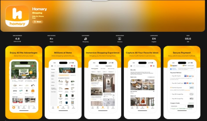
Logo: White H on orange background
Category: Shopping / Home Improvement
What the H stands for: Home, Harmony
Homary is one of the fastest-growing furniture e-commerce apps, competing directly with Wayfair and Article but with a more curated, design-forward approach.
The app specializes in affordable luxury such as modern sofas, LED bathroom mirrors, solid wood dining tables, kitchen faucets, and outdoor sets.
Its killer feature 3D AR: point your iPhone at your living room and see how a 7-foot sofa actually fits. It also has daily flash sales up to 70% off and an “Open Box” section where returned items in perfect condition sell for half price.
Why the logo works: The white H is architectural and premium, like a floor plan or a designer logo. It feels upscale and modern, matching its target audience of millennial homeowners who want West Elm style without the markup. On an orange background, it looks like a luxury fashion brand.
Pro Tip: Always check Open Box first. Most items are customer returns with original packaging and carry the same warranty.
Read this too: Best Websites for Used Furniture
11. HackNotice
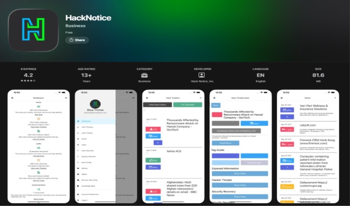
Logo: H overlapping with N on a dark background
Category: Cybersecurity / Privacy
What the H stands for: Hack, Hacked, Help
This is the H that protects your identity. It is a cybersecurity app that has become essential as data breaches hit record highs. The app monitors the dark web and public breach databases for your email, SSN, and passwords.
When a company like AT&T, Ticketmaster, or Change Healthcare gets breached, HackNotice instantly alerts you that your data was included and tells you exactly what was leaked and what to do next. It also has a real-time breach tracker and a password strength monitor.
Why the logo works: The overlapping H and N forms a lock-like shape. The H is bold and tech-forward, while the overlap suggests protection and connection. On a dark background, it looks like a security badge on your home screen, vigilant and modern.
Pro Tip: Add all your old email addresses, not just your main one. Most people have had at least one old Yahoo or MySpace email breached.
Check this out: Different Types of Hacking
12. Hacker by RNK Games
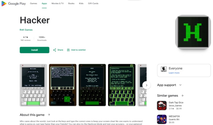
Logo: Glowing green H on black
Category: Gaming / Puzzle / Cyber Simulation
What the H stands for: Hacker, Hacktivism
This is the H for gamers who love cyberpunk. Hacker by RNK Games is a hacking simulation puzzle game that has stayed in the US top 100 Puzzle Games for over 3 years.
You play as a hacker solving terminal-based puzzles, cracking passwords, tracing IPs, and infiltrating servers. There is no mindless tapping. You actually type Linux-like commands, decrypt files, and complete missions for clients. The story mode includes corporate espionage, activist missions, and dark web jobs.
Why the logo works: The glowing green H on a pure black background is instantly recognizable as hacker culture, like the Matrix code. It looks like a terminal cursor. It doesn’t need extra art. That single glowing H tells you exactly what you’re getting: intrigue, code, and mystery. It stands out among colorful game icons.
Pro Tip: Play with headphones. The game has custom keyboard sounds and ambient server room audio that makes the puzzles much more immersive.
13. hair2hair
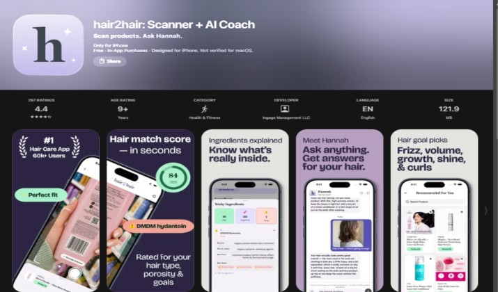
Logo: Stylish lowercase h
Category: Beauty / Hair & Wigs
What the H stands for: Hair, High Style, Help
This is the H for beauty and self-expression. hair2hair is a specialized beauty app focused on wigs, hair extensions, and hair care, serving a large and loyal audience looking for protective styles and fashion hair.
The app offers thousands of wig plus extensions, hair care products, and tutorials. You can filter by texture, length, color, and cap size, and see real customer photos and videos.
It also has a Hair Care Tracker that builds a personalized routine based on your hair type and goals, whether you are battling frizz, seeking volume, or growing out damage.
Why the logo works: The lowercase h is vibrant, feminine, and stylish, not clinical. It turns a simple letter into a symbol of transformation. For many users who see hair as identity and confidence, that little h means empowerment and choice.
Pro Tip: Use the “Try On” filter. You can upload a selfie and see how different wig colors and lengths look on you before you buy.
14. H-Hotels.com
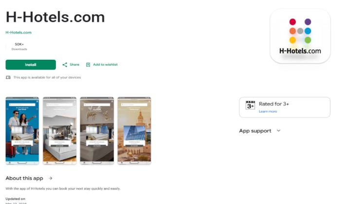
Logo: Multi-colored H-shaped logo
Category: Travel / Hotels
What the H stands for: Hotels, Hospitality, Home
H-Hotels.com’s app icon is a pure H-only icon, but it’s built from multiple colors forming the shape of an H.
The platform focuses on hotels across Germany and Europe, with growing US availability. You can book across its own brands like H4 Hotels, H2 Hotels, and H+ Hotels, earn loyalty points, access detailed hotel guides, and get app-only rates.
While smaller in the US than Hotels.com, its branding is a great example of how a single letter can be made vibrant and distinctive just with color.
Why the logo works: The multi-colored H feels lively, diverse, and welcoming — like different hotels and experiences coming together to form one brand. It doesn’t look corporate or boring. For travelers browsing a home screen full of solid-color icons, that colorful H stands out instantly and signals variety.
Pro Tip: If you travel to Europe often, the H-Hotels app has better rates for its own properties than Booking.com or Expedia.
Conclusion: One Letter, Different Worlds
The letter “H” has found its place across industries.
Why? Because it’s bold, simple, versatile and can be easily customized to make beautiful logo designs.
The “H” can stand for health, hospitality, happiness, home, or even happenstance.
No matter the meaning, brands use it as a visual shortcut for trust, recognition, and identity.
Next time you unlock your phone, take a look, you’ll likely see more “H” apps than you realized. It’s proof that even one letter can carry entire worlds of meaning.
Enjoyed the post?