
There’s something undeniably charming about a child’s handwriting.
The slightly uneven letters, the innocent imperfections, and the playful energy that radiates from each word.
If you’re into creating educational materials, designing birthday invitations, crafting personalized greeting cards, or working on projects that need that authentic childhood touch, consider these fonts.
They are some of the finest fonts on MS Word that beautifully capture the essence of children’s handwriting.
Take a look.
Also Read: Best Fonts That Look Like Rope
1. Comic Sans MS
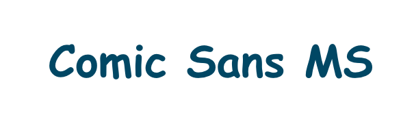
Comic Sans MS remains one of the most recognizable fonts that mimics children’s handwriting, despite its reputation in professional circles.
Originally designed to replicate the casual lettering found in comic books, this font features rounded, friendly characters with slightly irregular spacing that naturally evokes the feel of a child’s careful penmanship.
Its informal appearance makes it particularly effective for educational materials, children’s book covers, and any project where you want to create an approachable, non-threatening atmosphere.
The letters maintain good readability while preserving that hand-drawn quality that makes text feel personal and inviting.
Also Read: Best Handwriting Fonts In Word
2. Kristen ITC
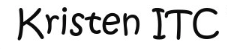
Kristen ITC perfectly captures the essence of teenage handwriting with its casual, slightly messy appearance that looks authentically hand-lettered.
The font features uneven baselines and varying character heights that mirror the natural inconsistencies found in young people’s writing.
Each letter appears to have been written with a felt-tip marker, complete with the subtle thickness variations and organic curves that make handwritten text so appealing.
This font works exceptionally well for projects targeting tweens and teens, informal invitations, journal-style designs, and any application where you want to convey authenticity and relatability.
Check Out: Best Signature Fonts In Word
3. Bradley Hand ITC
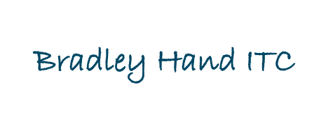
Bradley Hand ITC offers a more mature take on handwritten fonts while still maintaining that youthful, personal touch that makes it perfect for various applications.
The font strikes an excellent balance between legibility and character, featuring slightly slanted letters that appear to flow naturally from one to the next.
Its consistent letter spacing and well-proportioned characters make it highly readable while preserving the warmth and personality associated with handwritten text.
This versatility makes it ideal for everything from wedding invitations to educational worksheets, where you need both charm and clarity.
Check Out: Best Cursive Fonts In Word
4. Tekton Pro
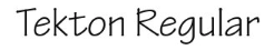
Tekton Pro is a property of Adobe but available to use on Word.
The font brings an architectural precision to handwritten fonts, mimicking the careful lettering that architects and designers use in their technical drawings.
While maintaining the personal quality of handwriting, this font features clean, geometric characters that appear both professional and approachable.
The letters have a slight slant and subtle weight variations that give them life and personality while remaining highly readable.
This unique combination makes Tekton Pro ideal for projects that need to appear both creative and credible, such as design presentations, artistic portfolios, and educational materials that require both clarity and character.
Also Read: Best Fonts For Memorization
5. Papyrus

Papyrus offers a more exotic take on handwritten fonts, with characters that appear to have been carefully carved or painted by hand on ancient parchment.
The font captures the same organic, child-styled quality that makes text feel personal and authentic.
The font’s distinctive texture and slightly irregular character shapes create visual interest while maintaining good readability.
Its unique appearance makes it perfect for creative projects, historical presentations, adventure-themed materials, and any design where you want to evoke a sense of ancient craftsmanship and human artistry.
Also Read: Easiest Fonts For Children Books
6. Chalkboard SE
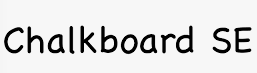
While primarily designed to mimic chalk writing on a blackboard, Chalkboard SE also effectively captures the feel of children’s handwriting, particularly the kind of careful lettering young students produce when writing on classroom boards.
The font features slightly rough edges and subtle texture variations that give it an authentic, hand-drawn quality.
Its bold, clear characters make it highly visible and easy to read.
This is why it works so well for educational presentations, playful signage, and any design where you want to evoke memories of elementary school classrooms and childhood learning experiences.
Explore: Best Google Doc Fonts That Look Like Blood
7. MV Boli
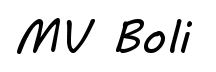
MV Boli presents a unique interpretation of handwritten text with its distinctive casual style that appears to have been written with a relaxed, confident hand.
The font features slightly rounded characters with subtle variations in weight and spacing that create the impression of natural, unhurried handwriting.
Its letters maintain a consistent baseline while incorporating gentle curves and organic shapes that give the text a warm, approachable feeling.
The font’s moderate slant and well-balanced proportions make it highly readable while preserving that essential handcrafted quality.
MV Boli works exceptionally well for personal correspondence, informal presentations, creative projects, and any application where you want to convey friendliness and authenticity without appearing too childish or unprofessional.
Also Read: Best Word Fonts For Coding
8. Cavolini
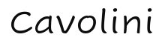
Cavolini captures the essence of playful, youthful handwriting with its bouncy, energetic character forms that seem to dance across the page.
The font features irregular baselines and varying character heights that mirror the natural exuberance found in children’s enthusiastic writing.
Each letter appears to have been written with joy and spontaneity, complete with subtle imperfections and organic curves that make the text feel alive and personable.
The slightly condensed letterforms and moderate spacing create good readability while maintaining that charming, hand-drawn aesthetic.
This font is perfect for children’s party invitations, playful signage, educational materials for younger audiences, and any project where you want to capture the unbridled creativity and happiness of childhood expression.
Also Read: Best Free Cursive Fonts On Canva
9. DotumChe
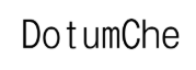
DotumChe offers a clean, modern take on handwritten fonts while maintaining the personal touch that makes handwriting so appealing to readers.
The font features well-proportioned characters with subtle rounded edges that soften the overall appearance and create a friendly, approachable feeling.
Its letters maintain consistent spacing and alignment while incorporating gentle curves and organic shapes that suggest natural pen movement.
The font strikes an excellent balance between legibility and character, making it suitable for both digital and print applications.
DotumChe works particularly well for contemporary design projects, casual business communications, educational materials, and any application where you need text that feels both modern and human, bridging the gap between digital precision and handwritten warmth.
Explore: PPT Fonts That Look Like Chalk
10. Segoe Print
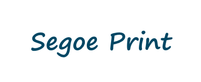
Segoe Print stands out as one of Microsoft’s most successful attempts at creating a digital font that truly looks handwritten.
The characters feature subtle variations in weight and positioning that create the impression of natural pen strokes, complete with the slight irregularities that make handwriting so distinctive.
The font maintains excellent readability across different sizes while preserving its handcrafted appearance, making it suitable for both headlines and body text.
Its clean yet personal aesthetic works particularly well for children’s materials, casual correspondence, and any project where you want to add a human touch without sacrificing professionalism.
11. Marker Felt
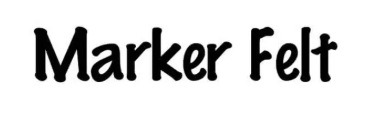
Marker Felt perfectly replicates the appearance of text written with a broad-tip marker, complete with the characteristic thickness and slightly rough edges that come from this writing instrument.
The font captures the enthusiastic, bold strokes that children often use when writing with markers, creating text that feels energetic and playful.
Its substantial weight and clear letterforms make it excellent for headlines, posters, and any application where you need text that commands attention while maintaining that youthful, hand-drawn appeal.
The font works particularly well for craft projects, children’s party materials, and casual design work.
Also Read: Canva Fonts That Look Like Calibri
Conclusion
The beauty of fonts that mimic children’s handwriting lies in their ability to humanize digital text, creating connections that sterile, perfect fonts simply cannot achieve.
Each of these ten Microsoft Word fonts offers its own unique interpretation of handwritten text,
The key is choosing the font that best matches your project’s tone and audience, ensuring that your message is not only clearly communicated but also emotionally resonant.
Enjoyed the post?


