
Looking for the best Power BI dashboard examples to simplify data-driven decision-making? You’ve landed on the right page.
Whether your data is in Excel or a complex cloud-based warehouse, business intelligence & data visualization tools like Power BI transform it into easily digestible, actionable insights.
In this guide, we’ll be walking you through 15 best Power BI dashboard examples that simplify decision-making, improve KPIs, and empower teams.
Let’s get started.
Best Power BI Dashboard Examples to Elevate Your Data Visualization
1. Customer Analysis Power BI Dashboard
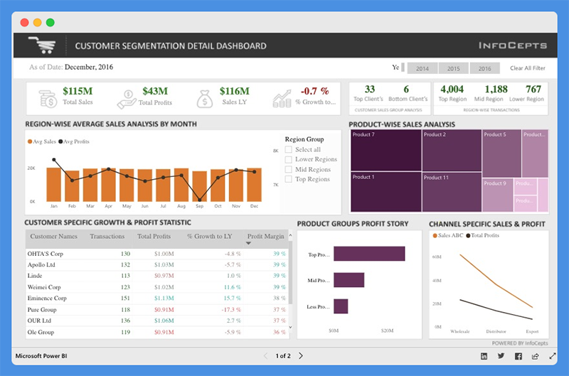
The Customer Analysis Power BI Dashboard offers valuable insight into product sales and profit for regional customers.
Managers and business leaders can use this Power BI dashboard to analyze business growth across regions.
They can evaluate profit distribution across customers, make valuable decisions to increase revenue, and drive profitability.
What Does this Dashboard Show?

This dashboard provides details about total sales, total profits, last year sales, and percentage growth. You can use the filters to view data for different years. With this dashboard, managers can gain key insights into:
- Product-wise sales analysis
- Customer-specific growth and profit statistics
- Channel specific sales and profits
Customers can use charts to:
- Compare total sales and profit margins
- Analyze client segmentation and product performance
People’s Response
- The icons and color combinations are excellent
- The dashboard is useful for sales and marketing teams
You Might Want To Read: Best Tableau Sales Dashboard Examples
2. Airport Authority Performance Power BI Dashboard

The Airport Authority Performance Power BI Dashboard gives a clear and user-centric view of all critical data which allows the authorities to make data-driven decisions, such as:
- Flight changes
- Emergencies
- Delays
What Does this Dashboard Show?
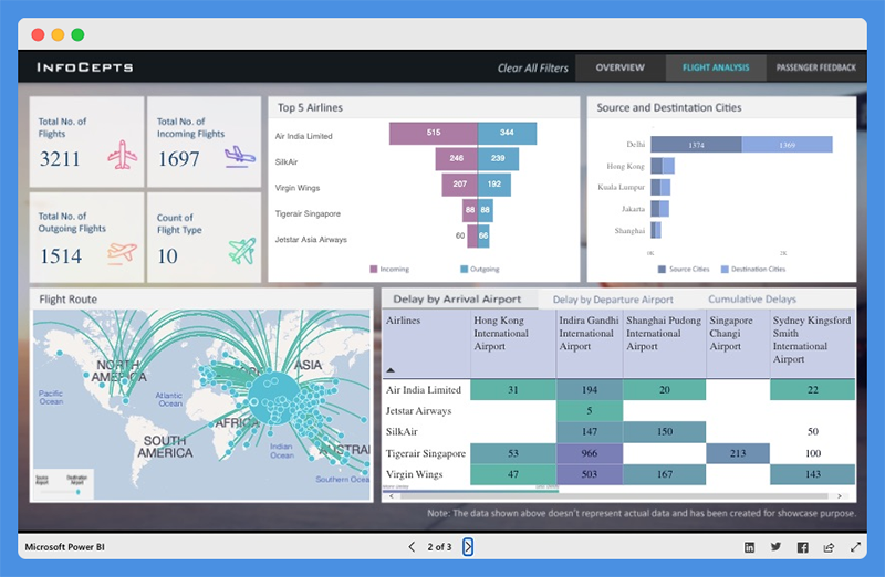
This Power BI dashboard overview offers quick insight into critical key metrics including:
- Total flights (incoming and outgoing flights)
- Total delays (arrivals and departures)
- Ground handling time – Queuing, Processing, and Clearance time
- Passengers satisfaction index
By using this dashboard, users can study the most popular flight routes, and the top airlines for incoming and outgoing flights. The dashboard also provides data about the source and destination cities of major airlines.
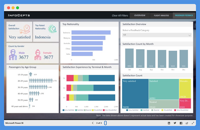
The Power BI dashboard also features a passenger feedback section and offers an insight into:
- Number of passengers by gender and age group
- Top Nationality
- Satisfaction experience based on terminal and month
- Total satisfaction count and more
The dashboard can help airport authorities to:
- Evaluate operational processes
- Discover bottlenecks
- Identify areas for improvement
People’s Response
- The dashboard offers detailed actionable insights into airport operations activities.
- Page backgrounds are neat and engaging.
Explore: Best Tableau Courses
3. Global Superstore Retail Power BI Dashboard

The Global Superstore Retail Power BI Dashboard offers a 360-degree view of overall sales performance. Managers can use this Power BI dashboard to set performance targets, track KPIs, and more.
What Does this Dashboard Show?
The dashboard has a single-screen display and offers actionable insights into key elements. Users can view detailed analyses and information including:
- Total sales, profit, and profit ratio
- Sales by country
- Sales by category and subcategory
- Total sales by city and more
People’s Response
- The dashboard highlights critical information in an easy-to-understand view.
- The dashboard looks professional and offers a plenty of key insights.
Worth Reading: Best Tableau Retail Dashboard Examples
4. Cancer Analytics Power BI Dashboard
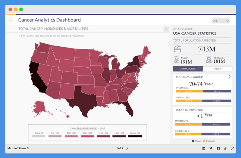
This Power BI dashboard shows analysis on cancer patients in the USA. Using the dashboard, health agencies can:
- Make informed decisions
- Establish policies to manage cases and track recoveries
What Does this Dashboard Show?

The Cancer Analytics dashboard shows total cancer cases and mortalities. Users can view the population affected, and the number of people affected based on demography and area.
The dashboard helps you understand cancer cases and mortality rates associated with various cancer types. You can hover over any state to find out the number of affected people.
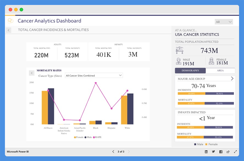
People’s Response
- The dashboard is intuitive and visually appealing.
- The color scheme is good resulting in clear depiction of data and trends.
5. Pharma Sales Analysis Power BI Dashboard
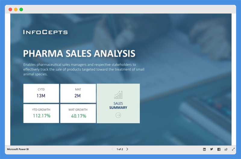
The Pharmaceutical Sales Analysis Dashboard provides an overview of sales for veterinary products. Veterinary professionals can use this chart to track the sales of their products.
What Does this Dashboard Show?
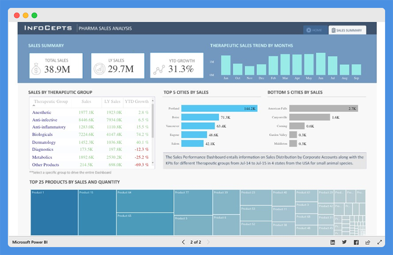
Using the dashboard, sales managers can track product sales for top cities along with cities that are at the bottom of the list. Users can view extensive reports on:
- Sales by Therapeutic Group
- Top 25 Products by Sales and Quantity
- Therapeutic Sales Trends across any given period
People’s Response
- Interactive with good visual interpretation
6. HR Analytics Power BI Dashboard

The HR Analytics Dashboard offers a bird’s eye view of a company’s human resource key metrics including:
- Headcount statistics
- Financial performance & statistics
- Demographic statistics
- Employee details
With this dashboard, organizations can make critical decisions to drive employee productivity.
What Does this Dashboard Show?
The Power BI dashboard provides data insights into headcount statistics. Under the tab, managers can view:
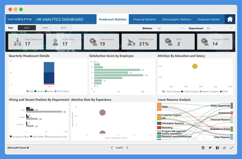
- Total Headcount
- Active Employees
- New Joiners
- Attrition Rate
- Satisfaction Score by Employee
- Attrition Rate by Education, Salary, and Experience
The dashboard also shows demographic statistics including:
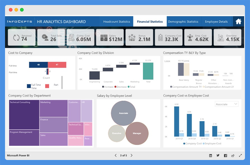
- Employee by Location and Demography
- Quarterly Employee Headcounts by Departments
- Total Absenteeism by Department and Leave Type
The chart also offers a representation of finances.

- Cost to Company (CPC),
- Company Cost by Division and Departments
- Compensation, Salary, Bonus, Overtime, and more
It also gives an overview of each employee, including:
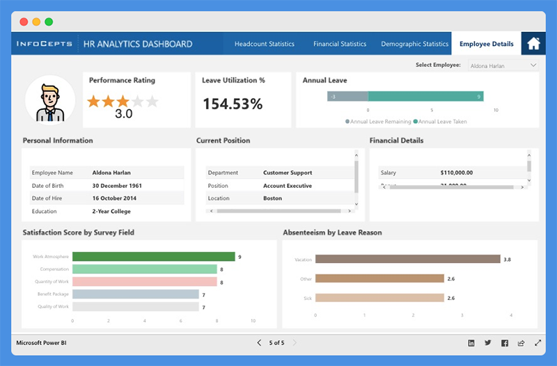
- Performance ratings
- Annual leave report
- Personal information
- Financial performance & details
- Current position
- Absenteeism report
People’s Response
- Reports and visualizations are pixel perfect.
- The dashboard color theme is visually appealing.
7. Executive Insights Power BI Dashboard
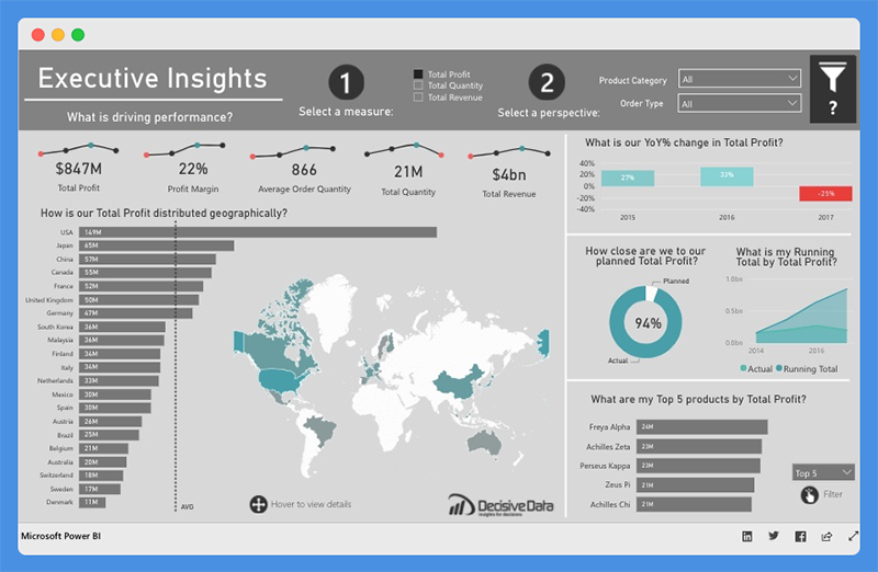
This Power BI intelligence dashboard sheds light on business health and performance. Companies can use this dashboard to explore department-wide data for decision making.
What Does this Dashboard Show?
The Executive Insights dashboard allows companies to view their businesses from multiple angles based on attributes including:
- Products
- Year
- Country
- Order type
The dashboard depicts line graphs, donut charts, and custom analysis. Companies can use filters to get information on specific business parameters like total profit, quantity, and revenue. They can also gain insights on:
- Profit margin
- Average order quantity
- YOY percentage change in Total Profit
- Top five products by Total Profit, Total Quantity, and Total Revenue
- How Total Profit, Total Quantity, and Total Revenue is distributed geographically
The tool allows users to dig deeper and view company performance based on specific product types.
People’s Response
- The dashboard looks organized and professional.
- Clear and easy to understand
8. Electricity Energy Usage and Cost Power BI Dashboard
This Power BI dashboard shows the data for United States Electricity Supply and Cost. It can help users to estimate the energy utilization for their appliances.
Using this dashboard, users can monitor their power consumption and take necessary steps to reduce costs.
What Does this Dashboard Show?
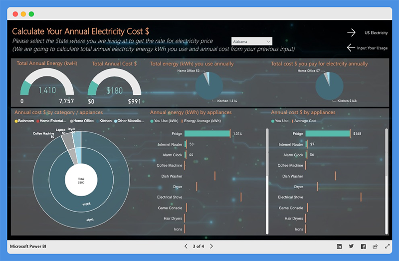
Users can calculate the usage by selecting the appliances they use and how much time each appliance is run each day. They can choose their state or location to estimate the cost of their electricity bill. The dashboard showcases the following:
- Total Annual Energy (kWh)
- Total Annual Cost ($)
- Annual Costs by Category or Appliance
- Annual Energy by Appliance
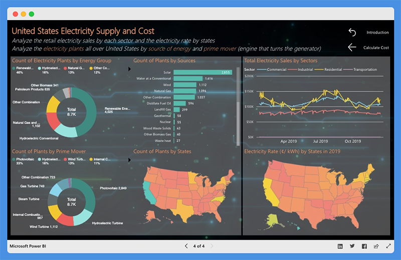
The dashboard also gives a summary of:
- Total Electricity Sales by Sector
- Count of Plants by Sources, Prime Movers, and Energy Group
People’s Response
- Use of right graphs and chart types
- The presentation is easy-to-understand.
9. Inventory Stock Analysis Power BI Dashboard
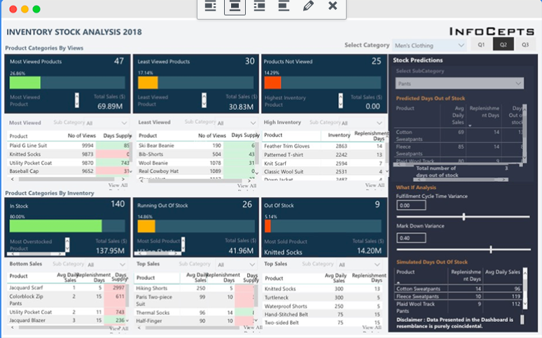
The Inventory Stock Analysis Dashboard provides insights on stock. Companies can track their stock and replenish products if needed.
What Does this Dashboard Show?
The dashboard is broadly categorized into:
- Product Categories by Customer Views and Inventory
- Category Selection – Men’s clothing and Women’s Clothing
- Quarters – First, second, and third quarters
Product Categories by Views are further classified into
- Most Viewed
- Least Viewed
- Products Not Viewed
You can also view Total Sales in USD and percentage-based classification. Product Categories by Inventory are classified into
- In Stock
- Running Out Of Stock
- Out of Stock
For each category, the top five products, number of views, days’ supply, and replenishment days are clearly outlined.
This dashboard also offers insights on Inventory. It divides the top five products into individual categories and segments them into Overall Percentage and Total Sales.
The dashboard offers a stock prediction section. Users can select product subcategories and get data on Average Daily Sales, Replenishment Days, and Days Out of Stock.
You can predict Time to Replenish Stock and Stock Availability based on factors like MarkDown Variance and Fulfillment Cycle.
People’s Response
- Intuitive & detailed
10. Sales Scorecard Power BI Dashboard
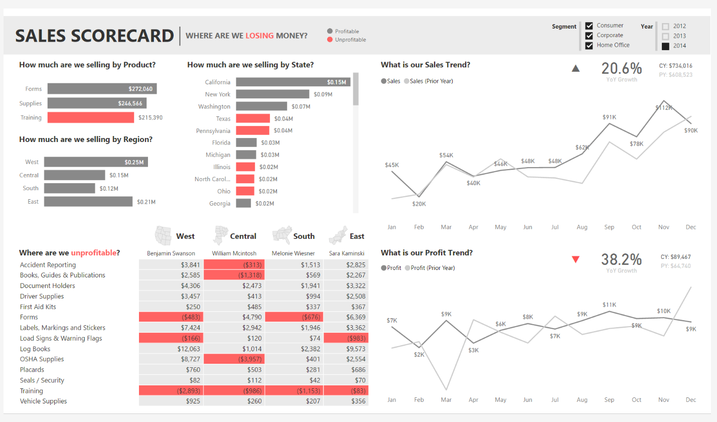
The Sales Scorecard dashboard helps organizations answer critical questions about sales performance.
It effectively leverages Power BI elements, including shapes, cards, treemaps, and DAX, to depict key performance indicators.
What Does this Dashboard Show?
This sales dashboard provides vital insight into how much companies are selling per state, region, and product. You can view sales and profit in comparison to previous years to put sales performance into perspective.
It also shows the cost components that are driving profits or losses. You can also filter according to year and business segments.
People’s Response
- The dashboard is interactive and easy to understand.
- It isn’t flashy, without the use of too many colors.
11. Social Media Monitoring & Analytics Power BI Dashboard
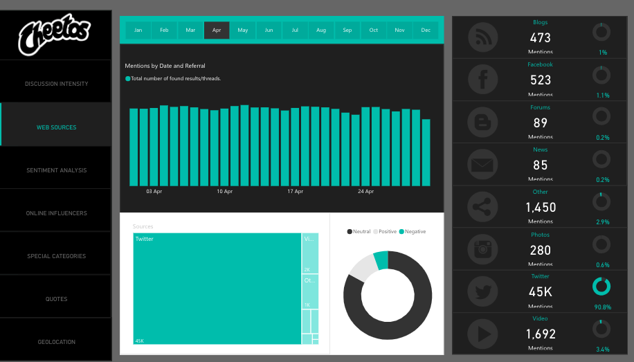
This analytics dashboard is great for marketers, managers, and agencies. With the Social Media Monitoring and Analytics dashboard, you can improve sales, product quality, and crisis control. The tool helps organizations understand the audience’s opinion about their product.
What Does this Dashboard Show?
This Power BI analytics dashboard shows monthly data focuses on aspects of social media including
- Discussion Intensity
- Web Sources
- Sentiment Analysis
- Online Influencers
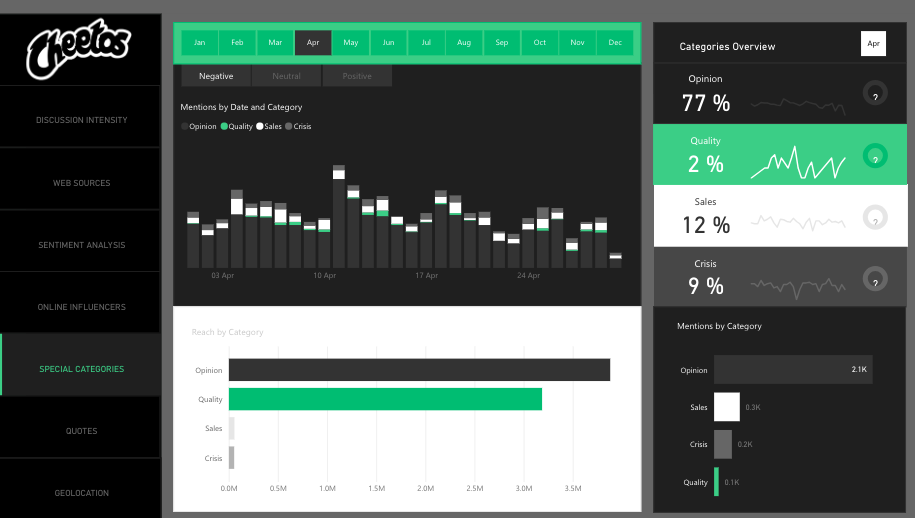
- Special Categories
- Quotes and Geolocation
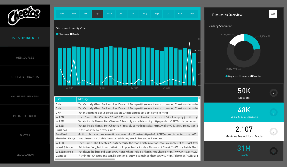
The Discussion Intensity tab offers critical insight into total reach, mentions on social media, and beyond social media. The chart also shows influencers by volume and impact, amplification, and true reach.
The sentiment analysis highlights User’s Mentions by Day, Hour, and Total mentions. Users can also view the percentage of negative, positive, and neutral mentions.
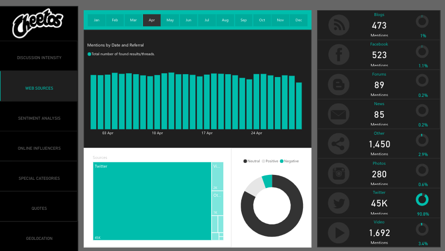
Web sources show the channels from which the mentions emanated, including:
- Blogs
- Photos
- Videos
With this analytics dashboard, users can view positive and negative mentions based on geolocation, including regions and cities.
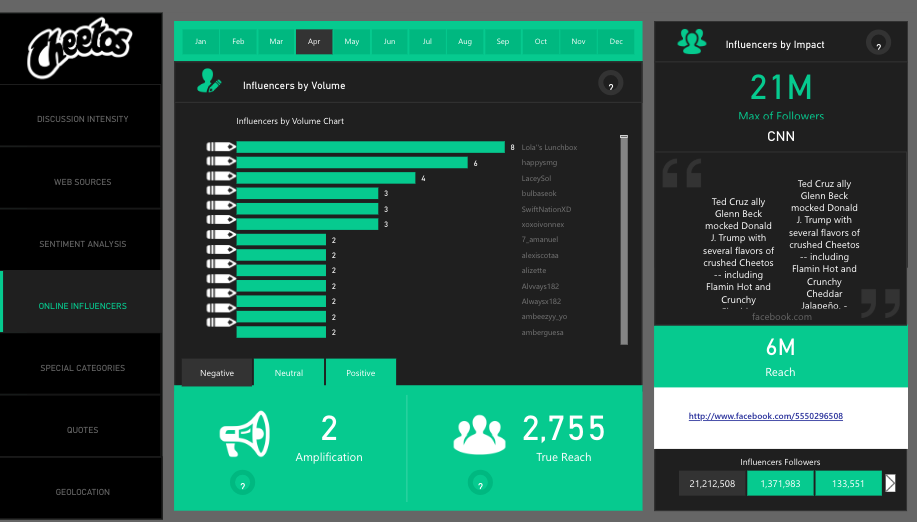
Under the online influencer section, you’ll find influencers broken down by volume and impact across the months of the year. It also shows a breakdown of the influencer’s follower numbers impact, whether it’s negative, positive, or neutral.
People’s Response
- The dashboard is stunning and offers critical insight.
- Beautiful dashboard design
12. Team Performance vs. Target Power BI Dashboard
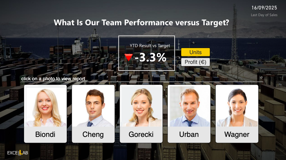
This Power BI dashboard serves as a dynamic command center for tracking how sales teams are performing against their assigned targets.
It blends high-level scorecards with deep-dive analytics, helping organizations understand not just whether goals are being met, but exactly where wins and gaps are happening.
Exploring the Data Layers
At the top level, it presents a complete snapshot of team-wide results, displaying cumulative progress toward yearly targets.
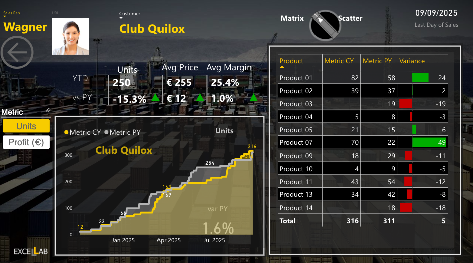
Each sales representative has a dedicated drillthrough page that reveals their personal metrics, from overall revenue and volume to margins, customer-level trends, and product sales history.
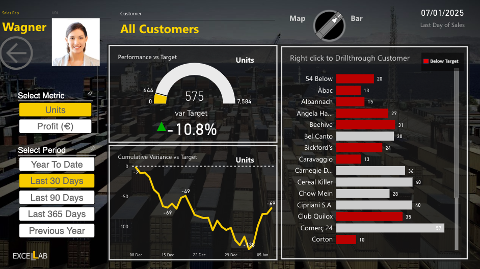
The customer analysis panels highlight which accounts are driving results and which are lagging, while the product-focused visuals compare current sales to previous periods—flagging shifts in pricing, units sold, and profit margins.
Interactive time filters let users switch between recent activity (30 or 90 days) and year-to-date summaries to uncover both short-term and long-term trends.
Ideal Use Cases
-
Sales Performance Tracking: Evaluate rep contributions in real time to support coaching and development.
-
Revenue Optimization: Identify high-value customers and products that deserve extra attention.
-
Account Management: Spot underperforming accounts early to prevent churn and create retention plans.
-
Strategic Planning: Feed reliable performance data into forecasts, territory plans, and resource allocation.
-
Incentive Design: Use granular data to shape incentive structures that align with actual performance.
Feedback
-
Smooth drillthrough navigation from team summaries to individual performance reports.
-
Comparative charts showing year-to-date results versus past years for context.
-
Visual signals (variance bars, KPIs, and trend lines) make it easy to see where performance is slipping or improving.
-
Clean layout and consistent visuals reduce noise and make analysis faster.
13. Attendance Tracker Power BI Dashboard
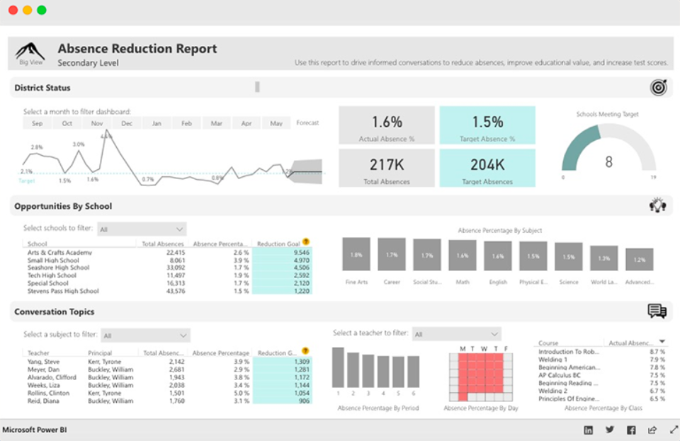
The Attendance Tracker Dashboard helps school administrators track attendance across different teachers, classes, and schools.
This attendance tracker dashboard will drive critical conversations and increased engagement between key stakeholders. With the reports from this dashboard, stakeholders can increase attendance and improve performance in the educational sector.
What Does this Dashboard Show?
The dashboard shows the Absence Percentage by Subject, Courses, Period, and Day. Users can gain insight into the percentage of Actual and Target Absence, Total Absences, and Target Absences.
The District Status section provides high-level insight into attendance trends and goals. The line chart highlights Actuals compared to Target over time. Plus, the chart offers a predicted range for future months.
The chart also shows data about Opportunities by School. This section will help administrators target the most critical schools to work with. The most critical schools have the highest opportunity for Absence Reduction.
The Conversation Topics section provides insight into relevant information such as subject, course, period, and days of the week.
With this data, school administrators can reach out to teachers on an individual basis and increase educational value.
People’s Response
- Excellent and Insightful dashboard for teachers and administrators.
- The dashboard provides valuable insights at a district level to create action and development plans for teachers, schools, and specific periods and subjects.
14. NFL Fantasy Football Player Comparison Power BI Dashboard
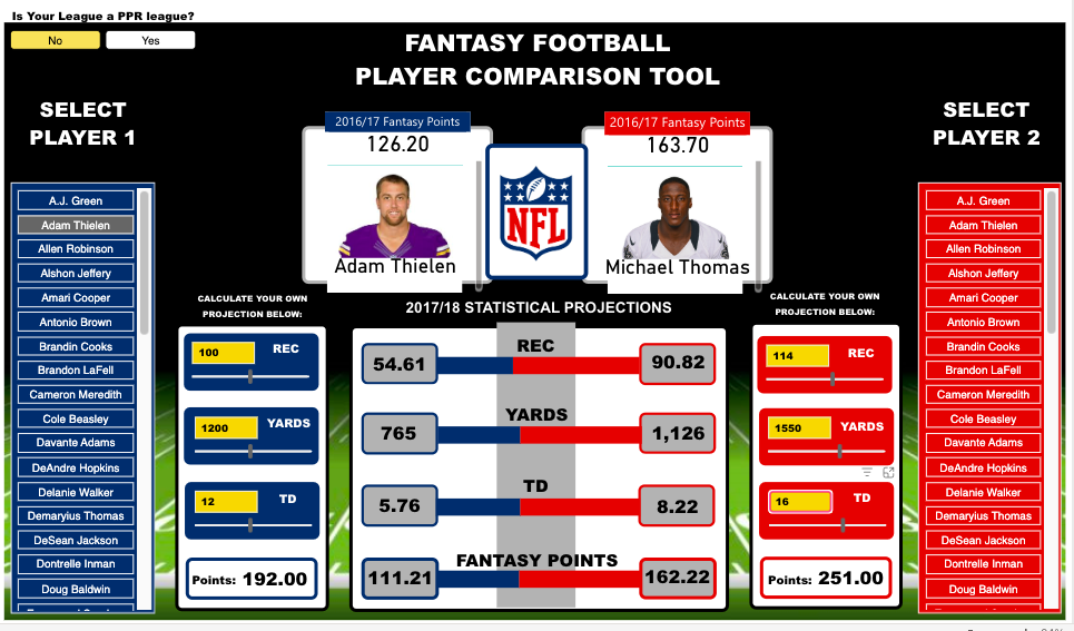
This Microsoft Power BI dashboard helps users prepare their fantasy draft for the new NFL season.
The dashboard draws its data from the NFL Fantasy Football player projection and the NFL player stats. Games and NFL enthusiasts use this dashboard to make accurate predictions and secure winnings.
What Does this Dashboard Show?
You can use this Fantasy football player comparison tool by selecting player one and player two from the lists provided. The Power BI report allows users to compare players by viewing critical players’ stats. You can view stats including:
- Total fantasy points for the previous season
- Projected receptions
- Yards and touchdowns for the upcoming season
- Current season’s NFL.com predicted points total
The dashboard includes “What Ifs” to allow the user to create their player projections. Under the sections ‘Calculate Your Projection,’ you can adjust the selected player’s receptions, touchdowns, and yards numbers to see how it will impact their overall fantasy points.
The scoring for this dashboard is based on the standard NFL.com fantasy scoring system.
Furthermore, this dashboard includes an option for PPR (points per reception) leagues. If your league is a PPR league, you can select ‘Yes’ in the top left corner. The overall points calculation will take into account the added points for each of the player’s receptions.
People’s Response
- Fantastic design layout
- Excellent use of the player images
15. Seattle’s Construction Climate Power BI Dashboard
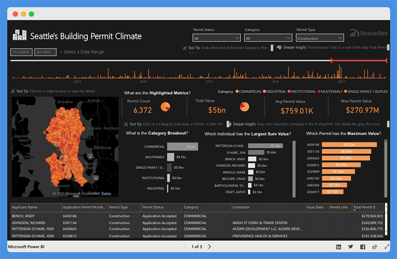
This Power BI dashboard visually captures and presents the growth of Seattle’s Construction industry. The dashboard is powered by data from the Seattle Building Permits dataset.
The building permit data offers profound insight and paints a clear picture of industry growth. It also provides a sneak preview into the future of Seattle’s construction climate.
USES
- Construction salespeople researching prospective sites
- Contractors investigating the competition’s strategy
- Managers and CEOs that are making critical decisions on how to pivot their business
Seattle’s Construction Climate dashboard provides a deeper understanding of the market. Also, it enables you to drill down into major details and research specific events.
What Does this Dashboard Show?
This dashboard is divided into three tabs. These tabs provide answers to critical questions.
For the Building Climate Overview Tab
- The top bar chart shows the increase in pace and amount of investment with time.
- The map highlights the investment concentration in specific locations. It also shows how the concentration is affected by Individual, Contractor, or Category.
- The Highlighted Metrics section provides insight into market status. It shows the Permit Count, Total Value, Average Permit Value, and Maximum Permit Value.
- The Middle Bar Chart shows categories that have the highest breakout. It also displays the individuals with the Largest Sum Value and Permits leading the market.
Contractor Competition Tab
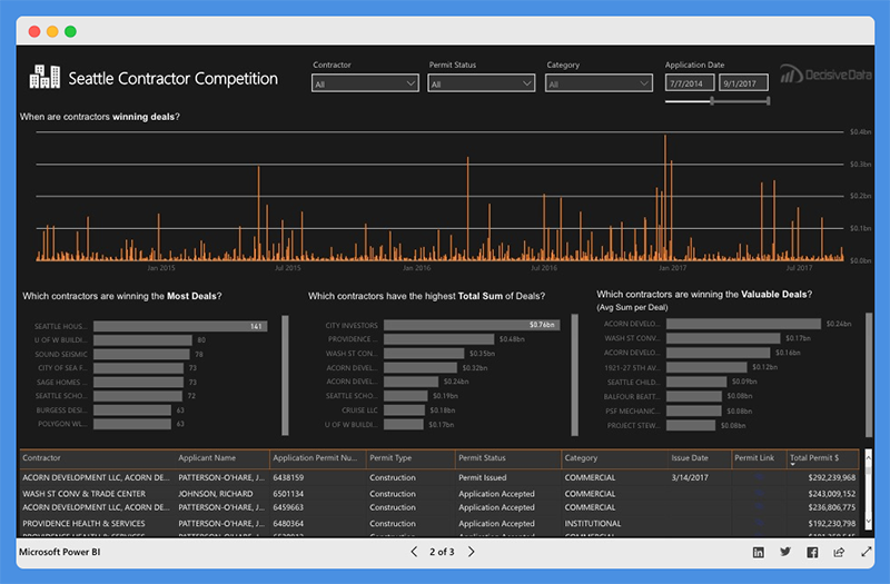
- The top line charts show the trending deal amounts and frequencies.
- The middle bar charts show contractors that are winning the most deals. It also shows which contractors have the highest Total Sum of Deals. You can also see which contractors are leading the market based on size, quantity, size, value
Category Growth Tab
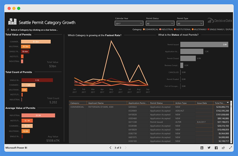
- The left bar chart showcases the Total Value of Permit, Total Count of Permits, and Average Permit Value for each category.
- The line chart shows which category at the fastest rate and total Value growth trend and permit status.
- The right bar chart shows the status of most permits.
This dashboard is easy to operate. You can select the parameters that fit your situation. Also, you can adjust the time frame using the top slider bar.
Dashboard Filterable Fields
The filterable fields in this dashboard include the
- Permit Status – Application, review, and inspection lifecycle
- Permit Type – This refers to Activities covered by the permit (Construction, Site Development, and Demolition)
- Category – Industrial, Commercial, Institutional, Single Family or Duplex, and Multifamily
- Contractors associated with a permit
People’s Response
- The dashboard shifts the focus from data complexities to the design elements and visual flow.
- The dashboard is attractive, intuitive, and easy to understand.
- Users can easily find critical insights and make decisions quickly.
16. Carbon Emission Dashboard
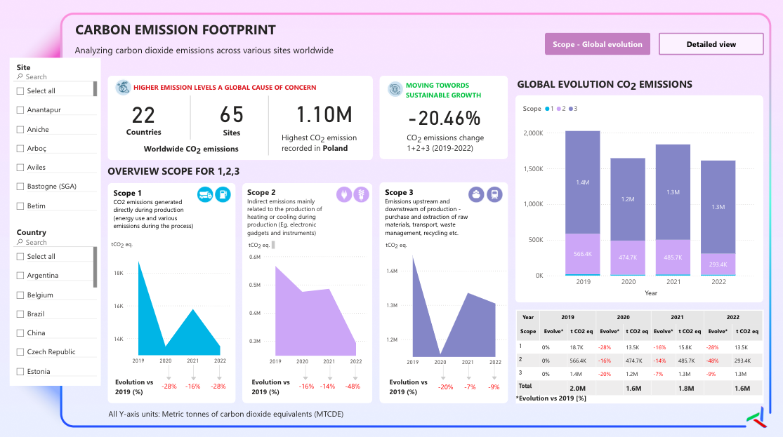
This Power BI dashboard views global carbon dioxide emissions across multiple dimensions and timeframes.
What Does this Dashboard Show?
The dashboard breaks down carbon emissions into three standardized scopes following GHG Protocol guidelines: Scope 1 (direct emissions from owned sources), Scope 2 (indirect emissions from purchased energy), and Scope 3 (all other indirect emissions in the value chain).
Each scope is visualized with trend lines showing evolution from 2019-2022, revealing an overall positive trend with a -20.46% reduction in total emissions.
The template displays both high-level KPIs and detailed breakdowns, including year-over-year percentage changes, absolute values in metric tonnes of CO2 equivalents (MTCDE), and comparative analysis across different geographical regions and time periods.
Uses (Verticals & Functions)
- Corporate Sustainability Reporting
- Government and Policy Making
- Supply Chain Management
- Investment and Finance
People’s Response
- Sophisticated Color Psychology
- Clean Scope-Based Visual Hierarchy
- Balanced Information Density
17. Delivery App Sales Dashboard
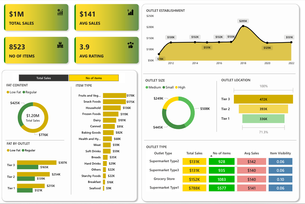
This Power BI dashboard shows a detailed overview of a delivery app sales performance across multiple business dimensions.
The template tracks total sales with average sale value covering the items sold.
What Does this Dashboard Show?
The dashboard analyzes sales trends from 2012 to 2022, showing outlet establishment growth peaking at $205K in 2018.
It breaks down performance by fat content (low fat vs regular), item categories (fruits/vegetables leading at $178K, followed by snack foods at $175K), and outlet characteristics including size (medium, small, high) and location tiers.
The visualization reveals that Tier 3 outlets generate the highest sales at $472K, while Tier 1 contributes $336K.
The template includes detailed outlet type analysis comparing supermarket types and grocery stores, with metrics covering total sales, number of items, average sales, and item visibility ratios across different establishment categories.
Uses (Verticals & Functions)
- Food Delivery Platform Analytics
- Retail Chain Performance Management
- Franchise Business Monitoring
- Supply Chain Optimization
- Market Penetration Analysis
People’s Response
- Gradient Color Scheme with Golden Accents
- Multi-Chart Integration with Consistent Visual Language
- Strategic Use of Donut Charts and Horizontal Bar Visualizations
18. Healthcare & Medical Analysis Dashboard
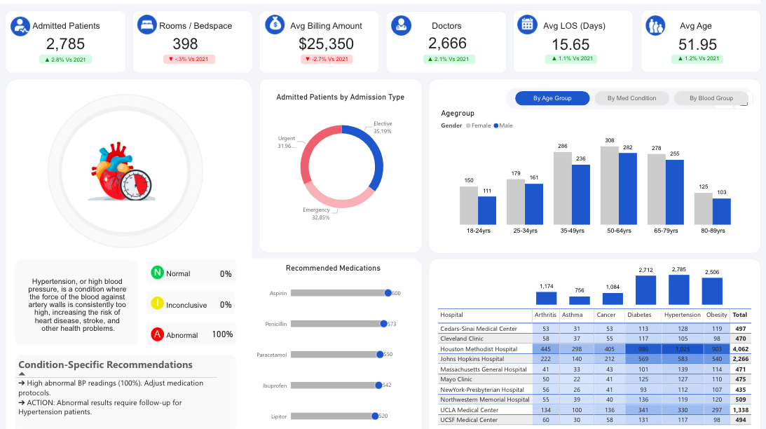
The dashboard depicts healthcare facility management system tracking key operational and clinical metrics.
What Does this Dashboard Show?
The template monitors admitted patients across rooms/bedspaces with average billing amount per patient.
The system tracks 2,666 doctors and maintains an average length of stay (LOS) of 15.65 days, with patients averaging 51.95 years of age.
It analyzes patient demographics by age groups, showing higher admissions in the 35-49 and 50-64 age ranges, with gender distribution tracking.
It categorizes admissions by type (elective 36.19%, urgent 31.4%, emergency 32.86%) and provides critical clinical decision support through blood pressure monitoring with 100% abnormal readings flagged for immediate attention.
The template includes a sophisticated medication recommendation system tracking drugs like Aspirin, Penicillin, Paracetamol, Ibuprofen, and Lipitor with dosage indicators.
It features a comprehensive hospital comparison matrix showing patient volumes across major medical centers, with Massachusetts General Hospital leading at 6,062 patients, followed by Johns Hopkins at 2,266 patients.
Uses (Verticals & Functions)
- Hospital Administration & Operations Management
- Clinical Decision Support Systems
- Healthcare Quality Assurance & Patient Safety
- Medical Resource Planning & Capacity Management
- Healthcare Analytics & Performance Monitoring
People’s Response
- Clean Medical-Grade Interface with Intuitive Clinical Icons
- Color-Coded Alert System for Critical Patient Indicators
- Comprehensive Multi-Hospital Benchmarking Visualization
19. Procurement Dashboard
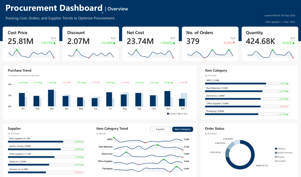
This one shows Procurement details shedding light on financial and operational metrics.
What Does this Dashboard Show?
The dashboard displays purchase trends with monthly comparisons showing year-over-year percentage changes, with notable performance indicators across different periods.
It categorizes spending by item types including MRO ($5.58M), Raw Materials ($5.24M), Electronics ($5.08M), Office Supplies ($5.04M), and Packaging ($4.89M).
The system tracks supplier performance with Beta Suppliers leading at $6.19M, followed by various logistics providers.
Order status is visualized through a donut chart showing delivery performance with 72.1% delivered orders and detailed breakdowns of pending, partially delivered, and cancelled orders.
Uses (Verticals & Functions)
- Corporate Procurement & Supply Chain Management
- Vendor Performance Monitoring & Evaluation
- Cost Control & Budget Management
- Purchase Order Tracking & Compliance
- Strategic Sourcing & Category Management
People’s Response
- Professional Dark Theme with High-Contrast Data Visualization
- Comprehensive Multi-Metric KPI Cards with Trend Indicators
- Intuitive Category-Based Horizontal Bar Charts with Performance Colors
20. Revenue & Profitability Dashboard
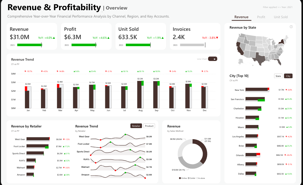
This dashboard focuses on financial performance, tracking revenue with profit and units sold across a certain number of invoices.
What Does this Dashboard Show?
It shows strong year-over-year growth with revenue up 4.0%, profit increasing 4.6%, and units sold growing 1.9%, though invoices declined by 3.8%.
The dashboard displays monthly revenue trends with detailed percentage changes, revealing seasonal patterns and performance fluctuations throughout the year.
It analyzes performance by retailer with West Gear leading at $6.2M, followed by Foot Locker ($7.8M) and Sports Direct ($6.2M).
The system includes geographical analysis showing revenue distribution across US states, with New York, San Francisco, and Charleston as top-performing cities.
Revenue is segmented by sales methods through a donut chart, and retailer trend analysis tracks individual performance trajectories for major accounts including Kohl’s, Walmart, and Amazon.
Uses (Verticals & Functions)
- Corporate Financial Performance Management
- Multi-Channel Retail Analytics & Optimization
- Geographic Market Analysis & Expansion Planning
- Retailer Relationship Management & Account Monitoring
- Revenue Forecasting & Business Intelligence
People’s Response
- Modern Dark Interface with Clean Financial Metrics Display
- Geographic Heat Map Integration for Spatial Revenue Analysis
- Multi-Dimensional Trend Analysis with Retailer-Specific Performance Tracking
21. Superstore Performance Dashboard
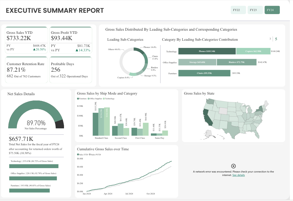
This executive-level Power BI dashboard delivers high-level business intelligence for superstore operations, presenting critical performance indicators including gross sales year-to-date with gross profit.
What Does this Dashboard Show?
The report demonstrates exceptional customer loyalty with an 87.21% retention rate across 682 customers out of 782 total, while maintaining 256 profitable operational days.
The visualization breaks down sales distribution across leading sub-categories, with Technology dominating market share, followed by Office Supplies and Furniture segments.
Geographic performance analysis reveals state-by-state revenue concentration through an integrated US map visualization.
The dashboard tracks shipping methodology effectiveness across different service levels (Standard Class, Second Class, First Class, Same Day) and monitors cumulative gross sales trajectory throughout FY24, showing consistent upward growth patterns from January through October 2024.
Uses (Verticals & Functions)
- C-Suite Strategic Decision Making & Board Reporting
- Multi-Location Retail Chain Performance Assessment
- Customer Lifecycle Management & Retention Analysis
- Supply Chain & Logistics Optimization
- Financial Planning & Annual Performance Reviews
People’s Response
- Executive-Grade Minimalist Design with Focus on Key Metrics
- Strategic Use of Gauge Charts and Geographic Heat Mapping
- Sophisticated Color Palette Emphasizing Professional Credibility
22. Sustainability Review Dashboard
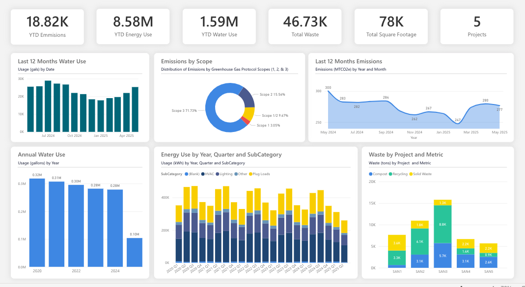
This sustainability-focused Power BI dashboard monitors comprehensive environmental impact metrics across organizational operations, tracking YTD emissions alongside energy consumption and water usage.
The platform oversees waste management across total square footage spanning active projects.
What Does this Dashboard Show?
The interface presents emissions categorization following GHG Protocol standards, with Scope 2 representing the largest portion at 58.4%, followed by Scope 3 at 29.7% and Scope 1 at 3.05%.
Monthly water consumption patterns reveal seasonal fluctuations with detailed gallons-per-date tracking, while annual water usage demonstrates declining trends from 2020’s peak of 2.32M gallons to 2024’s projected 1.70M.
Energy utilization analysis breaks down consumption by quarters and subcategories including Steam, HVAC, Lighting, and Plug Loads through comprehensive stacked visualizations.
Waste categorization distinguishes between Compost, Recycling, and Solid Waste across different project phases, providing granular visibility into sustainability performance metrics.
Uses (Verticals & Functions)
- Corporate Environmental Compliance & ESG Reporting
- Facilities Management & Green Building Operations
- Sustainability Program Monitoring & Carbon Footprint Reduction
- Energy Efficiency Optimization & Resource Management
- Environmental Impact Assessment & Regulatory Adherence
People’s Response
- Clean Environmental Theme with Nature-Inspired Color Psychology
- Advanced Scope-Based Emission Categorization with Intuitive Donut Visualization
- Multi-Timeline Analysis Combining Monthly Trends with Annual Projections
23. Transportation & Logistics Analysis Dashboard
![]()
This transportation-focused Power BI dashboard orchestrates comprehensive logistics operations monitoring, capturing total bookings with ontime deliveries.
The system identifies delayed shipments and average trip lead time across average distance per trip.
What Does this Dashboard Show?
The platform reveals distinct booking patterns through monthly trajectory analysis, displaying growth from January’s baseline through August’s peak performance.
Daily operational intensity shows weekday dominance at 2,202 bookings versus weekend’s 277, while route categorization demonstrates intra-city preference at 54% over inter-city at 76%.
Hourly logistics distribution illustrates peak activity during afternoon hours, with detailed heat mapping across weekdays showing Tuesday and Wednesday as high-volume periods.
You can also see driver performance rankings, and destination analysis positions.
Uses (Verticals & Functions)
- Fleet Management & Transportation Operations
- Last-Mile Delivery Optimization & Route Planning
- Logistics Performance Analytics & Driver Management
- Supply Chain Visibility & Customer Service Enhancement
- Transportation Cost Analysis & Operational Efficiency
People’s Response
- Dynamic Purple-Themed Interface with Logistics-Specific Iconography
- Comprehensive Heat Map Integration for Time-Based Pattern Recognition
- Strategic Combination of Circular Progress Indicators and Detailed Analytics Tables
24. Weather Analysis Dashboard
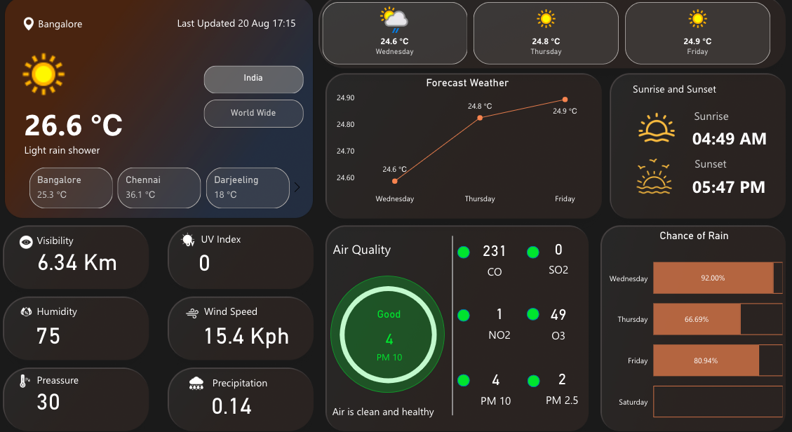
This meteorological Power BI dashboard delivers real-time atmospheric conditions displaying current temperature and climatic conditions for a city.
The interface provides multi-city temperature comparisons alongside comprehensive environmental metrics featuring humidity levels, and wind velocity.
What Does this Dashboard Show?
The platform integrates air quality monitoring through a sophisticated circular gauge indicating “Good” status at PM 10 level 4, complemented by detailed pollutant breakdowns showing CO at 231, SO2 at 0, NO2 at 1, O3 at 49, PM 10 at 4, and PM 2.5 at 2.
Three-day forecasting spans Wednesday through Friday with temperature progression from 24.6°C to 24.9°C, while sunrise/sunset data pinpoints 04:49 AM and 05:47 PM respectively.
Precipitation probability analysis reveals declining rain chances from Wednesday’s 92% through Saturday’s minimal forecast.
Uses (Verticals & Functions)
- Agricultural Planning & Crop Management Systems
- Aviation & Transportation Weather Intelligence
- Event Management & Outdoor Activity Planning
- Environmental Health Monitoring & Public Safety
- Tourism & Hospitality Weather Advisory Services
People’s Response
- Sophisticated Dark Theme with Weather-Appropriate Color Coding
- Intuitive Air Quality Visualization with Traffic Light Status Indicators
- Seamless Integration of Current Conditions with Multi-Day Forecasting Elements
25. Emergency Room Overview
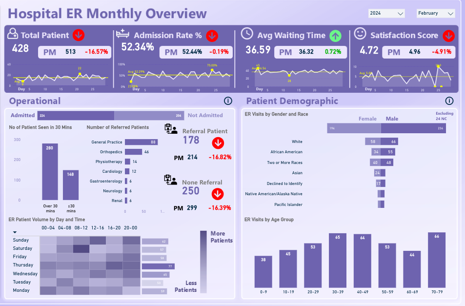
This emergency department Power BI dashboard orchestrates critical healthcare operations monitoring,
It captures total patients with admission rate and average waiting time alongside satisfaction score.
What Does this Dashboard Show?
The interface reveals concerning performance trends with patient volume declining 16.57% compared to previous month (PM 513), while admission rates dropped 0.19% and satisfaction scores plummeted 4.91%.
The platform dissects operational workflows through departmental referral patterns, highlighting General Practice leading with 88 referrals, followed by Orthopedics at 46 and Physiotherapy at 16.
Patient flow analysis demonstrates 260 cases requiring over 30 minutes versus 148 cases resolved within that timeframe.
Demographic segmentation reveals gender and racial distribution patterns, with age group analysis showing peak utilization in the 40-49 and 50-59 brackets at 65 and 64 visits respectively.
Weekly heat mapping illustrates patient volume intensity across different time slots, identifying peak operational periods and resource allocation requirements.
Uses (Verticals & Functions)
- Emergency Department Operations Management & Workflow Optimization
- Healthcare Quality Assurance & Patient Experience Enhancement
- Clinical Resource Planning & Staffing Decisions
- Hospital Administration & Performance Benchmarking
- Healthcare Analytics & Regulatory Compliance Monitoring
People’s Response
- Medical-Grade Purple Interface with Clinical Performance Indicators
- Advanced Heat Map Visualization for Time-Based Patient Flow Analysis
- Comprehensive Demographic Breakdown with Multi-Dimensional Performance Tracking
What Makes a Good Power BI Dashboard?
You can build a Power BI dashboard that doesn’t just look good but also drives action. You’ve got to focus on more than just fancy visuals.
We’re talking about elements that go from turning raw data into crystal-clear decisions.
-
Visuals That Mean Business: Pick visuals that get straight to the point. No fluff. They should make your data not just readable but actionable. Keep it clutter-free.
-
Insights That Matter: Zero in on the KPIs and metrics that align with your business goals. Your dashboard should be a decision-making tool, not just a pretty picture.
-
Easy Navigation: Your dashboard should be a breeze to navigate. Design it so users can quickly jump to different sections and dig deep into the details.
-
Design Consistency: Stick to a design theme. Use a cohesive color scheme, fonts, and layout to keep things streamlined and professional (Microsoft).
-
Be Responsive and Interactive: Make sure your dashboard plays nice with different screen sizes and devices. Add interactive elements like slicers and tooltips to keep users engaged.
-
Keep Data Fresh: What’s worse than outdated data? Make sure your dashboard always reflects the current state of affairs. Regular data refreshes are a must.
-
Optimize Performance: Keep your dashboard snappy by minimizing the number of visuals and cutting down on unnecessary interactions. Stick to Microsoft-certified visuals for optimum performance.
-
Know Your Audience: Last but not least, tailor your dashboard to the people who’ll actually use it. Understand their goals and metrics to deliver a tool that’s genuinely useful to them (Microsoft).
By nailing these elements, you’ll create a Power BI dashboard that’s not just eye-catching but a serious asset for data-driven decision-making.

What are Some Common Mistakes to Avoid When Designing a Power BI dashboard?
If you want your Power BI dashboard to be a decision-making powerhouse, then dodge these all-too-common pitfalls. These mistakes can turn your dashboard from a help to a hindrance.
-
Don’t Botch the Charts: Picking the wrong visuals is like bringing a knife to a gunfight. Choose charts that make your data instantly understandable.
-
Skip the Clutter: Overloading your dashboard is a one-way ticket to Confusionville. Keep it streamlined and focused (Microsoft).
-
Color with Caution: Inconsistent colors are distracting and unprofessional. Stick to a cohesive color palette throughout your dashboard (Microsoft).
-
Show the Bigger Picture: Omitting variances and trends is like serving a cake without icing. Give your data the context it deserves.
-
Data Quality Isn’t Optional: Using sketchy or outdated data is a no-go. Ensure your data is reliable and current.
-
Use Slicers Sparingly: Don’t go overboard with slicers. Keep them to a minimum and only where they add value.
-
Consistency is King: Mixing fonts, colors, and layouts is a rookie mistake. Keep the design uniform across all pages of your dashboard.
By steering clear of these blunders, you’re on the fast track to building a Power BI dashboard that doesn’t just look good but is a bona fide decision-making tool.
Best Power BI Dashboard Examples – Wrap-Up
Power BI is one of the powerful data visualization tools offered by Microsoft that enables users to create interactive visual reports and dashboards from their data. Power BI allows users to connect to multiple data sources and analyze data.
In the guide above, we have reviewed some of the best Power BI dashboard examples. Use of Power BI dashboards cut across multiple industries and can be used for several purposes.
Business leaders use Power BI dashboards to track sales and marketing, Key Performance Indicators (KPIs), human resource analytics, inventory, and more.
Business teams can collaborate on the same data, reports, and share insights across Microsoft Office applications such as Microsoft Excel and Teams. Users can promote insights across the organization while maintaining data consistency, accuracy, and security.
With intuitive Power BI dashboards and Power BI reports, businesses can visualize their data and uncover deep insights. The dashboard provides insights into business performance and answers to business questions.
You should use Power BI dashboards to make data-driven decisions that will put your business in the driver’s seat.
Enjoyed the post?