
Data visualization software enables you to turn any data into a visual story.
A dashboard is a visualization of business-critical data, presented in an easily digestible format.
With dashboards created by the likes of Adobe, Heathrow Airport, and some from Microsoft, there are a lot of diverse and incredibly useful Power BI Sales dashboards out there for you to take inspiration from.
Below, we have listed some of the best-looking, most functional, and highly intuitive dashboards.
Take a look.
What Is Power BI?
Data is an asset and it is highly valuable to businesses. But data alone is difficult to understand and challenging to comprehend.
Microsoft’s Power BI is a data visualization tool. It enables users to create dynamic and interactive visualizations of data.
Microsoft claims that it is simple enough for anybody to be able to create an effective dashboard and that it can be used by students and schools, as well as data professionals and marketing teams.
Through the Power BI community, and other external websites and communities, it is possible to view example dashboards.
You can use similar dashboards to digest big data on a variety of topics. They are great examples to give you pointers on creating your very own data dashboards.
If you see a sample that you like and that could be modified to your own end, you can get in touch with the partner that provided it and have them modify something specifically for you.
Let’s dig in and learn more about these dashboards.
Also Read: Bad Data Visualization Examples
Best Power BI Sales Dashboard Examples
1. Social Media Monitoring & Analytics Dashboard

Social media is a powerful tool for modern business. It is not only a marketing and sales channel, but it can be used to communicate with existing, potential, and old clients.
However, whether it is Facebook, YouTube, Twitter, or any other social media platform, it needs careful management and monitoring.
The Social Media Monitoring and Analytics Dashboard is easy to use. It is broken down into multiple tabs, which means that each tab only has a small amount of data that you need to get to grips with.
Discussion Intensity can be considered the main page. It displays information such as the number of mentions your brand has received.
The information is then broken down into social media and other mentions, something which is very effective for brand monitoring.

Other tabs offer further breakdown, such as ‘by social media platform.’ You can view the type of mentions you receive, for example, image tag or direct link.
The sentiment analysis attempts to determine whether your mentions are positive or negative, while the Online Influencers tab shares information on who is mentioning you the most.
You can even view quotes from your mentions. The Geolocation section shows where in the world you are being talked about.
Interesting Comparison: Tableau Vs Power BI
2. Online Sentiment Analysis Dashboard

Online mentions of a brand or an individual can make or break their reputation.
The first step of reputation management involves identifying people’s perception about a brand. When you have the feedback, it’s easier to work improvement areas.
The Online Sentiment Analysis Dashboard displays your mentions by category. It has four primary categories, namely opinion, quality, sales, and crisis.
You can choose whether to view negative, positive, or neutral sentiments and filter further according to the source.
The sources include Facebook, Twitter, Photo, and Video among others. When you select a particular time period, you are shown the data for it.
Though some of you might find the information limited, it’s especially handy at the onset of a campaign. You get to know the user sentiment before drafting the improvement plan.
3. Email Engagement Analysis Dashboard

Email marketing remains one of the most powerful means of building lists, converting website visitors into paying leads, and drumming up repeat and ongoing business.
It enables businesses to stay in touch with their clients. A good-quality email list can be profitable for several years to come.
The key to success of an email campaign is performance monitoring which enables you to identify pain points, highlight areas for improvement, and figure out what works, and what not.
The Email Engagement Analysis Dashboard highlights email engagement figures, such as the number of emails sent, delivered, clicked and emails read.
The dashboard highlights KPIs like delivery rate, bounce rate, email open rate, and click rate.
It even includes information like acceptable email bounce rate, although it varies according to the industry, email type, and whether the leads on your email list are hot or warm.
Additionally, you can view your email performance on a month-to-month basis to track the performance of your optimization efforts.
4. Property Developer Sales Analytics Dashboard

The dashboard has a very specific purpose.
It shows the performance of team members that were involved in the sales of real estate properties.
Similar to most businesses, even real estate sales involve collective efforts of the team members. A member from the call center team to the one who finally closes the deal, everyone has a part to play.
The Property Developer Sales Analytics Dashboard breaks it down nicely. It displays sales figures and the data according to the type of property. Apartments, penthouses, office space, and studios for instance. It also shows targeted and actual revenues.
The page shows the sales funnel which depicts the number of sales held up at a particular stage. It also displays the efficiency of sales calls by property type along with the result achieved.
While a sale might be considered a success for the salesperson that visited the property, it could have taken multiple unprofitable calls to achieve that visit.
This means that the sale would be a success for the salesperson but a potential failure for the sales team.
All this and more can be effectively depicted in a dashboard like this.
5. Sales Leads Overview
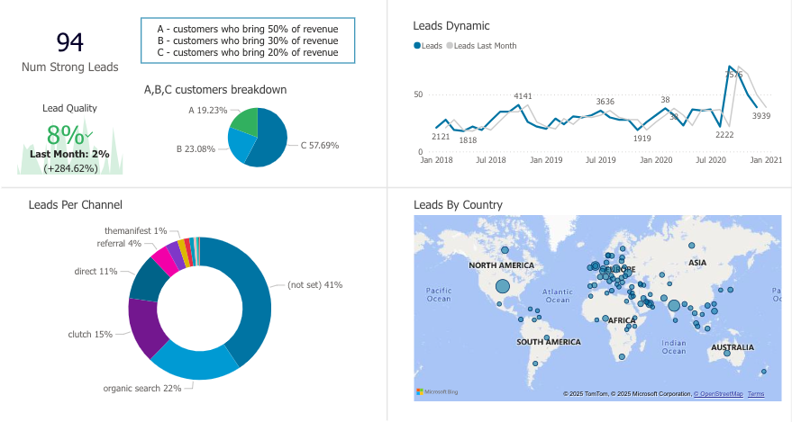
Monitoring sales leads is essential for predicting future revenue and optimizing sales performance by identifying which lead sources and strategies are most effective.
It enables early detection of potential problems in the sales pipeline and helps teams allocate resources efficiently to maximize conversion rates.
Regular lead tracking provides critical data for strategic decision-making and ensures sustainable business growth..
The dashboard above provides a comprehensive overview of sales leads for an organization.
It shows the number of strong leads with lead quality score, which represents a 2% increase from the previous month.
The customer breakdown is segmented into three categories: A-customers contributing 19.23% of revenue, B-customers contributing 23.08% of revenue, and C-customers contributing 57.69% of revenue, with C-customers representing the largest segment.
As you can see, the leads are acquired through various channels including organic search, Clutch, direct traffic, referrals, and other sources.
The dashboard also displays a leads dynamic trend chart showing fluctuations during a period, with notable peaks, and significant spikes.
Additionally, there’s a global leads distribution map showing lead sources across different continents, with concentrated activity in North America, Europe, and Asia, while also showing presence other regions.
This indicates the organization’s international reach and diverse lead generation capabilities.
6. Sales Funnel Dashboard
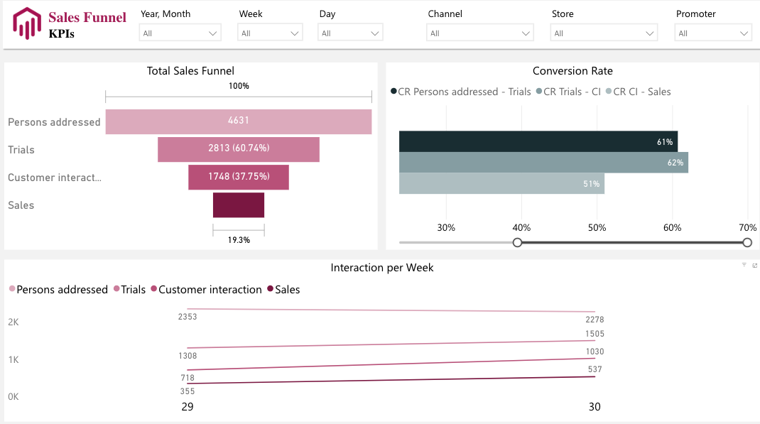
This Power BI Sales Funnel KPIs dashboard provides a deep analysis of the organization’s sales pipeline performance with multiple filtering options for Year/Month, Week, Day, Channel, Store, and Promoter.
The Total Sales Funnel section displays a visual funnel chart showing the progressive drop-off from initial contact to final sales, starting with “Persons addressed” at the top, followed by “Trials,” “Customer Interaction,” and finally “Sales” at the bottom, with each stage showing decreasing percentages to illustrate the conversion flow.
The dashboard also includes a Conversion Rate analysis with a horizontal bar chart displaying different conversion metrics including “CR Persons addressed – Trials,” “CR Trials – CI,” and “CR CI – Sales.”
Additionally, there’s an “Interaction per Week” section featuring a multi-line trend chart that tracks the four key funnel stages over time.
It shows how the volume of persons addressed, trials, customer interactions, and sales fluctuate week by week, with the lines displaying different trajectories and values across the time period.
The dashboard uses a clean design with filtering capabilities and color-coded visualizations to help stakeholders understand sales funnel performance and identify potential bottlenecks or opportunities for improvement.
7. Executive Insights Dashboard

The Executive Insights dashboard offers an in-depth and detailed report on how, where, and when a company made sales and profits. It includes several pages, primarily navigated through the top bar.
Profits are driven by sales and determined by revenue. The dashboard displays profit from the total number of products sold and the business revenue.
It breaks down sales globally and by product. You can see the numbers by product category and order type (e.g. email, web, telephone sales).
The dashboard also displays the best-performing products by profit, and highlights how close you are to achieving targeted profit levels. You can also see the net running profit for the year.
On top of the geographic display are some general statistics that show the profit, profit margin, average order, total quantity, and total revenue performance.
The dashboard is dynamic and easy to understand. It shows the visual data according to the selected filters which means you only see the information you want to see, dispensing out the unnecessary stuff.
8. Attendance Tracker Dashboard

The Attendance Tracker Dashboard is ideal for school administrators to track students’ attendance. Though you can modify it as per your needs.
The dashboard offers district-level data assisting the heads of multiple schools and regional officers.
The aim of the dashboard is to highlight opportunities for teachers and other staff to hold conversations with students.
Student-Teacher interactions clearly encourage regularity and discourage absence.
You can see the absence figures that are displayed according to the teacher, principal, school, subject and class level.
It also shows the estimated attendance percentage along with the actual numbers.
By using such a dashboard, you can identify whether absences are higher for a particular day, for a particular teacher, or a subject.
This enables faculty members to highlight the problem and then determine its cause and work towards solving it.
The dashboard is clear and concise, bearing all the information on a single page thereby making it easy to ignore the background noise and get to genuinely useful information.
9. Global Superstore Dashboard

The Global Superstore Dashboard is a dynamic dashboard that highlights sales and profits for a global store having multiple sites.
You can see the numbers by country, region, city, as well as by product category and sub-category.
This helps users to determine the cities where, for example, mobile phone cases are making the highest profits. You can also check the cities struggling to drive sales.
You can click on any of the countries or regions to update the sales vs profits sub-category, and vice versa.
It also helps in getting rid of the redundant data. If the UK stores do not sell cell phone cases, data for these products won’t be displayed when you click on the UK country selector.
The top right of the dashboard offers trend data so that users can view sales and profit figures over a five-year period.
Looking at the trend, you can make out if a product is selling well in a particular season along with the months when the sales go down.
10. Handball Comparison Dashboard

The Handball Comparison dashboard is a dynamic team comparison display that can be modified for any team sport.
It shows the statistics and data for major teams. You can select home and away teams by choosing from the gallery at the top.
It is also possible to drill down further to see how specific players within each team have performed.
Click on the player thumbnail at the side of the team and the statistics will update with individual’s data.
You can also update statistics according to the player position, grouping, goals, and play styles by using the options at the bottom.
11. NSW Transport Impact (During Pandemic)

The 2019 pandemic impacted daily lives in immeasurable ways, even down to public transport.
This dashboard shows the take-up rate of public transport in New South Wales, Australia, and how it was impacted..
The information is useful for the head of rail and bus companies. It shows the overall impact on public services.
The data could be modified for tourism and other related industries, too.
12. Inventory Stock Analysis Dashboard

Inventory and stock management are challenging even for the most experienced business owners, let alone for the ecommerce novice.
The Inventory Stock Analysis Dashboard is beneficial for all experience levels. It can be broken down by category and yearly quarter.
It shows vital information such as the products that have been viewed the most and those that are viewed the least.
This data can help you understand which products need better cross-promotion or, even if they are being promoted right, they lack visual appeal.
You can also view product stock levels which helps you to stock up the products that are running out of inventory.
This is useful for all types of products but especially beneficial for perishables as it enables you to maintain a relatively low stock level while still ensuring that you never run out.
The Inventory Stock Analysis Dashboard is great at predicting the right time to replenish specific product stocks.
Explore: Best Tableau Courses
13. Team Performance Dashboard

The Team Performance vs Target Dashboard shows the difference between a team’s set target and actual performance.
Using the dashboard, you can assign targets for unit sales and the profit generated from them.
Targets can be broken down by customer. You can also view sales by region using the dial at the top.

The objective is to show actual performance against targets.
With the donut chart on the left, accompanied by the level of actual profits achieved, one can see the missed targets in red.
This makes it quick and easy to spot areas where the sales team members are failing to hit their targets.
This dashboard does have a few pages and while others use tabs and pages to display the different options, the Team Performance vs Target Dashboard hides the options a little more.
Click on the team member to open team member details, use the dial at the top to change the view, or right-click on specific products to drill down.
Also Read: Best Qlikview Dashboard Examples
14. Customer Analysis Dashboard

The Customer Analysis Dashboard gives sales, revenue, and profit figures by product, region, and customer name, as well as by sales channel.
You can also group products according to your own preference, so you could group according to the type of product or the sales value, for example.
A lot of sales dashboards concentrate primarily on the products. Others may look solely at marketing channels to determine whether social media marketing is more profitable and turning more revenue than email marketing.

The customer analysis dashboard looks at revenue and sales using customer-based data.
Although it will work best for companies that sell their products to a limited number of clients, the ability to group customers means that it can be used by any company regardless of the customer base size.
For example, group customers by region and you can see a heatmap that shows which customer regions perform best.
As well as general revenue, you can see total profit, growth compared to the year before, and profit margins by customer. Work out your most profitable customers and look for other, similar clients, to further enhance your profit levels.
Check Out: Misleading Data Visualization Examples
15. HR Analytics Dashboard

Your employees are your most important asset. And with the HR Analytics Dashboard, you can monitor data on all of your team members.
Headcount statistics show information such as the total number of employees, new joiners, and active employee figures. You can also see the attrition rate, which is the ratio of employees that left a business for any reason.
Financial statistics show salary and cost by the individual, job role, and department. You can compare annual figures to those of last year and break down company cost by department and work out where money is going and whether it is being used to its full potential.

The Demographics tab shows employee location and nationality, gender split, department headcounts, and absenteeism figures across the organization.
Finally, Employee Details enables you to choose a single employee and then look at details such as personal information, current position, financial details, and absenteeism records.
Explore: Best Tableau Retail Dashboard Examples
16. Sales Scorecard Dashboard

The Sales Scorecard Dashboard is a single-screen dashboard. It aims to answer the question “how is my company doing?”
As you can see, the colors are used wisely. The majority of the data is depicted in grayscale, but the areas where the organization is struggling to perform are highlighted in red. This makes it easy to identify areas of improvement.
Because a loss doesn’t tell a full story, the dashboard also offers a comparison to last year’s figures.
This enables you to monitor trends and make out if the current year numbers have improved or have gone down.
It shows sales figures by product, state, and region. You can identify the products that are in loss and not performing. Similarly, you can make out the locations as well.
The single page display is a great advantage. It saves you from needless navigation from one page to other to see the information you want.
Conclusion
You can’t expect your business to grow without monitoring your data and working on it.
By harnessing the power of Power BI, these organizations were able to succeed, and continue to do so.
Take inspiration from these dashboards to design your own. In course, you’ll realize what is Power BI made of and what makes it instrumental in defining business success.
Enjoyed the post?