Georgia is a beloved serif typeface known for its elegance, readability, and classic appeal.
Designed by Matthew Carter in 1993 for Microsoft, it has become a staple in digital typography.
Whether you’re creating marketing materials, presentations, or website content in Canva, you might be looking for fonts with that same timeless Georgia feel.

Fortunately, Canva offers several excellent alternatives that capture Georgia’s essence while adding their own unique character to your designs.
Take a look at some of the good alternatives to Georgia.
Also Read: Best Canva Fonts That Look Like Calibri
1. Merriweather

Merriweather brings Georgia’s readability to your Canva designs with slightly more personality in its letterforms.
The serif typeface features a taller x-height (the height of lowercase letters) similar to Georgia, ensuring excellent legibility across digital screens.
Merriweather’s slightly heavier weight gives it a commanding presence on the page while maintaining the traditional serif aesthetic.
Its versatile nature makes it suitable for both headings and body text, particularly in long-form content where maintaining reader engagement is essential.
Check Out: Best Canva Font Pairings
2. Lora
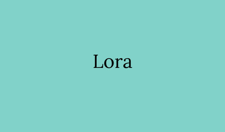
Lora captures Georgia’s elegant essence with a more contemporary flair.
This well-balanced serif font maintains Georgia’s excellent readability while incorporating slightly more calligraphic elements at its terminals and serifs.
Lora’s subtle stroke variations create a pleasant rhythm in paragraphs of text, making it an excellent choice for storytelling and narrative content.
The font performs beautifully across screen sizes, preserving its character and clarity whether used in headlines or body copy.
Also Read: Most Professional Fonts On Canva
3. PT Serif
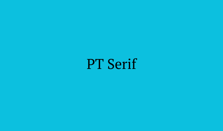
PT Serif offers Georgia’s classic proportions with slightly more angular features.
This versatile serif typeface was designed with digital displays in mind, sharing Georgia’s excellent screen legibility.
PT Serif’s well-defined serifs and open letterforms create comfortable reading experiences even in dense paragraphs.
Its slightly condensed nature allows for efficient space usage without compromising on elegance, making it ideal for professional documents, formal invitations, or academic presentations where Georgia’s refined character is desired.
Check Out: How To Identify A Font From An Image In Canva?
4. Crimson Text
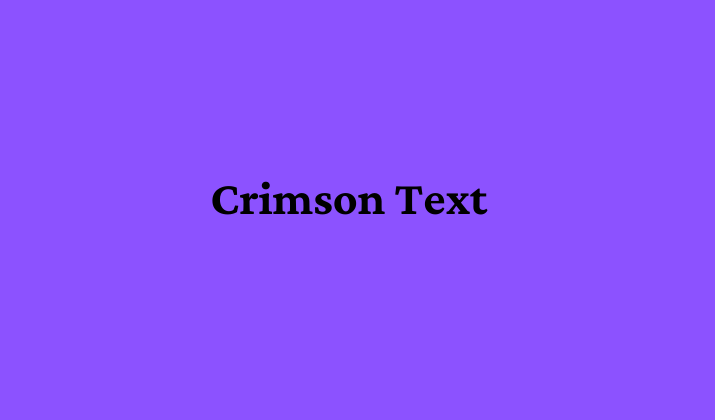
Crimson Text channels Georgia’s traditional typography roots with a slightly more literary feel.
The old-style serif font features elegant proportions and carefully crafted details that evoke classic book typography while maintaining excellent screen readability.
Crimson Text’s slightly narrower letterforms allow for efficient use of space in layouts, and its gentle stroke contrast creates an inviting texture for longer reading experiences.
The font excels in contexts where you want to evoke sophistication and timeless quality in your Canva designs.
Explore: Best Canva Fonts For Insta
5. Libre Baskerville

Libre Baskerville reimagines classic Baskerville proportions with the screen optimization that made Georgia famous.
This elegant serif typeface features a generous x-height similar to Georgia, ensuring excellent readability across digital platforms.
Libre Baskerville’s slightly heavier weight gives it commanding presence while its well-defined serifs maintain that traditional, authoritative aesthetic.
The font works beautifully for both headers and body text, particularly in contexts where conveying tradition and trustworthiness is important.
Check Out: Best Canva Fonts For Teachers
6. Source Serif Pro
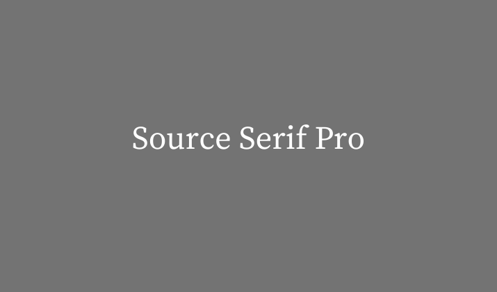
Source Serif Pro delivers Georgia’s readability with more contemporary proportions.
The versatile serif typeface was specifically designed for digital environments, sharing Georgia’s excellent screen performance.
Source Serif Pro features clean lines and well-defined details that create comfortable reading experiences across devices.
Its comprehensive character set makes it suitable for multilingual projects, while its various weights provide flexibility for creating typographic hierarchy in your Canva designs without needing to switch font families.
Also Read: Best Barbie-Inspired Canva Fonts
7. Noto Serif
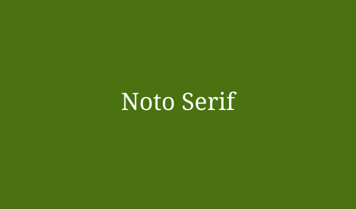
Noto Serif brings Georgia’s universal readability to multiple language systems.
Developed by Google as part of its ambitious Noto project (named for “no tofu” – eliminating the boxes that appear when text can’t be displayed), this highly versatile serif typeface maintains the balanced proportions and excellent screen legibility that made Georgia famous.
Noto Serif features slightly more vertical stress in its letterforms, providing a crisp, authoritative appearance that works well for both formal business communications and academic publications.
Its extensive language support makes it particularly valuable for multilingual projects where maintaining typographic consistency across different writing systems is essential.
8. EB Garamond
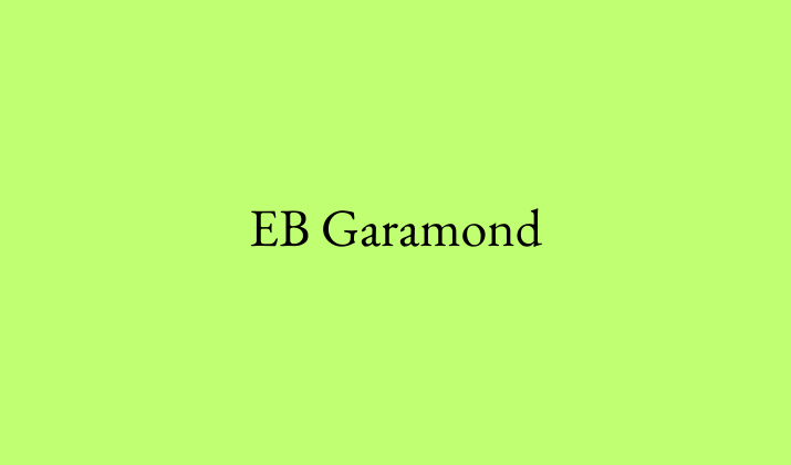
EB Garamond offers Georgia’s readability with more historical character.
The elegant revival of Claude Garamond’s 16th-century designs brings classical typography to digital environments with the same screen-friendly approach that made Georgia revolutionary.
EB Garamond features more pronounced calligraphic details and slightly warmer proportions than Georgia while maintaining excellent legibility at various sizes.
The font creates an instantly sophisticated atmosphere in any design, making it perfect for projects that aim to evoke literary tradition, cultural institutions, or timeless luxury.
Its well-balanced letterforms create beautiful text blocks in both print and digital formats.
Explore: Best PPT Fonts Like Chalk
9. Bitter
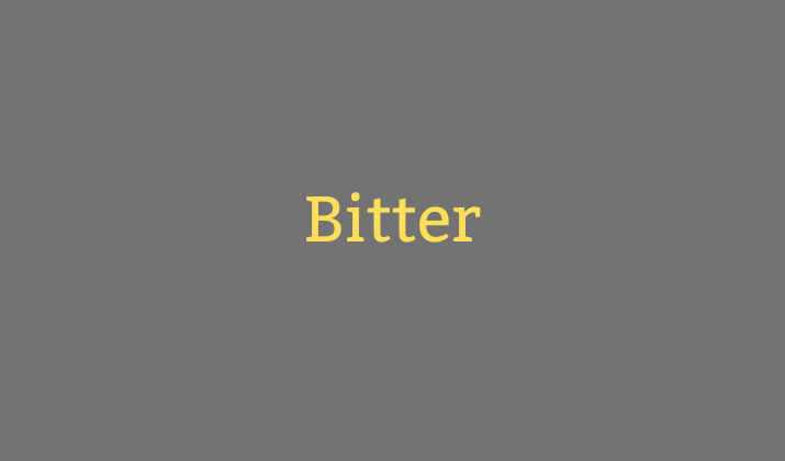
Bitter presents a robust alternative to Georgia with its slab serif characteristics and excellent screen optimization.
The distinctive typeface offers the readability and elegance of Georgia while introducing slightly stronger serifs that give it additional presence and personality.
Bitter was specifically designed for comfortable reading on digital devices, sharing Georgia’s exceptional legibility across various screen sizes and resolutions.
Its slightly condensed proportions make efficient use of space without sacrificing readability, while its well-defined letterforms maintain clarity even at smaller sizes.
Bitter’s semi-bold weight creates a satisfying texture in body text that enhances readability while providing subtle emphasis.
This makes it particularly effective for editorial design, professional presentations, and digital publications where Georgia’s authoritative yet approachable character is desired.
Check Out: Best Arabic Fonts On Canva
10. Adelle
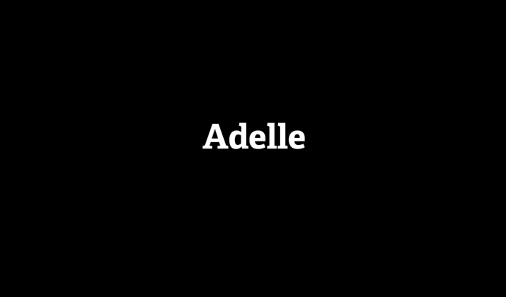
Adelle combines Georgia’s practical readability with subtle contemporary styling.
This versatile workhorse serif was specifically designed for demanding typographic environments, sharing Georgia’s exceptional performance across different sizes and media.
Adelle features slightly squarer serifs and more open counters (the enclosed spaces in letters like ‘e’ and ‘o’), enhancing readability particularly in smaller sizes or challenging reading conditions.
Its robust character and subtle warmth make it excellent for editorial design, corporate communications, or any context where you need typography that feels both professional and approachable.
The font’s balanced proportions create harmonious layouts whether used for headlines or extended body text.
Check Out: Trendy Teacher Fonts On Canva
Conclusion
While Georgia remains a classic typeface, these Canva alternatives offer similar attributes with their own unique characteristics.
If you need something for elegant headings, readable body text, or both, these Georgia-like fonts provide excellent options for your next design project.
When you understand the subtle differences between these typefaces, you can make informed choices that enhance your design’s readability, visual appeal, and overall effectiveness.
Enjoyed the post?