Microsoft fonts without serif, commonly known as sans-serif fonts, are typefaces that lack the small decorative strokes or “feet” that extend from the main strokes of letters found in serif fonts.
The term “sans-serif” literally means “without serifs” in French. These fonts are characterized by their clean, modern appearance and excellent readability on digital screens.
This makes them particularly popular for web design, user interfaces, and contemporary print materials.
Microsoft has developed and included numerous high-quality sans-serif fonts across its operating systems and Office suite, each designed to serve different purposes from body text to display headings.
Take a look at some of the most popular fonts without serif.
Also Read: Best Signature Fonts In MS Word
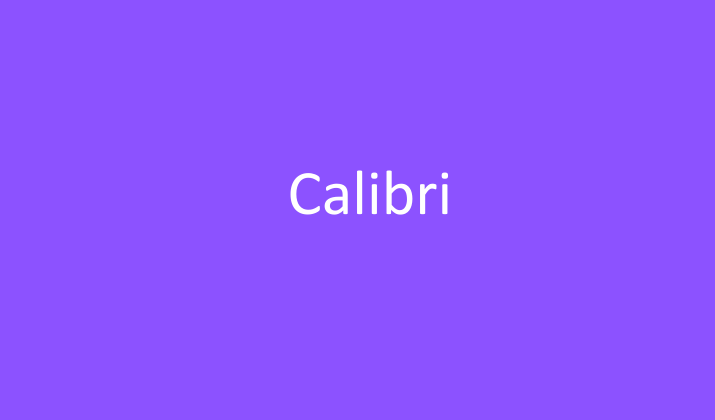
1. Calibri
Calibri stands as Microsoft’s flagship sans-serif font and has served as the default typeface for Microsoft Office applications since 2007, replacing Times New Roman.
Designed by Lucas de Groot, this humanist sans-serif font features subtle rounded edges and a warm, approachable character that makes it exceptionally readable at various sizes.
Its balanced proportions and generous spacing make it ideal for both digital and print applications, from business documents to presentations.
Calibri’s versatility shines through its ability to maintain clarity in small sizes while looking professional and modern in larger display uses, making it a reliable choice for corporate communications and everyday document creation.
Check Out: Best Fonts For Outlook Email
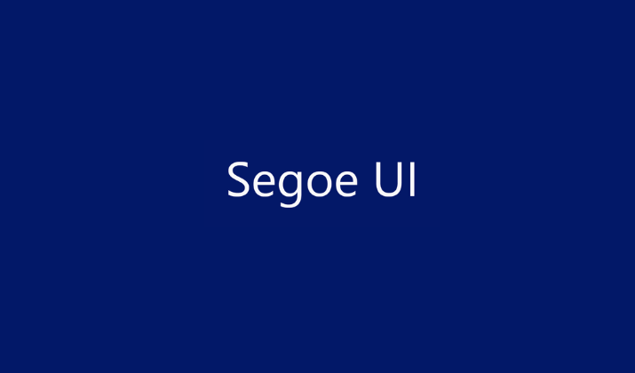
2. Segoe UI
Segoe UI represents Microsoft’s primary user interface font, designed specifically for optimal screen readability and serving as the default system font for Windows Vista and later versions.
Created by Steve Matteson at Monotype Imaging, this font family prioritizes functionality and legibility across different screen resolutions and sizes.
Its clean, geometric structure with subtle humanist touches ensures excellent performance in user interfaces, making text crisp and easy to read on both high and low-resolution displays.
Segoe UI’s extensive character set and multiple weights make it particularly valuable for international applications and complex interface designs where consistency and clarity are paramount.
Check Out: Best Cursive Fonts In Word
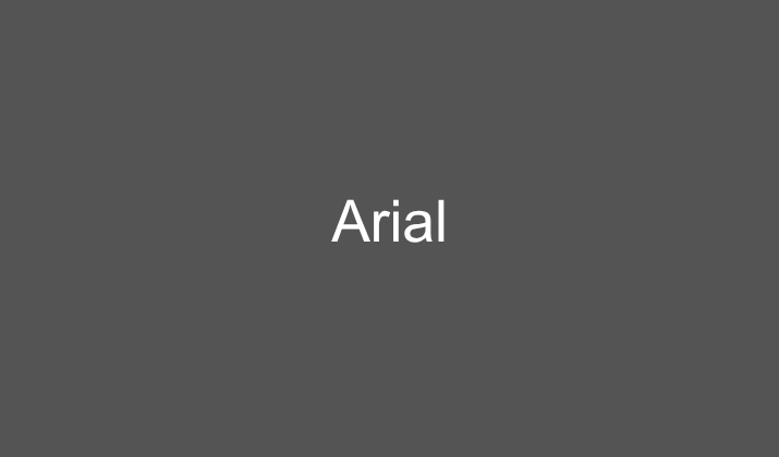
3. Arial
Arial remains one of the most widely recognized and utilized sans-serif fonts in the digital world, originally developed by Robin Nicholas and Patricia Saunders in 1982 as a more affordable alternative to Helvetica.
This neo-grotesque sans-serif font features neutral, highly legible letterforms that work effectively across virtually any application, from web design to print materials.
Arial’s ubiquity stems from its excellent readability, wide character support, and reliable performance across different platforms and devices.
Its straightforward, no-nonsense design makes it a safe choice for corporate communications, technical documentation, and any situation where clear, professional presentation is essential.
Explore: Best Handwriting Fonts In Word
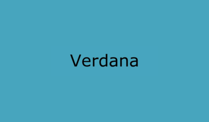
4. Verdana
Verdana was specifically engineered by Matthew Carter for Microsoft to excel in low-resolution screen environments, making it one of the most screen-optimized fonts available.
This humanist sans-serif font features unusually wide proportions, generous spacing, and large x-height, all deliberately designed to maintain exceptional readability even at small sizes on computer monitors.
Verdana’s robust character shapes and carefully crafted letterforms ensure that text remains clear and legible across various digital platforms, from websites to mobile applications.
Its slightly condensed but open design makes it particularly effective for body text in digital environments where readability is crucial.
Discover: Best Coding Fonts In Word
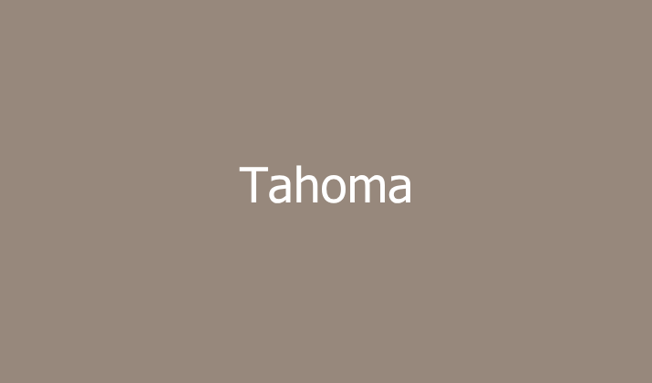
5. Tahoma
Tahoma, designed by Matthew Carter, represents Microsoft’s answer to the need for a compact yet highly readable sans-serif font that performs exceptionally well in user interface applications.
This font features tight letter spacing and narrow character widths, allowing more text to fit in limited space without sacrificing legibility.
Tahoma’s clean, geometric design with subtle humanist influences makes it particularly effective for menus, dialog boxes, and other interface elements where space efficiency is important.
Its balanced proportions and excellent hinting ensure consistent performance across different screen resolutions, making it a popular choice for web design and application interfaces.
Also Read: Best Fonts For Professional Emails & Presentations
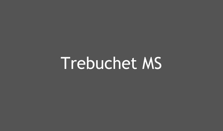
6. Trebuchet MS
Trebuchet MS, created by Vincent Connare, brings a distinctive personality to Microsoft’s sans-serif font collection with its slightly playful yet professional character.
This humanist sans-serif font features unique design elements including distinctive letterforms and a more casual, approachable feel compared to more formal fonts like Arial or Helvetica.
Trebuchet MS works particularly well for creative projects, informal communications, and designs that benefit from a font with more personality while maintaining professional readability.
Its moderate contrast and friendly appearance make it suitable for both body text and display applications where a warmer, more human touch is desired.
Also Read: Best Fonts For Legal Documents
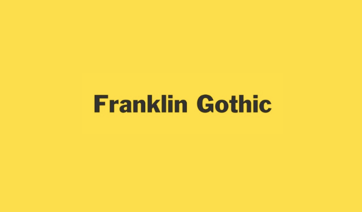
7. Franklin Gothic
Franklin Gothic represents a classic American gothic sans-serif design that has been digitized and refined for modern Microsoft applications.
This font family features strong, bold letterforms with excellent impact and readability, making it particularly effective for headlines, signage, and display applications.
Franklin Gothic’s robust character and authoritative presence make it ideal for designs that need to convey strength, reliability, and professionalism.
Its condensed variants allow for efficient use of space while maintaining excellent legibility, making it valuable for both print and digital applications where bold, attention-grabbing typography is required.
Also Read: Easiest Fonts For Children’s Book
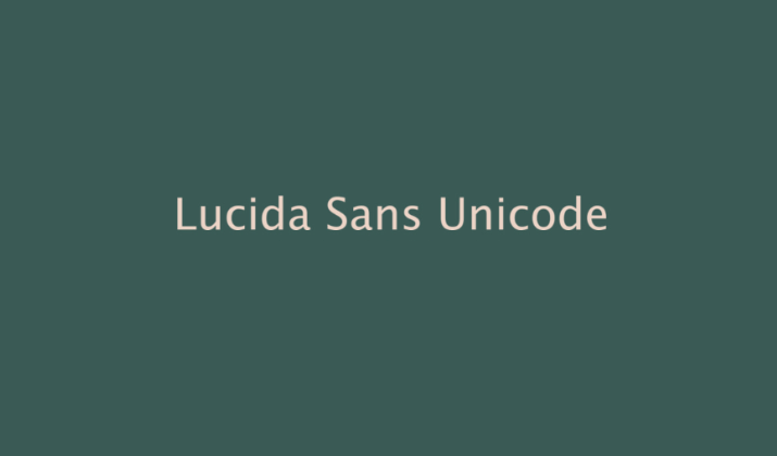
8. Lucida Sans Unicode
Lucida Sans Unicode, part of the broader Lucida font family designed by Charles Bigelow and Kris Holmes, offers exceptional multilingual support with its extensive Unicode character set.
This humanist sans-serif font provides excellent readability while supporting a vast array of languages and special characters, making it invaluable for international communications and diverse content creation.
Lucida Sans Unicode’s clean, professional appearance combined with its comprehensive character support makes it particularly useful for technical documentation, academic papers.
It is also ideal for any application requiring extensive symbol and international character support.
Also Read: Best Fonts For Military Documents
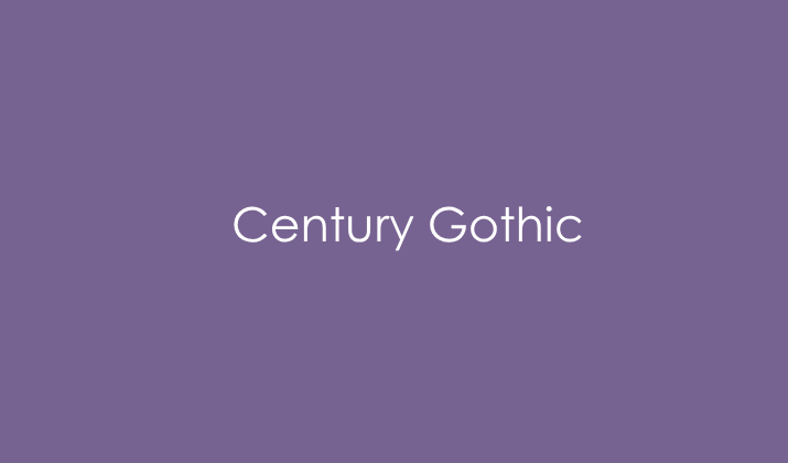
9. Century Gothic
Century Gothic presents a distinctive geometric sans-serif design based on the classic Futura typeface, offering a more modern and streamlined appearance with its perfectly circular letterforms and consistent stroke widths.
This font’s clean, geometric structure creates a contemporary, minimalist aesthetic that works exceptionally well in modern design applications.
Century Gothic’s unique character shapes and consistent geometric proportions make it particularly effective for branding, marketing materials, and design projects that benefit from a sleek, forward-thinking appearance.
Its excellent readability and distinctive style make it a popular choice for headlines and display text where visual impact is important.
Check Out: Best PPT Fonts That Look Like Chalk
10. Corbel
Corbel, designed by Jeremy Tankard, rounds out Microsoft’s collection of high-quality sans-serif fonts with its warm, humanist characteristics and excellent readability across various applications.
This font features slightly flared strokes and subtle curves that give it a friendly, approachable character while maintaining professional credibility.
Corbel’s balanced proportions and generous spacing make it particularly effective for body text in both digital and print environments.
Its versatile design allows it to work well in a wide range of applications, from business documents to creative projects, where a font with personality and excellent readability is needed.
Also Read: Best Fonts For Teachers
Conclusion
Microsoft’s collection of sans-serif fonts offers designers and users a comprehensive toolkit for virtually any typographic need.
From the corporate reliability of Calibri and Arial to the screen-optimized excellence of Verdana and Segoe UI, each font serves specific purposes while maintaining the clean, modern aesthetic that defines quality sans-serif typography.
Enjoyed the post?

