Are you creating a new website or brand identity for your business? Or maybe you’re preparing a pitch for a high-brow client or putting the final touches on the book you plan to publish soon.
You need to be careful when picking a font type for your project because it will contribute to the impression that people have of you and your work.
But with thousands of typefaces out there, it can be challenging to figure out which fonts are in vogue and would best suit the job at hand.
Not to worry, we’ve put together a selection of some of the most common fonts available today. Read on to find out what they are and how you can use them in text and designs.
Also Read:
Most Common Fonts & When and Where To Use
1. Garamond

Garamond is one of the oldest typefaces in existence today. Its history can be traced back to the late 1400s and early 1500s but no one can say for sure who actually invented it.
However, the font is named after Claude Garamond, a French engraver who used old-style serif typeface design resembling modern-day Garamond for his engraving punches.
Garamond was officially released for use in text designs in 1975 as ITC Garamond. Adobe put its spin on the font in 1989 when it released Adobe Garamond, which was designed by Robert Slimbach.
The font continues to enjoy widespread usage till today. Garamond is best used in documents, books, magazines, invitation cards, and other printed materials. If you want to project a slightly formal, elegant, and regal appearance, go Garamond.
Garamond doesn’t always translate well in web design so it’s best to avoid using it for this purpose. You might end up with text that is unreadable if your audience doesn’t have the font installed on their system.
Check Out:
2. Helvetica
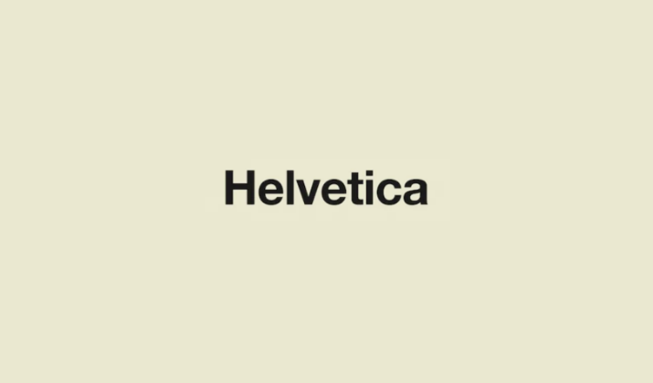
Helvetica is commonly used by people and corporations from all walks of life from designers to writers, small businesses, and international enterprises.
It has received global recognition and several awards and has been the subject of books, art exhibitions, and even a documentary.
This font was designed in 1957 in Switzerland by Eduard Hoffman and Max Miedinger who were working for type foundry, Haas at the time. They created Helvetica to serve as a sleek, modern, unassuming typeface that doesn’t impose any meaning or impression on the viewer.
Helvetica is usually referred to as a “safe” font because it can be anything you want it to be depending on how or where you incorporate it.
It doesn’t lend itself to any singular idea. Instead, it straddles the line between formal and informal, modern and classic, or sophisticated and casual.
The beauty of this font is that it is highly versatile and adaptable. You can use Helvetica in your presentations, resumes, website design, brand logo, product packaging, and anywhere where legibility is paramount.
Also Read:
3. Cambria
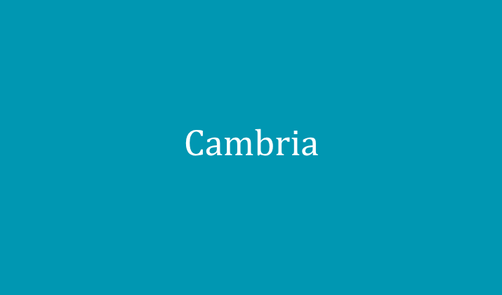
Commissioned by Microsoft and created by Jelle Bosma, a Dutch Typeface designer in 2004, this transitional serif font has won the hearts of users all over the globe. Cambria is one of the fonts that accompany Office and Windows products.
It was designed to be readable on and off screen regardless of the size of the font it is displayed in print or the quality of the resolution it is viewed in. Cambria allows readers to easily make out the text without straining their eyes or exerting too much brain effort.
This makes it an excellent font for crafting body text, web content, and print documents. Whether you’re drafting a proposal for a client or designing a blog, Cambria will not feel out of place in both professional and informal settings.
Check Out:
4. Playfair Display

If you’re looking for a font that screams creativity, this is it. Playfair Display draws inspiration from the Baskerville typeface and it was designed by Claus Eggers Sorensen.
Playfair Display is the font you use when you want to capture attention at first glance and provoke a sense of elegance, style, and luxury. It has a delicate, hand-written feel that allows readers to quickly decipher text when it’s rendered in a larger font size.
This typeface has many weights and versions for you to choose from; some are simple and sleek while others are more decorative and showy.
The high contrast between the narrow and wide lines of Playfair Display font makes it an excellent choice for logos, headlines, titles, editorials, and social media graphics.
However, the typeface tends to lose its romantic appeal and becomes challenging to read when used at smaller sizes so you’ll want to go with some other font for the body of your text.
Check Out:
5. Didot

Not only is Didot one of the most common fonts available today, but it’s also considered the first modern typeface.
The history of this font dates as far back as the French Revolution and Firmin Didot and Giambattista Bodoni are credited with originating and perfecting the typeface.
Didot is often used to symbolize splendor, affluence, comfort, and creativity. This is because its creator, Firman, belonged to one of the most influential families in the print industry at the time and served as a printer for the King of France.
Didot is not ideal for body copy because of its high contrast level. However, the font lends itself well to signage, logos, editorials, billboards, and any purposes that require it to be displayed in large format or size.
Explore:
6. Georgia

Have you ever used Yahoo, scrolled through timelines on Twitter, purchased an item from Amazon, or read the New York Times digital version? If the answer is yes, then you have definitely come across this font.
Georgia was designed for Microsoft by Matthew Carter and made available in 1996 as part of the Clear Type Font Collection for Windows operating systems.
The fonts in this collection were specifically created to be readable and aesthetically pleasing on screen and in print even in small sizes.
Georgia is a safe font that evokes creativity and friendliness without being too dramatic. It is precisely this charm and versatility that makes it perfectly suited for all kinds of activities from document drafting to web design and advertisements.
Also Read:
7. Calibri
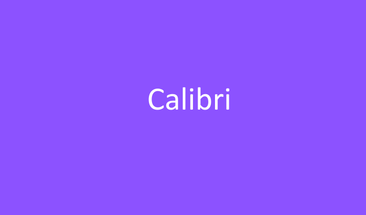
This award-winning contemporary sans serif font is also brought to you by Microsoft. The company commissioned Lucas de Groot, a Dutch typeface designer, to develop Calibri so it could take the place of Times New Roman as the default font for its Office line of products.
Calibri boasts of subtle curves around the letters with tight set width that renders beautifully in both big and small text formats. It gives off a business casual air that makes it appropriate for both professional and informal settings.
Although it won’t help you stand out if you stand out if you use it in logos and other brand design elements, it won’t create any problems for you either.
Explore the best alternatives to Helvetica & Helvetica Neue here.
8. Bodoni

Named after its creator, Gianbattista Bodoni, a highly revered Italian printer from the 18th century who worked at the palace of Duke Ferdinand of Parma, Bodoni is one of the most common fonts in existence today.
The font was modernized and reproduced in the early 1900s by Morris Fuller Benton who was commissioned by American Type Founders.
Bodoni is characterized by a prominent contrast between its thick and thin lines as well as unbracketed serifs that give it a distinct appearance.
Bodoni has different versions that can serve all kinds of purposes including logos, posters, headlines, print books, and body text. It has most famously been used in the Goodfellas movie poster and Vogue’s logo.
Also Read:
9. Futura
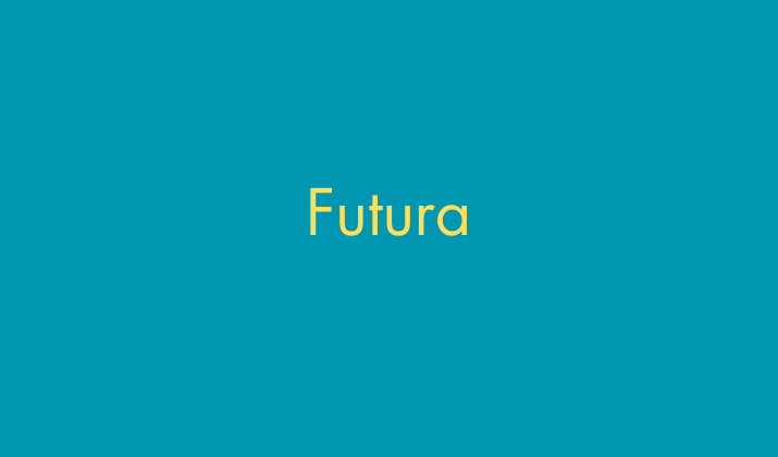
Since it was released in 1937, the Futura font has enjoyed commercial success and remained enduringly popular.
This undeniably good-looking font was created by Paul Renner, a German typeface designer and it draws inspiration from the Bauhaus movement of the previous century.
Futura font is based on sharply defined geometric shapes—circles, rectangles, and triangles, which make it perfectly symmetrical, lighter, easily reproducible, and amenable to scale.
It supports many different languages and has a wide array of symbols and styles to choose from.
The even-width and low-contrast strokes of this typeface allow it to function excellently when used as body text in copy and documents. Or as statement text in headlines, logos, billboards, and book covers.
Check Out:
10. Spectral
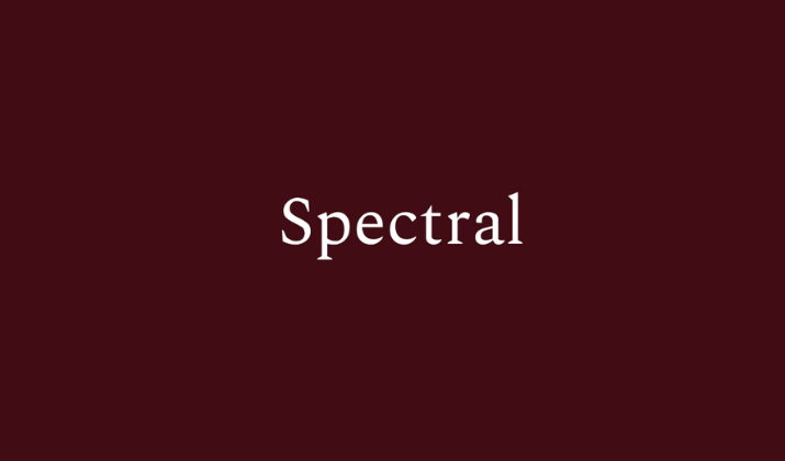
If you’re looking for a font that works well for long-form reading, text-rich documents, and digital purposes, you can’t go wrong with Spectral.
This adaptable serif-style font was commissioned by Google Fonts and created by Production Sort, a French type design agency.
The Spectral font offers nine weights in italic and regular that you can choose from. It features triangle-like serifs that add a calligraphic feel to the typeface while still retaining a natural and welcoming look.
Spectral can fit lengthy texts on screen and still retain its legibility. This makes it ideal for crafting documents, blog posts, presentations, proposals, and more.
Also Read: Best CSS Web Safe Fonts
11. Verdana
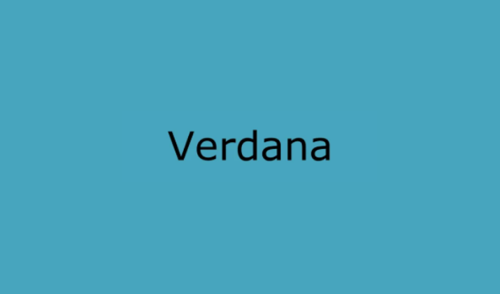
Another common font that has refused to fade from usage in both print and online mediums is Microsoft-owned Verdana. It is a conservative font that is suitable for pretty much any use case.
The sans serif typeface was developed by Matthew Carter as a more legible alternative to Helvetica and other existing fonts that wouldn’t lose its character when displayed on screens or in small font sizes.
The secret to Verdana’s appeal is in the way it is designed. Each character has ample spacing, width, contrast, and distinct strokes that prevent them from clashing.
Every line and stroke of Verdana has been meticulously crafted to ensure that the font stays clear, readable, and aesthetically pleasing regardless of which font weight or variation you use.
Also Read: Best Barbie Fonts On Canva
12. Arial
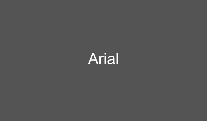
You might recognize Arial as the default font that’s displayed on your screen when you open up Google Docs, Microsoft Word, PowerPoint, and the like on your device.
It is rumored that IBM created this font to get around paying for the license to use Helvetica. Truth be told, Arial is almost indistinguishable from Helvetica as it shares the same character widths but it’s also lighter and less formal than the latter.
It was designed by Patricia Saunders and Robin Nicholas and publicly distributed in 1982. Unlike most contemporary sans serif typefaces, Arial takes a softer approach in the way its strokes and curves are cut so it’s not as robotic as its counterparts.
Arial is an incredibly versatile font that can be utilized for all kinds of purposes and projects be it forms, presentations, fine print, brand assets, and promotional material.
Check Out: Best 70s Fonts On Canva
13. Montserrat

Julienata Ulanovsky drew the inspiration for the design and name of this font from the signage and posters that furnished Montserrat, her neighborhood in Buenos Aires.
Her goal was to capture the spirit and soul of the area’s urban typography that emerged in the early 20th century.
Since it was released in 2010, Montserrat has gained widespread popularity. It has been a staple feature in posters, websites, flyers, and graphic design projects. The appeal and flexibility of the typeface cannot be overstated.
This distinctive typeface is suitable for online media, web design, and printed materials. It is highly readable in both small and large text. Feel free to break it out when you want to leave a memorable impression without compromising elegance or simplicity.
14. Lato

Created by Polish type designer Lukasz Dziedzic and made available in 2010, Lato is one of the most common fonts out there. This font is intended to capture the feeling of summer; warm, comforting, playful, and serious, all at once.
Lato characters maintain transparency when rendered in small case or body text but their unique characteristics are revealed when used in larger formats or uppercase.
It can go from casual to professional in a heartbeat so you can use it for general purposes without worrying about sending the wrong message. Lato comes in five weight types with matching italics so you’ll have variations to play around with.
Also Read: Best Canva Fonts For t-shirts
15. Times New Roman
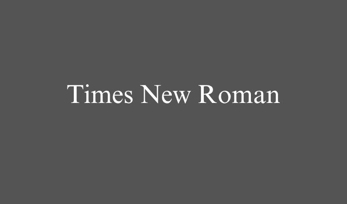
Whether you love or hate it, it’s impossible to deny the influence of Times New Roman in the digital and print landscape. It was designed by Stanley Morison for the Times London Newspaper and became an instant hit.
Since its 1931 release, the transitional serif font has made its way into pretty much every facet of life and corner of the world. Times New Roman is one of the safest fonts available today, especially for professional purposes.
It is widely used everywhere from the classroom to the boardroom and has been featured in magazines, newspapers, books, essays, reports, and more. Many platforms and institutions have even adopted it as the default typeface for their activities.
Times New Roman supports a vast collection of symbols and languages. What’s more, it’s exceptionally legible when used as body text, as large text, or in web design.
16. Tahoma
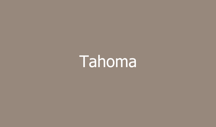
Tahoma is a sans-serif typeface designed for high readability on screens, making it a reliable choice for digital content.
Its clean, straightforward letterforms give it a modern but slightly more compact appearance compared to fonts like Verdana.
Because of its clarity at smaller sizes, Tahoma works well for web interfaces, software applications, and email communication.
It’s often used in professional documents that require a simple, no-nonsense font. While it may not have the flair of decorative typefaces, its functionality makes it ideal for usability-focused projects.
Use Tahoma when designing user manuals, presentations, or websites that prioritize accessibility.
17. Trebuchet MS
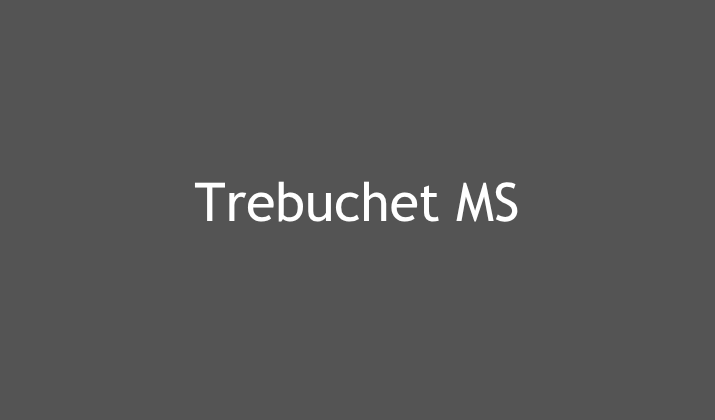
Trebuchet MS is another widely used sans-serif font originally designed for legibility on computer screens.
It has a slightly wider structure and playful character shapes, which lend it a more approachable and friendly tone. This makes it an excellent option for websites, blogs, or educational materials where warmth and readability are important.
Unlike fonts that can feel overly formal, Trebuchet strikes a balance between casual and professional. Its design makes it suitable for both headings and body text, giving designers flexibility.
Consider using Trebuchet MS when crafting content aimed at younger audiences or community-focused projects.
18. Century Gothic

Century Gothic is known for its geometric sans-serif style with clean, even strokes and a modern aesthetic.
Its circular forms give it a contemporary look, making it popular in branding, advertising, and logos.
However, because it uses wide letter spacing, it can consume more space in body text, which makes it less ideal for lengthy paragraphs. It’s best applied in headlines, titles, or minimalist designs that require a sleek appearance.
Century Gothic conveys innovation and forward-thinking, which is why many tech companies use it in their branding. Choose this font for presentations, posters, or marketing campaigns where modernity is key.
19. Baskerville

Baskerville is a classic serif typeface celebrated for its elegance, sharp contrasts, and refined details.
It has a timeless quality that makes it perfect for formal and academic writing. Because of its high legibility in print, it is commonly found in books, research papers, and scholarly publications.
The refined style also makes it a strong choice for luxury branding and high-end marketing materials. It projects sophistication, trust, and authority, which is why it’s often chosen by law firms and publishing houses.
Use Baskerville when you want to communicate professionalism with a touch of classic refinement.
20. Gill Sans
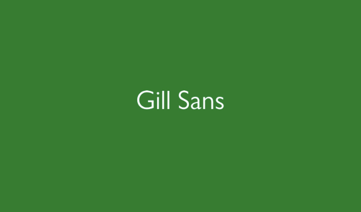
Gill Sans is a humanist sans-serif typeface that blends clean design with a warm, approachable feel.
Unlike purely geometric fonts, its letterforms have subtle variations that make text more engaging and less mechanical. It has been widely used in British design, including signage, posters, and branding for companies such as the BBC.
Its versatility allows it to work well in both display and body text settings. Gill Sans conveys a sense of clarity and professionalism without appearing overly rigid.
Use it in branding, editorial design, or educational content when you want a balance of modernity and friendliness.
21. Rockwell
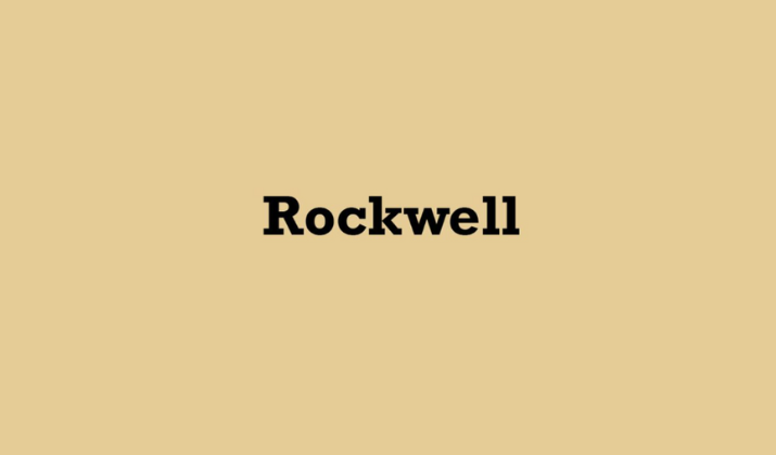
Rockwell is a slab serif typeface, instantly recognizable for its bold, block-like serifs. Its sturdy, geometric design gives it a strong, authoritative presence, making it great for headlines, signage, and logos.
Unlike delicate serif fonts, Rockwell communicates stability and confidence, which is useful in marketing and advertising materials.
It isn’t ideal for long paragraphs due to its heavy letterforms but works well in shorter text where impact matters most.
This font has a timeless quality, often associated with posters and traditional print design. Use Rockwell when you want to create bold statements or emphasize strength and reliability.
22. Franklin Gothic
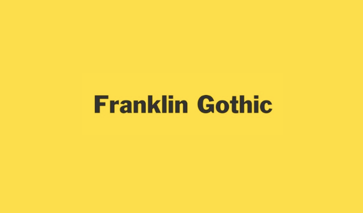
Franklin Gothic is a classic sans-serif font that has been widely used in newspapers, advertising, and signage for decades.
Its strong, straightforward design makes it highly versatile across both print and digital mediums. It’s often chosen for headlines and subheadings due to its bold presence, though it can also function in short body text.
Franklin Gothic has a no-frills, authoritative feel, making it a favorite in professional and journalistic contexts.
It works particularly well in corporate branding, presentations, and editorial design. Use this font when you want to convey seriousness, clarity, and direct communication.
23. Optima

Optima is a unique sans-serif typeface that carries subtle serif-like qualities, giving it a distinctive and elegant appearance.
It has been used in branding, luxury packaging, and even memorial engravings due to its refined yet approachable look.
Unlike rigid sans-serif fonts, Optima feels softer and more versatile, adapting well to both modern and classical designs.
Its balanced proportions make it suitable for titles, corporate identities, and artistic projects.
Optima communicates sophistication without being overly formal, making it a good choice for high-end businesses and creative industries. Use it when you want to combine modernity with timeless elegance.
24. Courier New
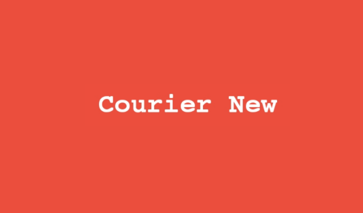
Courier New is a monospaced serif font designed to mimic the look of typewritten text. Its evenly spaced characters make it highly legible for coding, scripts, or documents where alignment matters.
While it isn’t ideal for long reading passages, it’s useful in technical writing, screenplays, and legal documents.
The typewriter aesthetic also gives it a retro, mechanical feel, which can be leveraged for design projects that require a vintage touch.
Because of its neutrality, Courier New is often the default font in programming environments. Use it when clarity, precision, and structure are top priorities.
25. Avenir
Avenir is a geometric sans-serif typeface created with the intention of blending modern simplicity with humanist warmth.
It has become a popular choice in corporate branding, mobile apps, and web design due to its balance of readability and style.
Its clean lines and elegant curves make it suitable for both professional and creative applications.
Avenir works particularly well in logos, user interfaces, and presentations where clarity and aesthetics are equally important.
It conveys modernity, sophistication, and trustworthiness, making it a favorite for forward-thinking businesses. Use Avenir when you want to combine functionality with polished design.
Wrapping Up
Different audiences, intents, and occasions call for different typefaces. The font you choose can influence how your content or text is perceived and the reaction it evokes.
If you’re not sure what font to use at any time, feel free to fall back on any of the fonts above.
Their popularity is a testament to how well-loved and appropriate they are for professional and informal communication.
Enjoyed the post?